Visual realism:
Exploring effects on memory, language production, comprehension, and preference
Proefschrift ter verkrijging van de graad van doctor
aan Tilburg University
op gezag van de rector magnificus,
prof. dr. E. H. L. Aarts,
in het openbaar te verdedigen ten overstaan van een door het college voor promoties aangewezen commissie
in de aula van de Universiteit
op woensdag 10 februari 2016 om 14:15 uur
door Hans Gerard Wilhelmus Westerbeek,
geboren op 8 april 1985 te Breda.
Promotores
Prof. Dr. A. A. Maes
Prof. Dr. M. G. J. Swerts
Copromotor
Dr. M. A. A. van Amelsvoort
Overige leden van de promotiecommissie
Prof. Dr. E. J. Krahmer
Prof. Dr. E. de Vries
Prof. Dr. B. Indurkhya
Dr. C. M. J. van Hooijdonk
Dr. R. Cozijn
On the cover
The cover photo shows the work LUCHTMATERIALISATIE (SKYMATERIALIZATION) by Liza Voetman. SKYMATERIALIZATION is an attempt to objectify observation. For this materialization, Voetman joined forces with two paint suppliers, aiming to objectively capture the sky’s color as seen in southern direction from N51° 34.402’ E 005° 05.363’, at precisely 18:50, on 31 consecutive days in March 2015. Using different techniques, the paint suppliers measured and blended the sky’s colors to allow Voetman to depict the color on wooden panels. SKYMATERIALIZATION demonstrates the full scope of this research.
(Photo: Hans Westerbeek)
Table of contents
Summary
A ubiquitous part of everyday communication takes place via pictures. For example, people use pictures to show what things look like, how things work, or what can be dangerous. Some of these pictures are less realistic than others: They distort reality by for instance violating what the represented reality looks like, or they present a simplified, schematized version of reality. This dissertation aims to explore whether such distortions of reality in representational pictures influence the way people describe, remember, understand, and learn from these pictures.
This dissertation explores the influence of visual realism from various fields of research, including memory, language production, route descriptions, educational psychology, and information design. In a series of experimental studies, in which participants perceive and cognitively process pictures, effects of visual realism on different kinds of processing are explored and described.
Chapter 1 introduces visual realism in pictures, and hypothesizes how deviations from visual realism may influence cognitive processing. Chapter 2 studies effects of visual realism on object recognition and memory, and the focus is on atypically colored pictures of objects. It is found that color atypicality affects object recognition, and consecutively atypically colored objects are remembered better than typically colored ones under certain circumstances. Chapter 3 introduces similar atypically colored objects in a language production task. Color atypicality is found to have large effects on the production of referring expressions: People mention atypical colors more frequently than typical colors when describing objects in visual context. Chapter 4 also concerns language production, but now in the context of producing route descriptions from maps. Maps are often either visually detailed (i.e., aerial photographs) or consist of schematic graphics, and this difference in visual realism is found to affect the both form and content of route descriptions that people produce. Chapter 5 further explores the differences between photographs and schematic graphics, but now in the context of educational design. Secondary school students are found to benefit from schematization, but experimental results suggest that this benefit is related to schematic pictures employing visual emphasis in pictures, rather than the leaving out of irrelevant visual detail. Finally, Chapter 6 presents a case study on visualizing football statistics, and it explores effects of visually realistic elements and natural metaphors on how people use (and prefer to use) an information display. The final chapter, Chapter 7, presents the conclusions drawn in this dissertation, identifies connections between the experiments in Chapters 2 through 6, discusses limitations of this dissertation and suggestions for future work, and it summarizes methodological and practical implications.
Taken together, the experiments reported in this dissertation present effects of different deviations from visual realism, using stimuli diverging in complexity and usage context, and situated in multiple fields of study. Visual realism is found to have an effect in studies in recognition, memory, language production, learning and comprehension, and information design. All studies in this dissertation, reported in Chapters 2 to 6, offer support for the hypothesis that deviations from visual realism in representational pictures influence how people process these pictures. Deviations of visual realism in pictures, either in terms of color atypicality or as schematization, are found to affect a number of human reactions towards these pictures, and the experiments reported in this dissertation suggest that pictures that deviate from visual realism are processed differently than realistic counterparts.
Table of contents
Chapter 1
General introduction
Human interaction is an intricate phenomenon that takes place not only via words, sounds, prosody, and facial expressions, but also via pictures (e.g., Tversky, 2000, 2011). In fact, using pictures to convey messages is ubiquitous in everyday communication. For example, manuals present pictures to show how things work or how they should be constructed (e.g., “insert plug A into connector B”), traffic signs and warnings can communicate where dangers are (“take care not to trip when boarding the train”), advertising often revolves around pictures (“see how sleek and elegant this new smartphone is”), and the news visualizes events by for example plotting statistics in graphs (“the national team scored five goals in yesterday’s game, and the opposition scored once”).
Pictures serve many functions (e.g., Carney & Levin, 2002; Pettersson, 1998, 2013; Rieber, 2000; Tversky, 2011). Pictures may have an aesthetic role, intended to elicit emotions in the people perceiving them, such as to like a new smartphone. Pictures can also be meant to affect behavior, by for example showing people where to insert a plug, what smartphone to buy, or where they might trip or fall if they do not pay attention. Some pictures have a primary function to visualize informational content, for example showing how a sports match played out. The focus in this dissertation is on the representational function of pictures. Representational pictures are pictures that represent things in the real world. In other words, they depict, as if they are a pictorial variant of descriptions (Carney & Levin, 2002; Pettersson, 2013; Tversky, 2001; 2011).
In depicting things and their features, representational pictures in visual communication often distort the reality they represent (Tversky, 2011): Some pictures are less realistic than others. The sign warning us not to trip and fall does not show the exact same train that we are exiting, for example. In the literature, visual realism is defined in terms of likeness: The less realistic a picture is, the fewer features of the represented reality are truthfully encompassed by the picture (e.g., Dwyer, 1976; Pierroutsakos & DeLoache, 2003; Rieber, 2000). In this dissertation, visual realism is defined as the degree to which a picture is visually similar to the reality it represents. Thus, according to this definition, color photographs are in principle more visually realistic than black and white pictures, which are in turn more realistic than schematic line drawings, for example. Also, pictures that show objects in strange or unlikely colors are less realistic than true-color counterparts.
The individual studies in this dissertation deal with different visual characteristics of pictures that affect the degree to which pictures are visually realistic. One concerns characteristics of pictures that are incongruent with the depicted content in reality. A case in point is the use of atypical colors. Another way in which pictures can be less visually realistic concerns schematization, where certain characteristics of reality are left out of the picture, and others are highlighted.
These two ways in which pictures can violate visual realism are illustrated in Figure 1.1. Figure 1.1a shows a case where the depiction of an apple deviates from how apples usually appear in reality (assuming that blue apples do not exist). In other words, it is incongruent with the reality it represents, as it violates one of the features of what a typical apple looks like, namely its color. Color typicality is discussed more in depth in Chapters 2 and 3, and for example in Naor-Raz, Tarr, & Kersten, 2003; Ostergaard and Davidoff, 1985; Price and Humphreys, 1989; Tanaka and Presnell, 1999; Tanaka, Weiskopf, and Williams, 2001; Therriault, Yaxley, and Zwaan, 2009; and Vernon and Lloyd-Jones, 2003.
Figure 1.1 Two apples.

Notes (A) A photographic picture of a blue apple, (B) A schematic drawing of an apple.
The drawing of an apple in Figure 1.1b also deviates from how apples usually appear in reality, but in a different way than Figure 1.1a. The schematic picture in Figure 1.1b leaves out some details of what an apple looks like (such as color and texture), as it is a schematic picture of an apple. In addition, clear lines and contrasts are used to highlight certain characteristics, such as the apple’s outline and stem. Schematization of pictures is further discussed in Chapters 4 and 5, and for example in Butcher, 2006; Dwyer, 1976; Goldstone and Son, 2005; Scheiter, Gerjets, Huk, Imhof, & Kammerer, 2009; Schwartz, 1995; and Tatler and Melcher, 2007.
Many of the pictures that we come across in everyday (visual) communication are incongruent with reality, or present a schematic form of what they represent. The pictures in Figure 1.2 show some (familiar) examples. From left to right, it shows a still from the “pink elephants on parade” scene in Disney’s Dumbo movie, screen shots from mapping software on a mobile device, an expository picture of the anatomy of the human eye, and an overview of one of the stages in a cycling race. Note how all these pictures deviate from reality: Elephants are not pink but grey, the map shows an abstract version of the vicinity of Tilburg University, the eye anatomy picture does not resemble what an actual eye looks like, and cyclists get a different view of the climbs and descents than what the schematic overview of the stage looks like.
Figure 1.2 Figure 1.2 Some examples of incongruent and schematic pictures in practice.
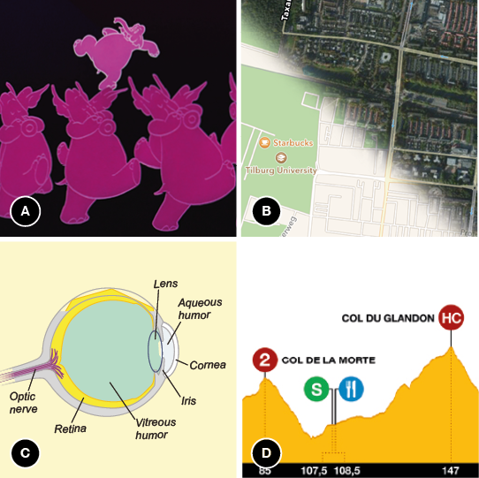
Notes (A) Pink elephants on parade, (B) Map variations on a mobile device, (C) Anatomy of the eye, (D) Pro le of a stage in a cycling race.
This dissertation asks questions about how such deviating pictures function, and how they are processed by the people perceiving them. Are they processed differently than more congruent or realistic pictures? Are deviating pictures in any way beneficial? Would people remember such pictures better? Would it affect how people describe them? Would it help them to understand a phenomenon better if a picture is not realistic? Gaining more insight into potential influences of visual realism on processing and understanding may be relevant for a variety of scientific disciplines and methodologies, and could be interesting for a range of practical applications, such as advertising, navigation, educational technology, and information design.
Processing and understanding pictures is essential in visual communication: For such communication to be effective, a visually conveyed message needs to be understood by its receiver, which is a matter of cognitive processing in the receiver’s mind (e.g., Hegarty, 2011; Tversky, 2011). The focus in this dissertation is thus on the cognitive processing and understanding of pictures (rather than on their production). Considering common theories on the processing of pictures, for example in the areas of visual cognition (e.g., Pinker, 1984), object recognition (e.g., Biederman, 1987; Tanaka et al., 2001) and naming (Humphreys, Riddoch, & Quinlan, 1988), the understanding of pictures (e.g., Tversky, 2011), and of pictures in combination with expository text (e.g., Ainsworth, 2006; Mayer, 2005), an essential aspect of understanding a picture is the consultation or assessment of some sort of mental representation of what is depicted by that picture (i.e., prior knowledge). Assuming that such mental representations are based on prior experiences, viewing and processing deviating pictures should yield a certain confrontation or conflict between picture and prior knowledge.
Such differential processing may lead to several effects. In the literature, deviating pictures are for example found to be distinctive in memory (e.g., Gounden & Nicolas, 2012; McDaniel & Einstein, 1986), as pictures that deviate from reality are remembered better than more realistic pictures. In addition, deviating pictures of objects are described as atypical, since they are not alike the common or typical appearance of the object in reality. Atypical colors are for example found to slow down recognition of objects because color is an intrinsic property of some objects, and is used to identify these objects (e.g., Bramão, Reis, Petersson, & Faísca, 2011; Naor-Raz et al., 2003; Tanaka et al., 2001). Atypical colors also attract visual attention (Becker, Pashler, & Lubin, 2007), leading to effects of visual salience on for example language production (Mitchell, 2013). Concerning schematic pictures, schematized visualizations are sometimes found to improve learning and comprehension, which is explained in terms of schematic pictures not presenting learners with irrelevant visual information (e.g., Dwyer, 1976; Scheiter et al., 2009; but also see Imhof, Scheiter, & Gerjets, 2011; Joseph & Dwyer, 1984). Pictures that deviate from reality can be found to be not cognitively ‘natural’ (e.g., Hegarty, 2011), or otherwise less alike the assumed ‘cognitive template’ of reality.
Taken together, this leads to the hypothesis that deviations from visual realism influence cognitive processing. Recognizing, remembering, describing, and understanding deviating pictures may evoke different cognitive processes than high-fidelity realistic counterparts would.
In this dissertation, the influence of deviations from visual realism, in the form of color atypicality and schematization is explored, adopting a multidisciplinary approach. In a series of experimental studies, in which participants perceive and cognitively process pictures, effects of visual realism on different kinds of processing are explored and described. Chapter 2 covers effects of visual realism on how pictures of things are remembered. How such pictures are verbally referred to in definite descriptions is investigated in Chapter 3. Chapter 4 looks into a specific context in which people verbally describe visualizations: producing route descriptions from maps. Chapter 5 concerns pictures in an educational context: Textbooks and educational applications often use pictures to explain certain concepts and processes, and this chapter considers effects of realism in these pictures on learning. Chapter 6 commences from a more applied perspective, and explores how using visually realistic elements in an information display that depicts statistics of soccer games affects understanding of and appreciation for the display.
Visual realism is thus studied from various angles. The experimental studies in this dissertation are rooted in research into memory, language production, route descriptions, educational psychology, and information design. Each field encompasses experimental research in which people look at and process visual information, and effects of manipulations in this information are expected to be observed in the resulting behavior (e.g., Abu-Obeid, 1998; Clarke, Elsner, & Rohde, 2013; Dwyer, 1976; Hegarty, 2011; Hunt & Worthen, 2006). In other words, the experimental stimulus input consists of pictures, and the output of interest lies in several behavioral measures.
As this dissertation aspires to explore visual realism by studying it’s influence in different fields of study, each field is introduced in the respective chapters of this dissertation. Each chapter presents a theoretical framing that introduces visual realism in a particular field. How realism plays a role in these chapters will be further explained in the Overview below.
Table of contents
Overview and research questions
Before each Chapter is introduced in this overview, it should be noted that all studies in this dissertation (i.e., Chapters 2 to 6) are self-contained, in the sense that they have either been published in a peer-reviewed journal, have been submitted for publication, or are currently under review for such a journal. These individual studies (or parts thereof) have also been presented at one or more international conferences or workshops. Therefore, the chapters themselves provide more in-depth theoretical backgrounds and discussions for the investigated issues. The overview below is merely intended as a brief introduction into the research questions and main findings of each of the chapters. In each chapter, it is indicated on which conference paper(s) or journal paper the chapter is based.
This dissertation is structured on the basis of the two types of deviations from visual realism described above. Chapters 2 and 3 investigate effects of color atypicality, from two different perspectives. Chapters 4 and 5 focus on schematization, again from different perspectives. Finally, Chapter 6 takes a more applied perspective, and focuses on using realistic elements in information displays. Both the stimuli, and the human reactions towards visual realism, get increasingly complex throughout this dissertation, enabling the current work to cover a rich array of human reactions towards different aspects of visual realism in representational pictures.
Chapter 2 studies effects of visual realism on memory. The focus is on atypically colored pictures of objects (as in Figure 1.1a). In memory research, one research question concerns why people generally remember ‘strange’ or ‘different’ things better than common things (Hunt & Worthen, 2006). This effect has been found for words and sentences, as well as for representational pictures. These pictures vary in terms of congruity: Strange things are incongruent or atypical, as they deviate from reality. However, why people remember such stimuli better is an area of current investigation. The research question that is addressed is:
Why are incongruent pictures (atypically colored objects) remembered better than congruent pictures (typically colored objects)?
It has been proposed that one important factor in explaining the effect of atypicality on memory is processing time, but so far research into this explanation is inconclusive (e.g., Gounden & Nicolas, 2012). The findings reported in Chapter 2 support the processing time account, by showing that atypically colored pictures are processed longer than typical ones, and that this is associated with better memory for these pictures. These pictures are based on stimuli used in object recognition studies (e.g., Naor-Raz et al., 2003), depicting everyday objects in atypical colors, such as red bananas and yellow lobsters.
Chapter 3 studies verbal descriptions of atypically colored pictures. In research on language production, particularly on the production of referring expressions, the general focus is on how visual properties of objects and their environment affect the way people uniquely refer to these objects in definite descriptions such as “the blue apple” (e.g., Clarke et al., 2013; Coco & Keller, 2012; Dale & Reiter, 1995; Krahmer & Van Deemter, 2012). In Chapter 3, color atypicality is introduced as a factor in research on referring expressions, addressing the following research question:
Are incongruent pictures (atypically colored objects) described differently than congruent pictures (typically colored objects)?
The results of the two language production experiments in this chapter show large effects of color typicality on referring expressions, as atypical colors lead people to mention these colors in their descriptions. This is attributed to cognitive salience: Atypical colors attract attention because they contrast with stored knowledge, and speakers are inclined to mention what is salient.
In Chapter 4, the focus is on how visual realism (here operationalized as visual detail, as in Figure 1.1b) in route maps may affect route descriptions. When people look at a map and describe how to go from one point to another (e.g., “go left at the shop and then take the first street on the right”), they produce verbal descriptions of visual information (e.g., Taylor & Tversky, 1992). Route maps can contain different degrees of visual detail (e.g., MacEachren, 2004; Timpf, 1999; and see Figure 1.2b), which is illustrated by mapping software available from for example Google, Apple, and Microsoft, which enable users to deliberately switch between detailed aerial photographs and simplified schematic maps. To investigate how visual detail in maps affects route descriptions, the research question addressed in this chapter is:
Are route descriptions that are based on realistic maps (aerial photographs) different from those based on schematic maps?
It is found that route descriptions are indeed different when people base them on schematic maps, compared to when they describe routes from detailed ones. These differences are related to both the form and the content of route descriptions: Descriptions of photographic maps are longer than descriptions of schematic maps, and the type of landmarks that are used to indicate where to change direction are different, depending on map type.
Chapter 5 investigates effects of visual detail on learning and comprehension. For several decades, educational psychologists have expressed an interest in the effects of visual detail in pictures that accompany written or spoken explanations (e.g., Butcher, 2006; Dwyer, 1968; Joseph & Dwyer, 1984; Mason, Pluchino, Tonatora, & Araisi, 2013; Scheiter et al., 2009). In textbooks and other educational materials, representational pictures are often used in combination with text to explain certain concepts, facts, and processes to students. Research in educational psychology has suggested that schematic line drawings support comprehension more effectively than detailed photographs do (e.g., Dwyer, 1968; Scheiter et al., 2009). However, it is unclear what explains this potential advantage of schematic drawings. Hence, the research question addressed in Chapter 5 is:
Why do students learn better from schematic pictures (line drawings) than from detailed pictures (microscopic photographs)?
Chapter 5 focuses on underlying processes or principles to which the potential advantage of schematic line drawings in educational materials can be attributed. It is found that the relative effectiveness of schematic pictures is not due to reduced visual detail compared to photographs, but due to the benefit of added visual emphasis. The findings in Chapter 5 support the idea that this visual emphasis helps students to identify key parts of the pictures, and make meaningful connections between text and pictures.
Chapter 6 presents a more practically applied example of visual realism, namely concerning information design. In the design of information displays, insights from perception and cognitive processing research lead to expectations about how they are best designed to facilitate optimal information extraction (e.g., Kessel & Tversky, 2011; Hegarty, 2011). One way to design such displays is to use realistic elements, for example by displaying soccer statistics on relevant parts of a soccer field (e.g., number of corners in the corners, number of goals in the goals). Although using realistic elements in information displays has been investigated by information designers for several decades (e.g., Bateman et al., 2010; Jansen, 2009; Neurath, 1974; Smallman & Cook, 2011), considering how visual realism in real-world information designs affects finding information yields new research questions (Hegarty, 2011). The question that is addressed in Chapter 6 is:
Does the use of visually realistic elements affect how people interpret and use an information display?
Chapter 6 aims to gain insight into effects of visually realistic elements in information displays by investigating whether theoretical design principles scale up to complex real-world information designs. Two real-world designs for summarizing soccer games are compared. Both designs were used by the BBC during the 2010 FIFA World Cup, and form an interesting case for studying the effectiveness of visually realistic elements in information design. While the realistic elements in one of the displays are theoretically beneficial for finding and understanding information, a large scale evaluation among more than five hundred participants shows that this display is actually less effective in several respects, such as finding data and drawing inferences. Also, the display that does not contain such realistic elements, is in several ways preferred by its users.
Chapter 7 summarizes the most important findings and conclusions of the foregoing chapters, reflects on overarching findings and themes, and discusses methodological implications of the current work. It also presents some considerations for practical applications.
In summary, the studies in this dissertation investigate various influences of visual realism on various cognitive processes. These chapters do so in a tradition and with dependent measures appropriate for the scientific field the chapter is situated in. Table 1.1 outlines the fields of research, experimental conditions, and dependent measures in each chapter.
Table 1.1 Overview of studies, conditions, and variables in this dissertation.
|
|
Field of research |
Experimental conditions |
Measure(s) |
| Chapter 2
Naming and remembering typically and atypically colored objects |
|
Memory |
Typically colored objects
Atypically colored objects |
Naming latency
Recognition, free recall |
| Chapter 3
Describing typically and atypically colored objects |
|
Language production:
Referring expressions |
Typically colored objects
Atypically colored objects |
Use of color adjectives |
| Chapter 4
Describing routes from schematic and realistic maps |
|
Language production:
Route desciptions |
Aerial photographs
Schematic maps |
Type of landmarks used
Descriptive accuracy
Descriptive efficiency |
| Chapter 5
Learning with schematic, realistic, and hybrid pictures |
|
Learning and comprehension:
Instructional design |
Microscopic photographs
Schematic pictures
Hybrid pictures |
Subjective evaluation
Comprehension
Accuracy of text-picture connections |
| Chapter 6
Understanding a visually rich information display |
|
Information design |
Visually rich display
Visually simple display |
Search time
Subjective evaluation |
Table of contents
Some remarks on differences between studies
Each study in this dissertation is situated in a different field of psychology and/or communication sciences. This means that the scientific literature is to a large degree unique for each individual chapter, and that there may be some differences in terminology. Most notably, the term realism is rarely used in Chapters 2 through 6, because each field of research has its own terminology to refer to differences in realism. In the Overview above, the terms color atypicality and schematization are used to refer to deviations from visual realism, which reflects the terminology in most chapters.
Additionally, each field of study involves its own traditions in methodology and statistical tests for experimental research. In the chapters that comprise this dissertation, it is intended to follow these traditions, conventions, and best practices closely. Therefore, each study makes use of the techniques that are adequate in each respective field of study, for the type of data that each experimental design yields. This dissertation contains quantitative experimental research in the lab, in classroom settings, and online, and it includes response time analyses, accuracy scores, verbal protocol analyses, quantified subjective evaluations, and basic eye tracking techniques. The statistical analyses deployed range from analysis of variance in between, within, and mixed designs, F1 and F2 analyses, correlation, linear regression, to (logit) mixed modeling (e.g., Barr, Levy, Scheepers, & Tily, 2013; Jaeger, 2008).
This dissertation comprises an extensive and omnifarious overview of influences of visual realism on cognitive processing and human communication, and thus takes up a multidisciplinary approach. The theoretical, terminological, and methodological differences between the studies in this dissertation reflect this multidisciplinary approach.
Table of contents
References
Abu-Obeid, N. (1998). Abstract and scenographic memory: The effect of environmental form on wayfinding. Journal of Environmental Psychology, 18(2), 159—173.
Ainsworth, S. (2006). DeFT: A conceptual framework for considering learning with multiple representations. Learning and Instruction, 16(3), 183—198.
Barr, D. J., Levy, R., Scheepers, C., & Tily, H. J. (2013). Random effects structure for confirmatory hypothesis testing: Keep it maximal. Journal of Memory and Language, 68(3), 255—278.
Bateman, S., Mandryk, R. L., Gutwin, C., Genest, A., McDine, D., & Brooks, C. (2010). Useful junk? The effects of visual embellishment on comprehension and memorability of charts. In Proceedings of the 28th international conference on Human factors in Computing Systems, Atlanta, GA.
Becker, M. W., Pashler, H., & Lubin, J. (2007). Object-intrinsic oddities draw early saccades. Journal of Experimental Psychology: Human Perception and Performance, 33(1), 20—30.
Biederman, I. (1987). Recognition-by-components: A theory of human image understanding. Psychological Review, 94(2), 115—147.
Bramão, I., Reis, A., Petersson, K. M., & Faísca, L. (2011). The role of color information on object recognition: A review and meta-analysis. Acta Psychologica, 138(1), 244—253.
Butcher, K. R. (2006). Learning from text with diagrams: Promoting mental model development and inference generation. Journal of Educational Psychology, 98(1), 182—197.
Carney, R. N. & Levin, J. R. (2002). Pictorial illustrations still improve students’ learning from text. Educational Psychology Review, 14(1), 5—26.
Clarke, A. D., Elsner, M., & Rohde, H. (2013). Where’s Wally: The influence of visual salience on referring expression generation. Frontiers in Psychology, 4: 329.
Coco, M. I. & Keller, F. (2012). Scan patterns predict sentence production in the cross-modal processing of visual scenes. Cognitive Science, 36(7), 1204—1223.
Dale, R. & Reiter, E. (1995). Computational interpretations of the Gricean maxims in the generation of referring expressions. Cognitive Science, 19(2), 233—263.
Dwyer, F. M. (1976). Adapting media attributes for effective learning. Educational Technology, 16(8), 7—13.
Dwyer, F. M. (1968). Effect of varying amount of realistic detail in visual illustrations designed to complement programmed instruction. Perceptual and Motor Skills, 27(2), 351—354.
Goldstone, R. L. & Son, J. Y. (2005). The transfer of scientific principles using concrete and idealized simulations. The Journal of the Learning Sciences, 14(1), 69—110.
Gounden, Y. & Nicolas, S. (2012). The impact of processing time on the bizarreness and orthographic distinctiveness effects. Scandinavian Journal of Psychology, 53(4), 287—294.
Hegarty, M. (2011). The cognitive science of visual-spatial displays: Implications for design. Topics in Cognitive Science, 3(3), 446—474.
Humphreys, G. W., Riddoch, M. J., & Quinlan, P. T. (1988). Cascade processes in picture identification. Cognitive Neuropsychology, 5(1), 67—104.
Hunt, R. R. & Worthen, J. B. (2006). Distinctiveness and memory. Oxford: Oxford University Press.
Imhof, B., Scheiter, K., & Gerjets, P. (2011). Learning about locomotion patterns from visualizations: Effects of presentation format and realism. Computers & Education, 57(3), 1961—1970.
Jaeger, T. F. (2008). Categorical data analysis: Away from ANOVAs (transformation or not) and towards logit mixed models. Journal of Memory and Language, 59(4), 434—446.
Jansen, W. (2009). Neurath, Arntz and ISOTYPE: The legacy in art, design and statistics. Journal of Design History, 22(3), 227—242.
Joseph, J. H. & Dwyer, F. M. (1984). The effects of prior knowledge, presentation mode, and visual realism on student achievement. The Journal of Experimental Education, 52(2), 110—121.
Kessell, A. & Tversky, B. (2011). Visualizing Space, Time, And Agents: Production, Performance, And Preference. Cognitive Processing, 12(1), 43—52.
Krahmer, E. & Van Deemter, K. (2012). Computational generation of referring expressions: A survey. Computational Linguistics, 38(1), 173—218.
MacEachren, A. M. (2004). How maps work: Representation, visualization, and design. New York: The Guildford Press.
Mason, L., Pluchino, P., Tornatora, M. C., & Ariasi, N. (2013). An eye-tracking study of learning from science text with concrete and abstract illustrations. The Journal of Experimental Education, 81(3), 356—384.
Mayer, R. E. (2005). The Cambridge handbook of multimedia learning. Cambridge: Cambridge University press.
Mitchell, M. (2013). Generating reference to visible objects. Ph.D. dissertation, University of Aberdeen.
Naor-Raz, G., Tarr, M. J., & Kersten, D. (2003). Is color an intrinsic property of object representation? Perception, 32(6), 667—680.
Neurath, M. (1974). Isotype. Instructional Science, 3(2), 127—150.
Ostergaard, A. L. & Davidoff, J. B. (1985). Some effects of color on naming and recognition of objects. Journal of Experimental Psychology: Learning, Memory, and Cognition, 11(3), 579—587.
Pettersson, R. (1998). Image functions in information design. In Proceedings of the 30th annual conference of the International Visual Literacy Association (IVLA), Athens, GA.
Pettersson, R. (2013). Image design. Tullinge, Sweden: Rune Pettersson.
Pierroutsakos, S. L. & DeLoache, J. S. (2003). Infants’ manual exploration of pictorial objects varying in realism. Infancy, 4(1), 141—156.
Pinker, S. (1984). Visual cognition: An introduction. Cognition, 18(1), 1—63.
Price, C. J. & Humphreys, G. W. (1989). The effects of surface detail on object categorization and naming. The Quarterly Journal of Experimental Psychology A: Human Experimental Psychology, 41(4A), 797—827.
Rieber, L. P. (2000). Computers, graphics, & learning. Hull, GA: Lloyd P. Rieber.
Scheiter, K., Gerjets, P., Huk, T., Imhof, B., & Kammerer, Y. (2009). The effects of realism in learning with dynamic visualizations. Learning and Instruction, 19(6), 481—494.
Schwartz, D. L. (1995). Reasoning about the referent of a picture versus reasoning about the picture as the referent: An effect of visual realism. Memory & Cognition, 23(6), 709—722.
Smallman, H. S. & Cook, M. B. (2011). Naïve realism: Folk fallacies in the design and use of visual displays. Topics in Cognitive Science, 3(3), 579—608.
Tanaka, J., Weiskopf, D., & Williams, P. (2001). The role of color in high-level vision. Trends in Cognitive Sciences, 5(5), 211—215.
Tanaka, J. & Presnell, L. (1999). Color diagnosticity in object recognition. Perception and Psychophysics, 2(6), 1140—1153.
Tatler, B. W. & Melcher, D. (2007). Pictures in mind: Initial encoding of object properties varies with the realism of the scene stimulus. Perception, 36(12), 1715—1729.
Taylor, H. A. & Tversky, B. (1992). Descriptions and depictions of environments. Memory & Cognition, 20(5), 483—496.
Therriault, D., Yaxley, R., & Zwaan, R. (2009). The role of color diagnosticity in object recognition and representation. Cognitive Processing, 10(4), 335—342.
Tversky, B. (2001). Spatial schemas in depictions. In M. Gattis (Ed.), Spatial Schemas And Abstract Thought (pp. 79—111). Cambridge: MIT Press.
Tversky, B. (2011). Visualizing thought. Topics in Cognitive Science, 3(3), 499—535.
Vernon, D. & Lloyd-Jones, T. J. (2003). The role of colour in implicit and explicit memory performance. The Quarterly Journal of Experimental Psychology, 56(5), 779—802.
Table of contents
Chapter 2
Naming and remembering typically and atypically colored objects
This chapter is based on:
Westerbeek, H., Van Amelsvoort, M., Maes, A., & Swerts, M. (in preparation). Naming and remembering atypically colored objects: Support for the processing time account for a bizarreness effect.
An earlier version of this work has been presented in:
Westerbeek, H., Van Amelsvoort, M., Maes, A., & Swerts, M. (2014). Naming and remembering atypically colored objects: Support for the processing time account for a secondary distinctiveness effect. In Proceedings of the 36th annual meeting of the Cognitive Science Society (CogSci), Quebec City, Canada.
Abstract The bizarreness effect is the effect that stimuli that are distinctive or different from stored knowledge are remembered better than common stimuli. We combine methodology from object recognition with memory tasks to investigate the processing time explanation for this effect, i.e., that distinctive stimuli are remembered better because they are more deeply processed and thus take more processing time during encoding. Participants in our experiment named common and distinctive items (typically and atypically colored objects), and memory was tested in recognition tasks. Our results replicate the bizarreness effect, as recognition scores were higher for atypically colored objects than for typical ones. Crucially, analyses of response times in the naming task showed that participants need significantly more time to process atypically colored objects. Also, longer response latencies in the naming task predicted better recognition, such that an increase in processing time caused by color atypicality was associated with an increase in memorability for atypically colored objects. Our results support the processing time hypothesis for the bizarreness effect. However, in a follow-up experiment we found that the effect diminishes when the recognition task is replaced by free recall. We interpret these findings as indicating that processing time during encoding plays a role in the bizarreness effect for atypically colored objects, but it does not reliably predict it.
Introduction
A recurring finding in experimental psychology is that items that are unusual or distinctive are remembered better than common items (e.g., Hunt & Worthen, 2006). This distinctiveness effect remains a field of investigation in current experimental psychology (e.g., McDaniel & Bugg, 2008; Michelon, Snyder, Buckner, McAvoy, & Zacks, 2003). There have been attempts to explain this effect in terms of differences in processing during encoding: Better memory for distinctive stimuli is associated with more attention and thus more processing time during encoding (e.g., Gounden & Nicolas, 2012; Kline & Groninger, 1991; McDaniel & Einstein, 1986). However, research aimed to test this explanation has been inconclusive. As we will argue below, this could partly be due to the way processing time has been operationalized and analyzed in previous studies. Also, we argue that the choice of stimuli to manipulate common and distinctive items could allow for alternative explanations. In the current chapter, we address these two potential problems, in order to investigate whether processing time is an explanatory variable for the secondary distinctiveness effect.
The secondary distinctiveness effect is the effect of better memory for items that are incongruent with general knowledge and expectations based on experiences with the real world (e.g., Schmidt, 1985, 1991). A specific secondary distinctiveness effect is the bizarreness effect: The effect that stimuli that show or describe something that is very unlikely are found to be more memorable than common stimuli. For example, a sentence like “the dog rode the bicycle down the street” (McDaniel & Einstein, 1986) is found to be remembered better than the non-distinctive equivalent “the dog chased the bicycle down the street”. In other studies, participants were presented with pictures instead of sentences, to exert more control over potential effects of reading and comprehension processes (e.g., Gounden & Nicolas, 2012). Secondary distinctive pictures show objects that are unlikely to be found in reality, such as a an office chair with human legs (Michelon et al., 2003), or a giraffe with two heads (Gounden & Nicolas, 2012). Alike the sentences, such pictures are found to be more memorable than pictures of common objects. Because such sentences and pictures can easily be regarded as strange, this particular secondary distinctiveness effect is called a bizarreness effect (e.g., McDaniel & Bugg, 2008).
The bizarreness effect has been examined using a wide variety of research designs and stimulus materials, in order to explore the conditions under which it occurs (e.g., Gounden & Nicolas, 2012; Graesser, Woll, Kowalski, & Smith, 1980; Nicolas & Marchal, 1998; O’Brien & Wolford, 1982). For example, both sentences and pictures are found to demonstrate the effect. Research designs also differentiate between whether memory is implicitly or explicitly tested, (Nicolas & Marchal, 1998). Designs also differ in how memory is tested (e.g., Gounden & Nicolas, 2012; Graesser et al., 1980). A particularly influential variable is the time span between learning and testing (e.g., O’Brien & Wolford, 1982): The bizarreness effect typically occurs when there is a sufficient delay of about two weeks between encoding and testing (e.g., McDaniel & Einstein, 1986; Michelon et al., 2003), which suggests that both common and distinctive items are remembered initially, but distinctive items are remembered longer than the common ones.
Explanations for the memory advantage for secondary distinctive items have been proposed in terms of differences in how these items and common ones are encoded into memory. Such encoding-based explanations propose that secondary distinctive stimuli are encoded differently than common ones (e.g., Kline & Groninger, 1991; McDaniel, Dornburg, & Guynn, 2005), as the distinctive nature of the stimuli attracts attention to what sets these items apart from what is considered normal or more common. One particularly appealing explanation for the effect that has received scholarly attention is the processing time hypothesis (e.g., Gounden & Nicolas, 2012; Kline & Groninger, 1991; McDaniel & Einstein, 1986). According to this account, distinctive items attract more attention than common ones during learning, and as a consequence more time is spent on the distinctive items. This longer and potentially stronger encoding then leads to superior memory for these stimuli.
While the processing time account is very intuitive, previous studies have not found consistent evidence to support this hypothesis. To test whether processing time during encoding explains the differences in memory for bizarre items, McDaniel and Einstein (1986) presented sentences describing common or bizarre relations between nouns to participants for either 7 or 14 seconds. Through a yes/no recognition task, McDaniel and Einstein measured memory for these items. They report that more nouns from bizarre sentences were recognized correctly than nouns from common sentences, but this effect was not modulated by the different presentation times. The authors report that, in a prior task, common sentences were processed in approximately 7 seconds. So, they reason, when 7 seconds were given to study both common and bizarre sentences, participants would not be able to spend the additional processing time on the bizarre sentences required to obtain an advantage in memory. However, because even at a 7 second presentation rate the nouns from bizarre sentences were recognized better than the nouns from common sentences, McDaniel and Einstein conclude that the mnemonic benefits of bizarreness are not related to increased processing time for such items.
When presentation time of distinctive and common items is manipulated, determining the relevant presentation time windows is crucial. Where McDaniel and Einstein (1986) based their presentation windows for sentences on mean processing times in previous research, Gounden and Nicolas (2012) reason that this method still yields a rather indirect manipulation. Therefore, they used images instead of sentences, taking additional processes involved in reading, comprehending and imagining the meaning of sentences out of the equation. These images were drawings of single objects (e.g., a horse), and incongruous versions of these drawings were created by multiplying salient features of these objects (e.g., a horse with three heads). To observe a potential role of processing time in the secondary distinctiveness effect, the images were presented to participants for either 500, 1000, or 3000 milliseconds. An expected interaction between distinctiveness and presentation time was not found: The incongruous objects were recalled better than the common ones in every presentation time condition. These results seem to suggest that processing time is not related to the secondary distinctiveness effect.
Kline and Groninger (1991) did find an interaction between presentation time and bizarreness. They presented sentences similar to those used by McDaniel and Einstein (1986; 1989) for 3, 5, 7, 11, 15, or 20 seconds, and report a memory effect for some of these time windows, but only when the sentences were relatively complex. However, the direction of the effect is unclear, as common sentences lead to better memory with a presentation time of 11 seconds, the effect reversed at 15 seconds, and no difference was found with a 20 second presentation time window. Therefore, bizarre items were not generally found to be processed longer than common items, and thus a conclusion that longer processing time for distinctive items accounts for the bizarreness effect cannot be based on the data.
In the remainder of this chapter, we discuss two methodological aspects of these studies that may have obscured potential effects of differences in processing time between common and distinctive stimuli: the manipulations of presentation time and the nature of the stimuli used. We argue that, if these methodological aspects are reconsidered, encoding-based explanations for the bizarreness effect may not need to be discarded.
In the studies discussed above, presentation time was manipulated to investigate a potential modulating role of processing time on the bizarreness effect. However, presentation time is not necessarily the same as processing time, and we reason that manipulations of presentation time make it difficult to ascribe secondary distinctiveness effects to differences in processing time. This is not only because presentation time and processing time are not necessarily the same, but also because one cannot know how quickly common and distinctive items are processed. Presentation times in experiments can be too short to obtain the ‘necessary’ encoding time for distinctive items. They can also be too long, such that distinctive items that are potentially harder to process get sufficient processing time anyway, nullifying a potential modulation of the memory effect. Moreover, processing time is likely to vastly differ between different kinds of stimuli.
In contrast, Michelon et al. (2003) investigated an encoding-based explanation for the bizarreness effect without manipulating presentation time, using event related functional magnetic resonance imaging (fMRI) instead. They presented pictorial stimuli to participants, all for 2.8 seconds. As such, Michelon et al. kept presentation times constant throughout their experiment, and measured cortical activity to study whether processing was different for common or incongruous pictures. Michelon et al. report that the incongruous pictures were remembered better than the common ones. Also, their analysis of cortical activation supports encoding-based accounts for the effect as signal increases were greater for distinctive versus common stimuli in several cortical areas. So, Michelon et al. attribute the memory effect to more elaborate processing, and they managed to avoid potential problems with presentation times.
The nature of the stimuli used by Michelon et al. potentially allows for alternative explanations, however. Their common pictures showed familiar objects, such as a teapot. Pictures in the incongruous condition were so-called chimeric objects, comprising of parts of two different objects fused into one, such as a key and a snake. Such pictorial stimuli however do not always yield minimal pairs in distinctiveness research, while the sentences for example used by McDaniel and Einstein (1986) and Kline and Groninger (1991) contain the same amount of words, nouns, and adjectives, irrespective of distinctiveness.
One could argue that using non-minimal pairs increases processing demands during encoding, as in the case of chimeric objects that comprise of (parts of) multiple objects. In such cases two objects are recognized, plus their spatial relationship with respect to each other. This is reflected by Michelon et al.’s finding that these objects elicit activation in both the ventral and the dorsal visual pathway. The dorsal pathway is often said to be associated with processing of spatial relations between objects (e.g., Landau & Jackendoff, 1993). So, the increase in overall cortical activity for chimeric objects may be explained by both their distinctiveness and by the fact that they comprise multiple objects. This problem also likely persists in other aforementioned studies: The objects with multiplied features of Gounden and Nicolas (2012) presented participants with more (visual) cues than the common objects. As a result, it is not immediately clear whether the memory advantage for chimeric or otherwise more complex objects is due to more elaborate processing, or to the fact that these stimuli were more complex and therefore contained more features, so that observers could possibly rely on more cues when retrieving them from memory.
We argue that if the methodological issues concerning presentation time and the nature of the stimuli used that we discussed above are addressed, this warrants a new investigation into the processing time account of the bizarreness effect. If we can present people with items that are secondary distinctive, and which are processed less quickly than common counterparts, we can measure this processing time difference and test whether the increased processing time of distinctive items predicts better memory for these items compared to common items. Furthermore, these distinctive items should not contain additional (visual) features compared to common items. The field of object recognition provides us with stimuli that meet both these criteria.
Studies in object recognition provide evidence that pictures of distinctive objects require more time to be processed than common equivalents. It is well established that pictures of objects that have an atypical color (for example a red banana) are less quickly processed (i.e., recognized and named) than pictures of typically colored objects (e.g., Naor-Raz, Tarr, & Kesten, 2003; Tanaka, Weiskopf, & Williams, 2001; Therriault, Yaxley, & Zwaan, 2009). For example, Therriault et al. (2009) report significantly slower responses for atypically colored objects compared to typically colored ones on naming and verification tasks, as well as on reading times for sentences where nouns are replaced by atypical pictures.
Atypically colored objects are secondary distinctive: They are − like bizarre, incongruous, or chimeric objects − unusual compared to stored knowledge, which contains information about the default color of an object (Bramão, Reis, Petersson, & Faísca, 2011; Naor-Raz et al., 2003). For example, a picture of a red banana contrasts with stored knowledge, which states that bananas are usually yellow. Additionally, typically and atypically colored objects are minimal pairs: They only differ in terms of one property (color) that has a different value. This minimizes potential confounds introduced by non-minimal pairs. Object recognition studies show that processing such atypically colored objects takes more time, but we do not yet know whether this influences memory. In this chapter, we thus combine object recognition with memory tasks.
Table of contents
We want to investigate the processing time hypothesis as an explanation for the bizarreness effect, and we take an interdisciplinary approach by combining methodology from object recognition with procedures from memory research. First, we administer a naming task with pictures of typically and atypically colored objects as encoding task, so we can measure processing time (i.e., naming latency) for common and distinctive items. Consecutively, memory is tested in yes/no recognition tests (in Experiment 1) and in a free recall task (in Experiment 2). This combination of naming and memory tasks allows us to investigate whether a difference in processing time predicts better memory for these items.
Table of contents
Experiment 1
Naming onto recognition
In this experiment, participants named typically and atypically colored everyday objects. They were not instructed about the successive memory tests, so our paradigm entails incidental learning (Nicolas & Marchal, 1998). Directly after naming, a yes/no recognition memory task was administered to test whether incidental learning was successful. The memory task was re-administered two weeks later.
Forty undergraduate students (all speakers of Dutch, thirty-two women and eight men, with a median age of 22 years) participated for course credit. They were not color blind, and all gave written consent for recording their voice and analyzing their data.
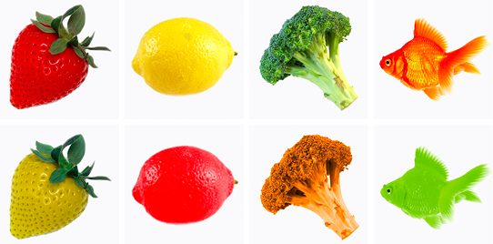
Seventy-six everyday objects were selected on the basis of stimuli used in object recognition studies (e.g., Naor-Raz et al., 2003; Therriault et al., 2009). Because atypically colored versions were to be created, these were all color-diagnostic objects (i.e., objects that have one or a few typical colors associated with them). For each object a high quality photo was selected and edited, such that the object was seen on a plain white background. For the atypically colored versions, further photo editing was done to change the objects’ color. Atypical colors were determined by rotating colors across the various objects, such that the number of objects in each color (red, blue, yellow, orange, green, brown, and pink) was the same in both typicality conditions. We did this to control for any effect of particular colors (hues and luminosities) on naming and recognition, which may confound our manipulation of typicality. Figure 2.1 presents some examples of objects in typical and atypical colors, as we used them in the experiment.
Figure 2.1 Some examples of typically and atypically colored objects, as used in experiments 1 and 2.
The seventy-six objects were equally distributed over two lists. In each list of thirty-eight objects, half of the objects was typically colored, and the other half was atypical. We ensured that an object never appeared in more than one color within each list. Of both lists, a second version was assembled in which color typicality was reversed: Objects that were typically colored in one version were atypical in the other and vice versa. This resulted in two versions of two lists of thirty-eight objects.
The lists were matched for color frequency, whether the objects are easily named (nameability), whether the typically colored pictures matched mental prototypes (prototypicality), how frequent the object’s name is in the language (Dutch), the length of the name in syllables, and the luminosity (i.e., brightness) of the pictures. We also made sure that luminosity was not different for typical and atypical objects within each list. Name frequencies were assessed using an on-line corpus (Keuleers, Brysbaert, & New, 2010). Luminosity was measured using MATLAB (Mathworks, Natick, MA).
Nameability and prototypicality of the typically colored objects were determined in pretests. Nameability was determined by asking ten participants to name both typically and atypically colored objects. Two lists of stimuli were created for this pretest such that they named each object in only one of the two color conditions. Accuracy rates were used to determine whether all objects in our stimulus set would be easily nameable. Whether the typically colored pictures matched mental prototypes was measured by means of an image agreement task (Snodgrass & Vanderwart, 1980): Seven different participants first read the name of an object (e.g., lion), and were instructed to imagine what this object would look like. Consecutively, they rated a picture of this object for how much it resembled what they imagined, on a five-point scale. These ratings were used to establish that the pictures of typically colored objects were found to be common exemplars (M = 4.30, SD = 0.55). None of the participants in the pretests were involved in the experiments reported in this chapter.
The experiment was performed in a dimly lit sound proof cabin, in order to minimize distraction. Participants were randomly assigned to one of the stimulus lists. They were instructed that they would get to see a number of pictures on a computer screen, and that they had to name these objects as quickly as possible. The instructions did not reveal that memory would be tested after the naming task. The objects appeared in a random order, one by one. The presentation time for each object was exactly 3000 ms, preceded by a fixation cross (800 ms) and followed by a blank screen (1000 ms). The first three items were filler objects, after which the thirty-eight stimulus objects were presented. The order of these stimuli was randomized for each participant.
Immediately after the naming task, the participants had to perform a second task. They were informed that the pictures from the first task would be shown once again, but that new objects would be mixed in. Participants had to say as quickly as possible (out loud) whether each object was part of the naming task (“yes”) or not (“no”). The new objects were the objects from the list that the participant did not see in the naming task (so, these were not previously seen in other colors). The order of the objects was randomized for each participant.
The participants were asked to return to the lab about two weeks later, but they were not instructed about the purpose of this second meeting. All participants returned to the lab and performed the yes/no recognition task again. Due to practical constraints, the delay between the tasks ranged from 11 to 18 days across participants (the median delay was 15 days, most participants returned after 14, 15 or 16 days). After this task, color blindness was assessed using the web-based CU Dynamic Colour Vision Test (Barbur, Harlow, & Plant, 1994).
Responses were recorded with a head-mounted microphone. Stimulus randomization, timing, and voice recording were administered using E-Prime (Schneider, Eschman, & Zuccolotto, 2012). Reaction times were measured by analyzing the audio recordings in Praat (Boersma & Weenink, 2012; Kaiser, 2013, p. 144).
For the naming task, we compared response times for typically and atypically colored objects in a within-participants design. For the recognition tasks, we compared hits, false alarms and corrected recognition scores (Pr) within participants. Response times and recognition data were analyzed using repeated measures ANOVAs, both on by-participants means (F1) and on by-item means (F2).
Despite the pretests, five of the seventy-six objects (blackberry, celery, pickle, red cabbage, sprout) yielded disproportionally high numbers of incorrect responses or non-responses, and were excluded (especially the atypically colored versions of these objects turned out to be problematic, as more than seventy percent of participants named the objects incorrectly or refrained from naming). So, all consecutive analyses are performed on the remaining seventy-one objects. Response times for incorrect responses and non-responses were discarded, removing 11.1 percent of the data. An outlier analysis on response times for correctly named objects was conducted, in which we removed response times that were faster than 500 ms or longer than 2500 ms. This outlier procedure resulted in discarding of 0.4 percent of the response times for correctly named objects, well within an acceptable range for response time data (Ratcliff, 1993).
Analysis of the processing time in the naming task, shown in Figure 2.2 (left panel), revealed a main effect of color typicality: F1(1, 39) = 95.85, p < .001, ηp2 = .711; F2(1, 70) = 66.24, p < .001, ηp2 = .486. Typically colored objects were named significantly faster (M = 1,123 ms, SD = 123 ms) than atypically colored ones (M = 1,285 ms, SD = 162 ms). This result replicates previous research in object recognition (e.g., Tanaka et al., 2001; Therriault et al., 2009), and shows that secondary distinctive items are processed less quickly than common ones.
Figure 2.2 Mean processing time (in milliseconds) for atypically and typically colored objects in the naming tasks of experiments 1 and 2.
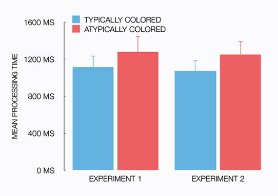
Notes Error bars are +1 standard deviation.
As is common practice in analyzing responses for recognition tasks, we corrected for response bias by calculating a corrected recognition score or discrimination index Pr (for a comprehensive discussion of measurements of recognition memory, see Snodgrass & Corwin, 1988). This recognition score corrects the percentage of hits (i.e., the participant saying that an object was seen when it actually was) for the percentage of false alarms (i.e., the participant saying that an object was seen while it actually was not), and is calculated as Phit − Pfalse alarm.
Results of the immediate recognition task showed no effects of color typicality on hits, false alarms, and on recognition scores; all p’s > .07. Performance was near perfect as hit rates and corrected recognition scores were both well above 95 percent. This confirmed that naming objects leads to successful encoding.
Results of the delayed recognition task are shown in Table 2.1. Analyses of hit rates revealed a main effect of color typicality, such that there were significantly more hits for atypically colored objects: F1(1, 39) = 35.85, p < .001, ηp2 = .479; F2(1, 70) = 27.89, p < .001 ηp2 = .285. A marginally significant effect in the same direction was found for false alarms: F1(1, 39) = 4.27, p = .046, ηp2 = .099; F2(1, 70) = 3.46, p = .067. Importantly, corrected recognition scores were higher for atypically colored objects than for typically colored ones: F1(1, 39) = 12.16, p = .001, ηp2 = .238; F2(1, 70) = 11.51, p = .001, ηp2 = .141.
Table 2.1 Delayed recognition results (in percentages) of Experiment 1.
Notes * p < .05, ** p < .005, *** p < .001. The indicated significance levels are based on F1-analyses.
|
Typically colored objects |
|
Atypically colored objects |
|
|
M |
(SD) |
|
M |
(SD) |
|
| Hits |
67.5 |
(16.6) |
|
82.8 |
(10.2) |
*** |
| False alarms |
20.9 |
(16.3) |
|
26.4 |
(15.4) |
* |
| Recognition score (Pr) |
46.7 |
(16.8) |
|
56.6 |
(15.3) |
** |
Initial analyses showed that the number of days between naming and delayed recognition did not affect hits, false alarms, and recognition scores; all p’s > .14. Delay was, therefore, not included as a factor in the analyses above. However, there was an interaction effect between delay and color typicality for hits, F(1, 38) = 6.23, p = .017, ηp2 = .141, which suggested that the effect of color typicality increased as a function of the number of days between naming and recognition.
These results show that those items that were processed longer in the naming task (i.e., the atypically colored objects) were also remembered better than items that were processed more quickly in the naming task (typically colored objects). To further explore this relationship between the results of the naming task and those of the recognition task, we carried out by-item linear regression analyses with naming latency as the predictor and corrected recognition scores as the outcome variable. A longer processing time in the naming task was associated with a higher recognition score in the delayed recognition task, β = .36, t(141) = 4.52, p < .001. A longer processing time predicted a higher recognition score, R2 = .13, F(1, 141) = 20.45, p < .001. Per color typicality condition, processing time and recognition score were similarly associated (typically colored objects: β = .24, t(70) = 2.08, p = .041; atypically colored objects: β = .35, t(70) = 3.10, p = .003). In both conditions, longer processing times predicted higher recognition scores (typical: R2 = .06, F(1, 70) = 4.32, p = .041; atypical: R2 = .12, F(1, 70) = 9.59, p = .003). Finally, the difference in processing time between typically and atypically colored objects in the naming task was associated with with the difference in memory score in delayed recognition, β = .24, t(70) = 2.08, p = .042, as a larger effect size in the naming task predicted a larger effect size in delayed recognition, R2 = .06, F(1, 70) = 4.30, p = .042. This shows that for objects for which processing time was virtually unaffected by color typicality, no secondary distinctiveness effect was found either. Conversely, for objects for which the color typicality manipulation yielded the largest effect on processing time, the memory effect was relatively large as well.
To our knowledge, we are the first to report that longer processing of atypically colored items is associated with better memory for these items, but to assess the robustness of the bizarreness effect found in this experiment we attempt to replicate our findings in a follow-up experiment. Because the yes/no recognition paradigm used in Experiment 1 is arguably relatively sensitive to the perceptual nature of our color typicality manipulation, in Experiment 2 we replaced recognition by free recall. In a free recall task, participants do not receive visual input that may serve as an extra cue that can be exploited to retrieve items from memory. So, by altering the conditions under which items are retrieved from memory, we can investigate whether our finding that longer processing of atypically colored items fully explains their advantage in a memory task, or alternatively, whether a different retrieval paradigm (i.e., without processing of visual input) may modulate the effect of processing time on memorability. This allows us to explore the robustness of the association between processing time and memory for distinctive objects.
Table of contents
Experiment 2
Naming onto free recall
Thirty-nine undergraduate students (all speakers of Dutch, thirty-one women and eight men, with a median age of 21 years) participated for course credit. As in Experiment 1, they were not instructed about the fact that their memory would be tested. None of these participants participated in Experiment 1 nor any of the pretests, and none were color blind. All gave written consent for recording their voice and analyzing their data.
The materials and procedure were identical to Experiment 1, except that instead of yes/no recognition tasks, a free recall task was administered. During free recall, the participants were asked to list as many items they had seen as possible (they were free to mention their colors as well). When the participant indicated that he or she could not remember any more items, the experimenter prompted once more, and in most cases this yielded a few more responses. The delay between the recall tasks ranged from 12 to 16 days across participants (the median delay was 14 days, most participants returned after 13, 14 or 15 days). As in Experiment 1, color blindness was assessed after this task.
Statistical analyses were identical to Experiment 1, except that for the free recall task the number of correctly recalled items was used as the dependent measure.
All consecutive analyses are performed on the same seventy-one stimulus objects as in Experiment 1. Response times for incorrect responses and non-responses were discarded, removing 9.4 percent of the data. The outlier procedure, which was identical to Experiment 1, resulted in discarding of 1.0 percent of the response times for correctly named objects. Analysis of the processing time in the naming task, shown in Figure 2.2 (right panel), revealed a main effect of color typicality: F1(1, 38) = 76.67, p < .001, ηp2 = .669; F2(1, 70) = 95.92, p < .001, ηp2 = .578. Typically colored objects were named significantly faster (M = 1,078 ms, SD = 111 ms) than atypically colored ones (M = 1,255 ms, SD = 148 ms). These results replicate our findings in Experiment 1, as well as findings in other object recognition studies.
Results of the immediate free recall task showed no effect of color typicality on the number of items recalled, as about an equal amount of typically colored (M = 6.9 objects, SD = 2.1 objects) and atypically colored objects (M = 6.5, SD = 2.7) were recalled: F1 < 1; F2(1, 70) = 1.33, p =.253. Analyses of the number of items recalled in delayed free recall also showed no effect of color typicality, as the same amount of typically (M = 3.4, SD = 1.7) and atypically colored objects (M = 3.4, SD = 2.3) were recalled: F’s < 1. Note that the number of items recalled in both immediate and delayed free recall is arguably rather low, given that the maximum number of recalled items was 19 in each of the typicality conditions. We also observed that the color of objects was hardly ever mentioned in the free recall tasks. Processing times for items in the naming task did not reliably predict the number of times these items were recalled (p’s > .17).
In contrast to our findings in Experiment 1, where we reported a robust effect of color typicality (secondary distinctiveness) on delayed yes/no recognition, no such effect was found in free recall. So, under different retrieval conditions, processing time does not reliably predict the memorability of secondary distinctive items, compared to common items. Specifically, when the retrieval task does not involve visual processing, objects that look different from stored knowledge (i.e., atypically colored objects) are not remembered better than objects that are more prototypical (typically colored ones).
Table of contents
General discussion
We investigated the processing time hypothesis of the bizarreness effect in two experiments in which participants named typically and atypically colored objects, followed by tests of memory for these objects. Atypically colored objects are secondary distinctive: They contrast with stored knowledge about everyday normal objects, and the bizarreness effect predicts that these objects are remembered better than (non-contrasting) typically colored objects. Also, typically and atypically colored objects are minimal pairs, as atypically colored objects do not present people with more (visual) cues than typically colored ones. To our knowledge, our study is the first to investigate the processing time account for the bizarreness effect by measuring (differential) processing times for common and distinctive items and correlating those to memory effects, instead of through an experimenter-controlled manipulation of presentation time.
In Experiment 1, we combined an object naming task with a yes/no recognition memory task. In the naming task, we found that when the color of an object is atypical (e.g., red banana), the object is recognized less quickly than when its color is typical (e.g., red strawberry), replicating results found in object recognition studies (e.g., Therriault et al., 2009). A recognition task that was administered two weeks later produced a bizarreness effect: Atypically colored objects were remembered better than typically colored ones. We thus found that items that received more processing time in encoding are associated with better recognition during the delayed memory test. These results are taken to support a processing time explanation for the bizarreness effect. To our knowledge, we are the first to report a direct association between longer processing times in encoding and better retrieval in the memory task.
We focused on the processing time hypothesis, which is an encoding-based account for the bizarreness effect: Distinctive items are processed longer than common ones during encoding, and are therefore more memorable (e.g., Gounden & Nicolas, 2012; Kline & Groninger, 1991). So, a difference in processing between common and distinctive items can be observed during encoding, which is what we found in both experiments. Additional explanations, based on retrieval processes, have been proposed in the literature (e.g., Hunt & Worthen, 2006). Such explanations attribute an advantage of distinctive items to their bizarreness, which can yield cues that are helpful in retrieving items from memory (e.g., McDaniel & Einstein, 1986; McDaniel et al., 2005). For example, if distinctive items provide more visual features than common items, these extra cues can be utilized during retrieval (e.g, Waddill & McDaniel, 1998). As addressed in the introduction, chimeric objects do just that: An office chair with human legs provides at least one additional (visual) cue compared to a common office chair, and objects with multiplied features also present participants with more of such cues. We argued that when encoding-based explanations for the bizarreness effect are studied, such additional cues should be kept under control as they may introduce confounds in experimental designs. In the current experiments we therefore ensured not to add attributes to distinctive stimuli (relative to common ones).
Our results do not rule out such additional retrieval based explanations of the bizarreness effect. Although we focused on processing time, our data may also provide evidence for differential processing during retrieval of secondary distinctive items compared to common items. We explored this by performing additional analyses on response times in the yes/no recognition task in Experiment 1. In the recognition task that was administered immediately after naming, response times for hits show a similar pattern as the response times in naming and in verification tasks (Therriault et al., 2009), as typically colored objects were recognized more quickly than atypical ones. However, in the delayed recognition task administered two weeks later, retrieval latencies (response times for hits) were not significantly different for typically and atypically colored objects. Although further research is needed, we take this interaction between delay and bizarreness to suggest that different processes are at play in delayed recognition as compared to immediate recognition. A possible explanation is that secondary distinctive items are retrieved more quickly than common items in delayed recognition (as is reflected in the recognition scores in Table 2.1), and that this compensates for any slower object identification caused by the atypicality of these items.
We take the present results to indicate that differential processing time at encoding is an explanatory variable in the bizarreness effect, but this does not preclude effects of differences in retrieval. In fact, when the recognition task was replaced by free recall (in Experiment 2), our results were modulated such that recall of typically and atypically colored objects was not significantly different from each other. And while we can not rule out that this is due to floor effects in the number of items recalled, it suggests that some processes that occurred during recognition (Experiment 1), and not during free recall (Experiment 2), were crucial for the memory effect. Also, the correlation we find between processing time in naming and recognition score in memory in Experiment 1 is significant but not very strong, which leaves variation to be explained, for example, by retrieval-based interpretations of the superior memory for secondary distinctive items over common items. Future research may be directed at the question under which circumstances encoding-based accounts explain more of the bizarreness effect than retrieval-based accounts, and vice versa.
Another direction for future research is related to the nature of the bizarreness effect that can be obtained with atypically colored stimuli. We changed the color of objects to obtain a rather subtle manipulation of secondary distinctiveness (i.e., with minimal pairs), that did not introduce additional visual features. In the introduction we reasoned that more extreme manipulations potentially boost retrieval based effects. When, for example, stimuli are distinctive because they consist of two objects ‘fused’ into one (e.g., Michelon et al., 2003), or because they possess multiplied protruding attributes (e.g., Gounden & Nicolas, 2012; Nicolas & Marchal, 1998), such items also have more cues to be used during retrieval (e.g., Waddill & McDaniel, 1998). Further research may however address the hypothesis that different encoding of distinctive and normal stimuli only accounts for secondary distinctiveness effects when stimuli that are minimally different from common stimuli are used. Only in such a case, during retrieval no higher number of cues is available for distinctive stimuli. Moreover, the current results suggest that the effect of color atypicality on memory may constitute a specific case of the bizarreness effect. Better memory for atypically colored objects was only found in recognition, and not in free recall, while the bizarreness effect is often found in free recall as well, when sentences or chimeric objects are used (e.g., Gounden & Nicolas, 2012; McDaniel & Einstein, 1986).
Additionally, in future work the naming task may be replaced by other tasks that do not involve retrieving the verbal label for the objects, but measure how quickly visually presented objects are processed in another way. In particular, tasks that require more shallow processing of the stimuli may interact differently with encoding-based processes involved in memory. In our experiments participants named the objects on the screen, so hypothetically processing encompasses assessing the stored representation of an object, its semantic representation, and the corresponding phonological representation which is then realized as a verbal response (see Humphreys, Riddoch, & Quinlan, 1988, for a further discussion of processes in picture naming). Alternatively, a verification task can be used, where participants have to verify whether a given name matches a picture by pressing a button (e.g., Therriault et al., 2009, Experiment 1b). With a verification task, processing time of visually presented objects is measured more directly than with a naming task, as potential effects caused by retrieving the verbal label from memory or formulating and producing a response can be avoided.
Table of contents
References
Barbur, J. L., Harlow, A. J., & Plant, G. T. (1994). Insights into the different exploits of colour in the visual cortex. Proceedings of the Royal Society of London B: Biological Sciences, 258(1353), 327—334. Web-based version available at http://www.city.ac.uk/health/research/centre-for-applied-vision-research/a-new-web-based-colour-vision-test/
Boersma, P. & Weenink, D. (2012). Praat: Doing phonetics by computer, version 5.3.06.
Bramão, I., Reis, A., Petersson, K. M., & Faísca, L. (2011). The role of color information on object recognition: A review and meta-analysis. Acta Psychologica, 138(1), 244—253.
Gounden, Y. & Nicolas, S. (2012). The impact of processing time on the bizarreness and orthographic distinctiveness effects. Scandinavian Journal of Psychology, 53(4), 287—294.
Graesser, A. C., Woll, S. B., Kowalski, D. J., & Smith, D. A. (1980). Memory for typical and atypical actions in scripted activities. Journal of Experimental Psychology: Human Learning and Memory, 6(5), 503—515.
Hunt, R. R. & Worthen, J. B. (2006). Distinctiveness and memory. Oxford: Oxford University Press.
Humphreys, G. W., Riddoch, M. J., & Quinlan, P. T. (1988). Cascade processes in picture identification. Cognitive Neuropsychology, 5(1), 67—104.
Kaiser, E. (2013). Experimental paradigms in psycholinguistics. In R. Podesva & D. Sharma (Eds.), Research Methods in Linguistics (pp. 135—168). Cambridge: Cambridge University Press.
Keuleers, E., Brysbaert, M., & New, B. (2010). SUBTLEX-NL: A new measure for Dutch word frequency based on film subtitles. Behavior Research Methods, 42(3), 643—650.
Kline, S. & Groninger, L. D. (1991). The imagery bizarreness effect as a function of sentence complexity and presentation time. Bulletin of the Psychonomic Society, 29(1), 25—27.
Landau, B. & Jackendoff, R. (1993). “What” and “where” in spatial language and spatial cognition. Behavioral and Brain Sciences, 16(2), 217—265.
McDaniel, M. A. & Bugg, J. M. (2008). Instability in memory phenomena: A common puzzle and a unifying explanation. Psychonomic Bulletin & Review, 15(2), 237—255.
McDaniel, M. A., Dornburg, C. C., & Guynn, M. J. (2005). Disentangling encoding versus retrieval explanations of the bizarreness effect: Implications for distinctiveness. Memory & Cognition, 33(2), 270—279.
McDaniel, M. A. & Einstein, G. O. (1986). Bizarre imagery as an effective memory aid: The importance of distinctiveness. Journal of Experimental Psychology: Learning, Memory, and Cognition, 12(1), 54—65.
McDaniel, M. A. & Einstein, G. O. (1989). Sentence complexity eliminates the mnemonic advantage of bizarre imagery. Bulletin of the Psychonomic Society, 27(2), 117—120.
Michelon, P., Snyder, A. Z., Buckner, R. L., McAvoy, M., & Zacks, J. M. (2003). Neural correlates of incongruous visual information: An event-related fMRI study. NeuroImage, 19(4), 1612—1626.
Naor-Raz, G., Tarr, M. J., & Kersten, D. (2003). Is color an intrinsic property of object representation? Perception, 32(6), 667—680.
Nicolas, S. & Marchal, A. (1998). Implicit memory, explicit memory and the picture bizarreness effect. Acta Psychologica, 99(1), 43—58.
O’Brien, E. J. & Wolford, C. R. (1982). Effect of delay in testing on retention of plausible versus bizarre mental images. Journal of Experimental Psychology: Learning, Memory, and Cognition, 8(2), 148—152.
Ratcliff, R. (1993). Methods for dealing with reaction time outliers. Psychological Bulletin, 114(3), 510—532.
Schmidt, S. R. (1985). Encoding and retrieval processes in memory for conceptually distinctive events. Journal of Experimental Psychology: Learning, Memory, and Cognition, 11(3), 565—578.
Schmidt, S. R. (1991). Can we have a distinctive theory of memory? Memory & Cognition, 19(6), 523—542.
Schneider, W., Eschman, A., & Zuccolotto, A. (2012). E-prime 2.0 user’s guide. Psychology Software Tools, Inc., Pittsburg, PA.
Snodgrass, J. G. & Corwin, J. (1988). Pragmatics of measuring recognition memory: Applications to dementia and amnesia. Journal of Experimental Psychology: General, 117(1), 34—50.
Snodgrass, J. G. & Vanderwart, M. (1980). A standardized set of 260 pictures: Norms for name agreement, image agreement, familiarity, and visual complexity. Journal of Experimental Psychology: Human Learning and Memory, 6(2), 174—215.
Tanaka, J., Weiskopf, D., & Williams, P. (2001). The role of color in high-level vision. Trends in Cognitive Sciences, 5(5), 211—215.
Therriault, D., Yaxley, R., & Zwaan, R. (2009). The role of color diagnosticity in object recognition and representation. Cognitive Processing, 10(4), 335—342.
Waddill, P. J. & McDaniel, M. A. (1998). Distinctiveness effects in recall: Differential processing or privileged retrieval? Memory & Cognition, 26(1), 108–120.
Table of contents
Chapter 3
Describing typically and atypically colored objects
This chapter is based on:
Westerbeek, H., Koolen, R., and Maes, A. (2015). Stored object knowledge and the production of referring expressions: The case of color typicality. Frontiers in Psychology, 6: 935.
Earlier versions of this work have been presented in:
Westerbeek, H., Koolen, R., & Maes, A. (2013). Color typicality and content planning in definite reference. In Proceedings of Bridging the gap between cognitive and computational approaches to reference (PRE-CogSci), Berlin, Germany.
Westerbeek, H., Koolen, R., & Maes, A. (2014). On the role of object knowledge in reference production: Effects of color typicality on content determination. In Proceedings of the 36th annual meeting of the Cognitive Science Society (CogSci), Quebec City, Canada.
Abstract When speakers describe objects with atypical properties, do they include these properties in their referring expressions, even when that is not strictly required for unique referent identification? We predict that speakers mention the color of a target object more often when the object is atypically colored, compared to when it is typical. Taking literature from object recognition and visual attention into account, we further hypothesize that this behavior is proportional to the degree to which a color is atypical, and whether color is a highly diagnostic feature in the referred-to object’s identity. We investigate these expectations in two language production experiments, in which participants referred to target objects in visual contexts. In Experiment 1, we find a strong effect of color typicality: Less typical colors for target objects predict higher proportions of referring expressions that include color. In Experiment 2 we manipulated objects with more complex shapes, for which color is less diagnostic, and we find that the color typicality effect is moderated by color diagnosticity: It is strongest for high-color-diagnostic objects (i.e., objects with a simple shape). These results suggest that the production of atypical color attributes results from a contrast with stored knowledge, an effect which is stronger when color is more central to object identification. Our findings offer evidence for models of reference production that incorporate general object knowledge, in order to be able to capture these effects of typicality on determining the content of referring expressions.
Introduction
In everyday language use, speakers often refer to objects by describing what they see, in such a way that an addressee can uniquely identify the intended object (e.g., Arnold, 2008; Brennan & Clark, 1996; Horton & Gerrig, 2005; Pechmann, 1989; Van Deemter, Gatt, Van der Sluis, & Power, 2012a). In Figure 3.1, for example, a speaker can refer to the leftmost object by using the definite description “the yellow tomato”. In this visual context this referring expression accommodates unambiguous identification by the addressee, as it describes the target object and rules out the other (distractor) objects. Note, however, that a description like “the tomato” would also suffice as an unambiguous description of the leftmost object, as there are no other tomatoes in the context. Then why would a speaker mention the tomato’s color anyway?
Figure 3.1 An example of a visual context, containing an atypically colored object.
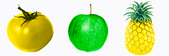
A reason could be that the color of the yellow tomato in Figure 3.1 draws attention, because it contrasts with one of the features in a stored representation of tomatoes in the speaker’s long-term memory, namely the feature that tomatoes are typically red. This makes the color of the tomato cognitively salient. Cognitive salience is different from physical salience, which is visual salience caused by image-level characteristics such as bright colors and strong contrasts (we take the terms cognitive and physical salience from Landragin, 2004). As such, the tomato’s color may not be physically different from the color of the pineapple, but when cognitively processed the color of the tomato is more conspicuous. As speakers are inclined to mention object properties that capture their attention or the attention of the addressee (e.g., Krahmer & Van Deemter, 2012), the yellow tomato’s atypical color probably causes the speaker to include this in the referring expression, even though this property may not be strictly necessary for unique identification. If speakers are influenced by atypical colors, that implies that speakers are sensitive to contrasts with stored object knowledge when they determine the content of a referring expression.
The question of content determination (i.e., which properties of an object does a speaker include in a referring expression?) is often addressed from both a psycholinguistic perspective and in the field of Natural Language Generation (NLG). Psycholinguistics provides models of content determination by human speakers (e.g., Brennan & Clark, 1996; Engelhardt, Bailey, & Ferreira, 2006), for example by addressing the question whether object properties are mentioned merely because they are salient to the speakers themselves, or also because these properties may be found useful for the addressee, whose task it is to identify the referred-to object (e.g., Arnold, 2008; Brennan & Clark, 1996; Horton & Keysar, 1996). NLG models make comparable predictions on content determination, as they often aim to simulate human referring behavior (e.g., Dale & Reiter, 1995; Krahmer & Van Deemter, 2012; Frank & Goodman, 2012).
Models of reference, either implicitly or explicitly, describe at least two (addressee-oriented and speaker-internal) types of factors that speakers rely on when determining the content of a referring expression. The first is how informative an object property is for addressees: When, for example, a property is unique to an object in a context, this property is highly informative with respect to the addressees’ task to identify the target object, as it rules out all other objects in the context. As such, informativeness can be regarded as a mainly addressee-oriented factor in content determination. The other factor, salience, is essentially more speaker-internal: Speakers tend to mention object properties that capture their visual attention (e.g., Brennan & Clark, 1996; Conklin & McDonald, 1982; Frank & Goodman, 2012; Fukumura, Van Gompel, & Pickering, 2010; Krahmer & Van Deemter, 2012). This is not to say that addressees would not benefit from object properties that are included in a referring expression based on salience. Speakers’ decisions with respect to content determination may reflect addressee-oriented considerations as well (we will further elaborate on this in the general discussion).
While both informativeness for addressees and salience for speakers are part of current models of content determination in reference production, specific extensions may be needed to capture the potential effects of atypicality on content determination. Without such extensions, models of reference would not predict that atypical colors are more salient to speakers (and addressees), and thus would model referring expressions that are identical despite differences in color atypicality.
To test how atypicality may affect content determination, we focus on atypical colors, and study definite descriptions produced by speakers referring to typically and atypically colored objects. Our hypotheses are: (1) A higher proportion of descriptions will include the color of atypically colored objects, compared to typically colored ones; (2) this proportion is correlated to the degree to which a color is atypical for an object; and (3) this proportion is higher when shape is less diagnostic for the identity of an object. Our null hypothesis would be that speakers base content determination on informativeness and physical salience, and thus would not be sensitive to differences in atypicality of target objects.
The cognitive processes that underly our predictions for effects of color atypicality on reference production are rooted in the psychology of object recognition. Object recognition is an integral part of speaker-internal processes in reference production. When speakers refer to visually perceived objects, such as the tomato in Figure 3.1, they must first recognize and identify this object as being a member of the category tomato. Recognizing objects implies assessing a stored representation of an object in long-term memory, which in turn yields a phonological representation of the object’s name (e.g., Humphreys, Riddoch, & Quinlan, 1988). This will then be realized as the head noun of the referring expression. Stored knowledge of the typical colors of objects plays a role in this process of object recognition and naming.
That atypicality affects object recognition follows from work in experimental psychology (e.g., Tanaka & Presnell, 1999; Tanaka, Weiskopf, & Williams, 2001; Therriault, Yaxley, & Zwaan, 2009). In several studies, it is shown that color plays a role in object recognition through response latencies for example, as people are slower to recognize and name objects that are atypically colored (e.g., Price & Humphreys, 1989; Therriault et al., 2009), or through Stroop tasks (Naor-raz, Tarr, & Kersten, 2003). These effects are caused by the fact that an atypical color cannot function as a useful cue for finding the corresponding mental representation of the object. Also, atypically colored objects are visually salient and thus likely attract attention in a scene (e.g., Becker, Pashler, & Lubin, 2007). These studies show that for (at least some) objects color is part of an object’s representation in stored knowledge, and that this is accessed when objects are recognized (see Tanaka et al., 2001; and Bramão, Reis, Petersson, & Faísca, 2011a, for comprehensive reviews).
Not all objects are strongly tied to one or a few particular colors. The degree to which a particular object is associated with a specific color is called color diagnosticity (e.g., Tanaka & Presnell, 1999). Objects that can have any color are called non-color-diagnostic. The color of these objects is not predictable from the object’s category (e.g., Bramão et al., 2011a; Sedivy, 2003), as theys can have many different colors (e.g., cars, pens). Conversely, objects that do have one or a few prototypical colors associated with them are called color-diagnostic objects (e.g., bananas, carrots), because color is diagnostic in determining their identity, and can be predicted from the object’s category (e.g., Bramão et al., 2011a; Bramão, Inácio, Faísca, Reis, & Petersson, 2011b, Tanaka & Presnell, 1999).
To study effects of atypicality, the focus is on color-diagnostic objects, because the color of these objects can be more or less like the prototypical color of the category the object belongs to. As said, in stored knowledge, the mental representation of such objects plausibly contains information about what their typical color is (e.g., Naor-Raz et al., 2003). This information is based on the color of objects in the same ontological category: If many exemplars of an object have the same color, then this color is prototypical of the object’s category (e.g., Rosch & Mervis, 1975). This does not rule out that other colors are possible too: Rosch’s (1975) Prototype Theory postulates that one object exemplar can simply be a better representative of the category than another. So, the exact color used is one factor that determines how atypical a color is for an object: For example, blue is very atypical for bananas, but green not so much.
Within the category of color-diagnostic objects, higher and lower color-diagnostic objects can be distinguished (e.g., Tanaka & Presnell, 1999). For high color-diagnostic objects, color is an important feature in determining their identity. Typical examples of such objects are fruits: Often a fruit’s shape is simple and similar to other fruits (i.e., round with only a few protruding parts), which makes color more diagnostic in identification (e.g., Tanaka et al., 2001). So, when other aspects of objects such as shape are more characteristic, color is likely to be less instrumental in object recognition (Bramão et al., 2011a, p. 245; Mapelli & Berhmann, 1997; McRae, Cree, Seidenberg, & McNorgan 2005; Rosch & Mervis, 1975). Shape diagnosticity is, for object recognition, a moderating factor in the degree of association between an object and its typical and atypical colors: Once viewers have to recognize atypically colored objects that have a highly diagnostic shape, we may expect color to be less crucial in the recognition of the object, as the process will be informed more prominently by the diagnostic shape. It may be assumed that manipulations of color typicality are more conspicuous for objects with a relatively simple shape (e.g., lemons) than for complex-shaped objects (e.g., lobsters).
As color atypicality is important for object recognition (and more so if objects have a low-diagnostic shape), and atypical colors capture visual attention (Becker et al., 2007; Landragin, 2004), what does that mean when speakers have to produce an adequate referential expression for visually present objects? In general, speakers are inclined to mention what captures their visual attention in referring expressions, which may be useful for addressees (e.g., Brennan & Clark, 1996; Conklin & McDonald, 1982; Frank & Goodman, 2012; Fukumura et al., 2010; Keysar et al., 1998; Krahmer & Van Deemter, 2012). Hence, for physical salience, the link with content determination is indeed well-established. For example, color contrast causes speakers to mention color in their object descriptions (e.g., Koolen, Goudbeek, & Krahmer, 2013; Viethen, Goudbeek, Krahmer, 2012). But what about cognitive salience, and color (a)typicality in particular? We expect that the cognitive salience associated with atypical colors also results in color being a highly preferred attribute when speakers have to produce adequate referential expressions for atypically colored objects.
The idea that stored knowledge of typical colors of objects plays a role in content determination gains support from a production study by Sedivy (2003). Her work does not involve atypical colors, but she investigated whether speakers mention color in a referring expression dependent on the color diagnosticity of the objects they describe. Participants gave instructions to a conversational partner to move one of two (typically) colored drawings of objects. In the experimental trials, color was not necessary for helping the addressee to disambiguate the target object from the other object, so mentioning color would yield what is called an overspecified referring expression (e.g., Koolen, Gatt, Goudbeek & Krahmer, 2011; Pechmann, 1989). The target objects (i.e., those that were to be moved) were either color-diagnostic (e.g., yellow bananas), or non-color-diagnostic (e.g., yellow cars). Sedivy (2003) observed that for color-diagnostic objects, the proportion of speakers that mentioned the (predictable) color of such objects was roughly thirty percent lower than when objects were not color-diagnostic. All objects in Sedivy’s experiment were typically colored, and it is yet unclear whether colors that contrast with stored knowledge will also make speakers include color. Sedivy’s (2003) results however do suggest that content determination is affected by color information in object knowledge, and that speaker’s decisions to encode color in a referring expression are not taken independently of an object’s type.
Participants in a study by Mitchell, Reiter, and Van Deemter (2013a) described objects with atypical materials or shapes, where mentioning these properties was necessary for the addressee to uniquely identify the intended object. Although not dealing with color, Mitchell et al.’s (2013a) study directly suggests that atypical object properties are preferred over typical ones in content determination. In their experiment, participants instructed a lab assistant to move a number of objects on a table into positions in a grid. Target objects could not be uniquely identified by mentioning their type only, so participants had to include shape, texture, or both in their referring expressions in order to be unambiguous. Crucially, Mitchell et al. manipulated whether the shape of the object was atypical (e.g., a hexagonal mug), or whether the material was atypical (e.g., a wooden key), and using neither of those properties would result in an ambiguous referring expression. Thus, for unique identification of the target objects the speakers had to decide between mentioning a typical property, an atypical one, or both. Speakers turned out to prefer the atypical property over the typical one significantly more often than the other way around.
So, previous work on reference production in combination with color diagnosticity and typicality shows that speakers to mention atypical properties of objects when referring to them. Nonetheless, there are some ways in which this work can be extended, with respect to overspecification, effects of color diagnosticity and typicality in object recognition, and the specific use of color adjectives. Firstly, it is yet unclear whether atypicality leads speakers to mention an atypical property that is not needed to uniquely identify the target object, but will yield an overspecified referring expression instead. In Mitchell et al.’s (2013a) task, mentioning the atypical property always disambiguated the target object from distractors, and as such one can speculate that the preference of speakers for the atypical property over the typical one may not only be due to the atypicality per se, but also because speakers may have found the atypical property somehow more informative or useful than the typical alternative. Such decisions may be different when the atypical property is not needed to uniquely identify the object. Secondly, Mitchell et al.’s (2013a) data does not provide insight into a potential relationship between the degree of atypicality of an object property and the probability that it is included in a referring expression. It may be less straightforward to define a degree of atypicality for a shape or material given some object, but this is possible in the case of color typicality. Finally, we argue that it is interesting to look specifically at color, because color is often found to be one of the most salient properties of objects and is realized in referring expressions more often than any other property (e.g., Pechmann, 1989), also in more naturalistic domains (e.g., Mitchell, Reiter, & Van Deemter, 2013b).
Experiments
To investigate how effects of color atypicality in object recognition may affect content determination in reference production, we test whether speakers redundantly include color in a referring expression, and whether this is proportional to the degree of (a)typicality of that color for the object that is referred to. Following the object recognition literature, the degree to which specific objects are associated with particular colors theoretically depends on two factors. One factor is the degree of color atypicality: Some colors are more atypical for an object than other colors (e.g., blue bananas are more atypical than green ones). The other factor is shape diagnosticity: Manipulations of color typicality are expected to be more conspicuous for low-shape-diagnostic objects (e.g., lemons) than for high-shape diagnostic ones (e.g., lobsters), because for the latter type of objects color may be less crucial in object recognition. Given the integral role of object recognition in reference production, the question is how these factors affect the production of referring expressions.
In two language production experiments, speakers view simple visual contexts composed of multiple typically and atypically colored objects. The speakers are instructed to describe one of the objects in such a way that a conversational partner can uniquely identify this target object. The contexts are constructed as such that color is never necessary for unique identification. As such, we keep the informativeness of color for the addressees’ task to identify the intended referent equal across all conditions. So, when speakers mention color, this is in a strict sense redundant. In Experiment 1, we investigate how the degree of atypicality of a color for the target object (on a continuum, established in a pretest) affects the proportion of descriptions including color. We aim to maximize the diagnostic value of color by focusing on objects with a low-diagnostic shape (e.g., Bramão et al., 2011a). In Experiment 2, we compare typically and atypically colored objects that have a shape that is more versus less diagnostic, in order to address the second factor that is expected to moderate color typicality. So, we investigate whether our findings from the first experiment extend to objects for which color itself is a less central property, and whether shape diagnosticity moderates speaker’s sensitivity to color atypicality in reference production.
Table of contents
Experiment 1
Referring to objects with colors of different degrees of atypicality
Forty-three undergraduates (thirty-two women and eleven men, with a median age of 21 years, ranging from 18 to 25) participated for course credit. The participants were native speakers of Dutch (the language of the study). All gave consent to have their voice recorded during the experiment. Their participation was approved by the ethical committee of our department.
A pretest was conducted to determine the degree of atypicality of objects in certain colors. Sixteen high-color-diagnostic objects were selected on the basis of stimuli used in object recognition studies (e.g., Naor-Raz et al., 2003; Therriault et al., 2009). These objects were mainly fruits and vegetables, with simple shapes. In terms of geons (cf., Biederman, 1987), they were mainly comprised of one or two simple geometric components. Such simple objects have an uncharacteristic shape, as shape is relatively uninformative for distinguishing these objects from other object categories (Tanaka et al., 2001). This makes color more instrumental in object recognition (Bramão et al., 2011a). For each of the objects a high quality photograph was obtained, which was edited such that the object was on a plain white background. Further photo editing was done to make a red, blue, yellow, green, and orange version of each object. This resulted in a set of eighty photos (sixteen object types in five colors).
The photos were presented to forty participants in an on-line judgment task (twenty-seven women and thirteen men, with a median age of 22.5 years, ranging from 19 to 54; none participated in any of the other experiments and pretests in this chapter). To manage the length of this task, participants were randomly assigned to one of two halves of the photo set. For each photo, participants first had to type in the name of the object (“what object do you see above?”) and the object’s color (“which color has the object?”). Then, they answered the question “how characteristic is this color for this object?” by using a slider control ranging from “is not characteristic” to “is characteristic” (“niet kenmerkend”, “wel kenmerkend” in Dutch). The position of the slider was linearly converted to a typicality score ranging from 0 to 100, where 100 indicated that the color-object combination was judged as most typical (i.e., the slider was placed in the rightmost position). For each photograph, the typicality score was averaged over participants in order to calculate a measure of color typicality.
Based on the results of the pretest, fourteen objects were selected for the experiment. Two objects were rejected because typicality scores were low for all the colors tested, or because many participants had difficulties naming the object (see the appendix for details). Furthermore, of each object two colors were discarded, such that the final set of objects and colors would represent the whole spectrum of the typicality ratings continuum obtained in the pretest (scores ranging from 2 to 98, from very atypical to very typical, plus scores in between). As an illustration: The least typical objects were a blue bell pepper and red lettuce, among the most typical ones were yellow cheese and a red tomato. A yellow apple and a green tomato fell about halfway in between the extremes.
The final set of objects was used to construct forty-two experimental visual contexts. Figure 3.2 presents three examples of these contexts. Each context contained six different objects, positioned randomly in a three by two grid. The colors of these objects were chosen such that there were three different colors in each context, with each color appearing on two objects. Also, the typicality score averaged over the six objects in each context was similar for all trials (the mean typicality score of each context was between 40 and 60). One of the objects in each context was the target object, which was marked with a black square outline. The other five objects were the distractors. The target object was always of a unique type in each context, so mentioning the target object’s color was never necessary to disambiguate the target from any of the distractors. Crucially, the forty-two target objects differed in their degree of typicality, as established in the pretest.
Figure 3.2 Examples of visual contexts in Experiment 1.
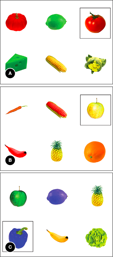
Notes (A) context with a highly typical target (red tomato; typicality score 97), (B) context with not typical nor atypical target (yellow apple; typicality score 58), (C) context with with an atypical target (blue pepper; typicality score 2).
To ensure that the degree of color typicality of the target object was not confounded with physical salience, we assessed salience by using a computational perceptual salience estimation algorithm (Erdem & Erdem, 2013). We did this because any effect of color atypicality on whether speakers mention color in a referring expression should not be attributable to the object’s color being more bright, contrasting, or otherwise physically salient to the speaker. Crucially, the algorithm that we used does not incorporate any general knowledge about objects and their typical colors, as it only measures salience based on physical (image-level) features.
We ran Erdem and Erdem’s (2013) algorithm on our forty-two experimental visual contexts, using its standard settings and parameters. The algorithm outputs physical salience scores for each pixel of an image, which expresses the relative salience of that pixel with respect to other pixels in the image. In our visual contexts, six areas of interest (AOIs) were defined, one for the target object and five for the distractor objects. Of each AOI, the mean relative salience of the pixels was calculated, which expresses how salient the object in that AOI is compared to the other AOIs (i.e., objects) in the context.
Analyses of the mean relative salience as determined by the algorithm showed that there was no significant correlation between the degree of physical salience of the target object in each scene and its color typicality, Pearson r(40) = 0.05, p = .721. The atypically colored objects in our experiment were physically not more salient than the typically colored ones (and vice versa). Furthermore, a one-way analysis of variance with color as the independent and salience as the dependent variable showed no differences in salience for each of the five target colors, F(4, 41) = 1.05, p = .397.
In addition to the experimental contexts, we created forty-two filler contexts. These consisted of four hard-to-describe greebles (Gauthier & Tarr, 1997), all purple, so that participants were not primed with using color in the other trials. One greeble was marked as the target object that had to be distinguished from the distractors.
Participants sat at a table facing the experimenter, with a laptop in front of them. The participants were presented with the forty-two trials, one by one, on the laptop’s screen. Between each experimental trial, there was a filler trial. Participants described the target objects in such a way that the experimenter would be able to uniquely identify them in a paper booklet. The instructions emphasized that it would not make sense to include location information in the descriptions, as the addressee would see the objects in a different configuration. Participants could take as much time as needed to describe the target, and their descriptions were recorded with a microphone. The addressee (experimenter) never asked the participants for clarification, so the data presented here are one-shot references.
The procedure commenced with two practice trials: one with six non-color-diagnostic objects in different colors, and one practice trial with greebles. Once the target was identified, this was communicated to the participant, and the experimented pressed a button to advance to the next trial. The trials were presented in a fixed random order (with one filler after each experimental trial). This order was reversed for half of the participants, to counterbalance any potential order effects. After completion of the experiment, none of the participants indicated that they had been aware of the goal of the study. The experiment had an average running time of about twenty-five minutes.
For each of the experimental trials, we determined whether the speakers’ description of the target object resulted in unambiguous reference, which mainly implied annotating whether respondents used the correct type attribute. Because the target object was always of a unique type in each context, mentioning type was sufficient. We also assessed whether the object’s type was named correctly. Using the correct type was important, because otherwise we could not deduce whether the object’s color was regarded as typical or atypical. We annotated each description as either containing a color adjective, or not.
Whether mentioning color was related to the degree of color atypicality of the target object was analyzed using logit mixed models (Jaeger, 2008). Initial analyses revealed that stimulus order had no effects, so this was left out in the following analyses. In our model, color typicality (as scores on the pretest) was included as a fixed factor, standardized to reduce collinearity and to increase comparability with Experiment 2. Participants and target object types were included as random factors. The model had a maximal random effect structure: Random intercepts and random slopes were included for all within-participant and within-item factors, to ensure optimal generalizability (Barr, Levy, Scheepers, & Tily, 2013). Specifically, the model contained random intercepts for participants and target objects, and a random slope for color typicality at the participant level.
The data of three participants was not analyzed because of technical issues with the audio recordings. Of the remaining 1680 descriptions, 1629 descriptions (97 %) were intelligible, unambiguous and contained a correct type attribute, resulting in unique reference. As expected, practically all analyzed descriptions were of the form “the tomato” or “the yellow tomato”.
Figure 3.3 plots the atypicality score of a target object in the pretest against the proportion of descriptions that contained color in the production experiment (exact proportions and typicality scores are listed in the appendix). The mixed model revealed a significant effect of color typicality on whether a target description contained a color attribute or not (β = −2.36, SE = 0.25, p < .001). The direction of the effect indicated that lower typicality in the pretest was associated with more referring expressions containing color. An additional analysis by means of bivariate correlation between the typicality score of each object and the proportion of speakers mentioning color for this object reconfirmed that these were significantly related (Pearson r(40) = −.86, p < .001).
Figure 3.3 Typicality scores of objects (horizontal axis) and the proportion of descriptions of these objects that contain color (vertical axis) in Experiment 1.
Notes The dots’ colors are the object’s colors. Some illustrative objects are labeled in this plot. The dotted line represents the correlation between the two variables.
The results of our experiment warrant the conclusion that content determination is affected by the degree of typicality of a target object’s color. When a color is more atypical for an object, the proportion of referring expressions that include that property increases. This effect is very strong, as exemplified by the high correlation between the two variables. Figure 3.3 also suggests that it is highly consistent across speakers: For a considerable number of typically colored stimuli, the percentage of speakers not using color approaches zero, and conversely, for some atypically colored stimuli this percentage approaches one hundred percent. This supports the theory that speakers evaluate contrasts with stored knowledge about typical features of objects in long term memory when producing a referring expression.
In Experiment 1, we have manipulated the degree of atypicality of the target objects by using different colors for objects, such that the object-color combinations span a range of atypicality scores. For example, speakers have described blue tomatoes (very atypical), green tomatoes (not atypical nor typical), and red tomatoes (very typical). However, target objects in Experiment 1 were predominantly simply shaped fruits and vegetables, i.e., objects for which color is especially instrumental in their identification (as their shape is not very informative about the identity of the objects; Bramão et al., 2011a; Tanaka & Presnell, 1999). As explained in the theoretical background, the diagnostic value of an object’s color in recognition is lower when its shape is more diagnostic (Bramão et al., 2011a). Accordingly, would color atypicality be less conspicuous when shape is more diagnostic, resulting in a moderation of the color atypicality effect on reference production? Therefore, the goal of Experiment 2 is to investigate the effect of color typicality on reference production, as a function of objects’ shape diagnosticity.
Table of contents
Experiment 2
Referring to typically and atypically colored objects with high or low shape diagnosticity
In Experiment 2, we cross color typicality with shape diagnosticity in a language production task similar to the one used in Experiment 1. As such, we aim to extend our findings from the first experiment to low-color-diagnostic objects (with more diagnostic shapes). We expect to find a similar relationship between color typicality and content determination as in Experiment 1, but because for low-color-diagnostic objects color is less instrumental in their identification we predict that higher shape diagnosticity overall decreases the proportion of referring expressions that include color. Secondly, we predict that shape diagnosticity and color typicality interact, such that effects of color typicality are larger when shapes are less diagnostic compared to when shapes are more diagnostic.
Sixty-two undergraduates participated for course credit. They participated in dyads, with one participant acting as the speaker and the other as addressee. So, there were thirty-one speakers (twenty-four women and seven men, with a median age of 22 years, ranging from 18 to 25), all were native speakers of Dutch (the language of the study). None of the participants took part in any of the other experiments and pretests in this chapter. They gave consent to have their voice recorded during the experiment. Their participation was approved by the ethical committee of our department.
High quality white-background photos of sixteen target objects were selected and edited, similar to Experiment 1, and supplemented by stimuli used in object recognition studies. The typical color of these objects was either red, green, yellow, or orange. Even though the saliency algorithm we employed showed no differences in physical salience between the five target colors used in Experiment 1, we decided for Experiment 2 to not use blue objects (which were all atypical in Experiment 1), and to equally balance color frequencies throughout the experiment. As such, the proportions of target objects in each color was kept identical in all conditions.
Half of the objects were low in shape diagnosticity: They had relatively simple shapes, as they were mostly round with very few protruding parts, like in Experiment 1. The other objects were high in shape diagnosticity, having relatively complex shapes, comprising many protruding parts and no basic round shape (i.e., comprised of many geons). Such objects (e.g., lobster; see the appendix for a complete list of objects used) thus have a more characteristic (diagnostic) shape, which sets it apart from other object categories.
As in Experiment 1, the target objects were placed in visual contexts of six objects. Again, the colors of these objects were chosen such that there were three different colors in each context, with each color appearing on two objects. Three of the objects were typically colored, the other three atypically colored. One of the objects in each context was the target object, singled out by a black square outline for the speaker. The other five objects were the distractors. The target object was always of a unique type, so that mentioning the target object’s color was never necessary to disambiguate the target from any of the distractors.
Eight contexts contained objects that were low in shape diagnosticity, and the other eight contexts contained objects high in shape diagnosticity. Also, in half of the contexts the target object was typically colored, and in the other half it was atypically colored. Figure 3.4 presents examples of the contexts in each of the four resulting conditions: The contexts on the left contain a typically colored target object; in the contexts on the right the target has an atypical color. The upper contexts comprise of low shape diagnostic objects; the lower contexts has high shape diagnosticity.
Figure 3.4 Examples of visual contexts in each of the conditions in Experiment 2, in two color typicality conditions (horizontal axis) and in two shape diagnosticity conditions (vertical axis).
The target objects were subjected to an on-line judgment task similar to the pretest in Experiment 1. Sixteen participants took part in this task (ten women and six men, with a median age of 21 years, ranging from 18 to 26; none participated in any of the other experiments and pretests in this chapter). As expected, typically colored objects yielded a higher typicality score (range 87.50 to 99.75) than atypically colored objects range 0.83 to 10.50). There were no differences in typicality scores for object with a high and a low shape diagnosticity (F < 1), and the two factors did not interact (F < 1). The pretest also showed that none of the objects were difficult to name.
As in Experiment 1, we used the computational physical salience estimation of Erdem and Erdem (2013) to ensure that color typicality was not confounded with differences in relative physical salience between typical and atypical objects, and between objects with high and low shape diagnosticity. Analyses of variance of the mean relative salience of the target objects showed no differences between typically colored and atypically colored target objects (F < 1), nor between objects with high and low shape diagnosticity (F < 1). The two factors did not interact (F < 1). This shows that possible (interaction) effects involving shape diagnosticity cannot be ascribed to colors being physically more salient when for example shapes are simple and colored areas may appear to be larger.
Participants took part in pairs. Who was going to act as the speaker and who as the addressee was decided by rolling a dice. In contrast to Experiment 1, addressees were naive participants instead of a confederate, in order to improve ecological validity (cf. Kuhlen & Brennan, 2013). Participants were seated opposite each other at a table, and each had their own computer screen. The screens were positioned in such a way that the face of either participant was not obstructed (ensuring that eye contact was possible), while participants could not see each other’s screen.
Each speaker described the target object of the sixteen visual contexts, as well as thirty-two filler contexts containing purple greebles. We made two lists containing the same critical trials, but with reversed typicality: Target objects that were typically colored for one speaker were atypically colored for another. As such, color typicality and shape diagnosticity were manipulated within participants, while ensuring that each target object appeared in only one typicality condition for each participant. We did this because one could speculate that the overall proportion of color adjectives in Experiment 1 might inflate because participants used them to express contrasts between objects of the same type over trials. The order of the contexts in each list was randomized for each participant, but there were always two filler trials between experimental ones (i.e., one more than in Experiment 1, to further assure that that the colorful nature of our stimuli does not boost the overall probability that color was mentioned; see Koolen, Goudbeek, & Krahmer, 2013).
The addressee was presented with the same contexts as the speaker, but without any marking of the target object. Also, the objects on the addressee’s screen were in a different spatial configuration than on the speaker’s screen, in line with the instruction that it would not make sense for the speaker to mention location information. In each trial, the addressee marked the picture that he or she thought the speaker was describing on an answering sheet. Although the addressee was instructed that clarifications could be asked, there were no such requests during the whole experiment, so the data presented here are one-shot references.
The procedure commenced with two practice trials with greebles, plus one practice trial with non-color-diagnostic objects (as in Experiment 1). Once the addressee had identified a target, this was communicated to the speaker, and a button was pressed to advance to the next trial. The experiment finished when all trials were described and the addressee identified the last target object. The experiment had an average running time of about fifteen minutes.
Data annotation was identical to Experiment 1. We analyzed whether using a color adjective or not was related to the degree of color atypicality of the target object using logit mixed models (Jaeger, 2008). Initial analyses revealed that stimulus list and stimulus order (trial number) had no effects, so these factors were left out in the following analyses. In our model, color atypicality and shape diagnosticity were included as fixed binomial factors, standardized to reduce collinearity and to increase comparability with Experiment 1. Participants and target object types were included as random factors. The model had a maximal random effect structure: Random intercepts and random slopes were included for all within-participant and within-item factors, to ensure optimal generalizability (Barr et al., 2013). Specifically, the model contained random intercepts for participants and target objects, random slopes for color atypicality and shape diagnosticity at the participant level, and a random slope for color atypicality at the target object level.
In total, 496 target descriptions were recorded in the experiment. 472 descriptions (95 %) were intelligible, unambiguous and contained a correct type attribute, resulting in unique reference. Practically all analyzed descriptions were of the same form as those in Experiment 1.
Our model revealed a significant effect of color atypicality on whether a target description contained a color attribute or not, β = 3.53, SE = 0.39, p < .001. Of the references to atypically colored target objects, 75.3 % contained color, compared to 14.3 % for typically colored target objects. Also, the model showed a significant main effect of shape diagnosticity, β = −0.89, SE = 0.35, p = .010. References to objects with a high diagnostic (i.e., complex) shape contained color in 38.4 % of the cases, compared to 49.1 % for low diagnostic (i.e., simple) shape target objects. Color typicality and shape diagnosticity interacted, such that the effect of typicality on using color in a referring expression was larger for low shape diagnostic objects than for the high shape diagnostic objects, β = −0.70, SE = 0.32, p = .030. Figure 3.5 plots the proportion of referring expressions containing color for each of the four conditions in the experiment.
Figure 3.5 The proportion of referring expressions containing color for each of the four conditions in Experiment 2.
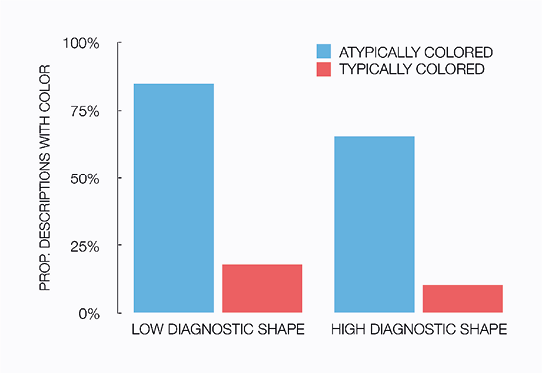
With respect to the effect of color typicality on content determination, inspection of the data revealed that not a single speaker acted against the general pattern and mentioned color more often for typically colored objects than for atypically colored ones. However, a mere three speakers mentioned color in all atypical trials, and never mentioned color in the typical trials. While most speakers showed more variation in their response to color atypicality, only these three speakers show what is often called deterministic behavior in the literature (e.g., Van Deemter, Gatt, Van Gompel, & Krahmer, 2012b).
Experiment 2 shows that the effect of color typicality on content determination is moderated by the diagnosticity of an object’s shape. Color is more often mentioned for objects with low shape diagnosticity. It is for these objects that the color atypicality effect is slightly larger compared to objects with higher shape diagnosticity. This further supports the idea that object recognition and the status of features of objects in long-term memory is closely related to reference production.
Table of contents
General discussion
We investigated the role of speakers’ stored knowledge about objects when producing referring expression. The experiments reported in this chapter show a strong effect of color atypicality on the object properties mentioned by speakers. Speakers mention the color of atypically colored objects significantly more often than when objects are typically colored, and this effect is moderated by the degree of atypicality of the color, and the diagnosticity of the object’s shape. These results support the view that stored knowledge about referred-to objects influences content determination. When a property of an encountered object contrasts with this knowledge, the probability that this property is included in a referring expression increases significantly. This also suggests that because object recognition is an integral part of reference production, there may be a close relation between findings in object recognition related to color diagnosticity and typicality on the one hand, and effects on reference production on the other.
Combined with the findings of Mitchell et al. (2013a), who report similar effects of atypical materials and atypical shapes on content determination, the current chapter forms converging evidence for sizable effects of atypicality on the production of referring expressions. Furthermore, our results corroborate Sedivy’s (2003) finding that object knowledge affects content determination, and that speakers’ decisions to encode color in a referring expression are not taken independently of the object’s type. Our research also resonates with Viethen et al.’s (2012) findings on how the specific color of an object can affect a speaker’s decision to include this color in a referring expression. While Viethen et al. focus on colors that are relatively easy to name or not (e.g., blue versus light blue), we report effects of specific colors combined with specific object types.
We attribute the effects of color atypicality on content determination reported in this chapter to the speakers’ visual attention allocation, and cognitive salience in particular: Because atypical colors attract visual attention (e.g., Becker et al, 2007), speakers tend to encode these colors in a referring expression (e.g., Krahmer & Van Deemter, 2012). In the visual contexts that we used, mentioning the type of the object was always sufficient to fully disambiguate the target object from all the distractors. The speakers’ decision to include color is in that sense redundant (i.e., the referring expressions containing color are overspecified; cf. Koolen et al., 2011; Pechmann, 1989). Instead of carefully assessing the objects and their properties in the visual context, and calculating their informativeness, speakers in our experiments appeared to use other rules or mechanisms to determine the content of a referring expression.
The idea that speakers may rely on different content determination processes than calculations of informativeness has been postulated in a number of recent papers (e.g., Dale & Viethen, 2009; Van Deemter et al., 2012b; Koolen et al., 2013; Viethen et al., 2012; Viethen, Dale, & Guhe, 2014). Instead of a careful consideration of the properties and salience of all (or a subset of) the objects in a visual context, speakers may turn to quicker, simple decision rules to make judgments in the content determination process. Such a decision rule that would fit our data would be: “If the contrast between the color of the target object and stored knowledge is strong, increase the probability that it is mentioned”.
Speakers’ reliance on relatively simple decision rules is argued to be related to the visual complexity of the contexts that they are confronted with. Some researchers hypothesize that speakers may especially rely on the “fast and frugal heuristics” in cases where considering all properties of all objects in a context is cognitively costly (e.g., Van Deemter et al., 2012b, p. 179). However, the contexts in our experiments are undoubtedly very simple: Speakers only have to consider the type of six objects that are presented in an uncluttered and simple environment, which is a task that is arguably well within the speakers information processing capacity (e.g., Miller, 1956). Yet speakers seem to apply (a variation of) the aforementioned decision rule in contexts with an atypically colored target. Such contexts are not more complex or visually cluttered than the typical ones. So, the decision rule that we propose above would not be one that merely applies when the (limited) processing capacity of speakers is exceeded, but one that is universally available whenever the content of a referring expression is determined.
Being able to refer to objects in a human-like manner is an important goal for NLG models of reference production (REG algorithms), and for the field of NLG (a subfield of Artificial Intelligence) in general (Dale & Viethen, 2009; Frank & Goodman, 2012; Van Deemter et al., 2012b). Our findings pose a new challenge for current REG algorithms. In the light of our findings, models can be enhanced by incorporating general object knowledge, because without access to such information they are unable to distinguish between typical and atypical objects when determining the content of a referring expression. Moreover, in our data, the decision to include color in a referring expression appears not to be taken independently of the target object’s type. For example, speakers decide to mention redness when they describe a lemon, but not when they describe a tomato. This is something that a model should be able to take into consideration.
Popular NLG models predict color use irrespective of the typicality and diagnosticity of the target’s color. In the Incremental Algorithm (IA; Dale & Reiter, 1995), attributes like color, size, and orientation are included in a referring expression on the basis of how informative they are, and they are considered one by one (i.e., incrementally). More salient attributes, like color, are considered early, because they are highly ranked in a predefined preference order (which is typically determined on the basis of empirical data). Type is likely to be included anyway, because it is necessary to create a proper noun phrase, and this would yield fully distinguishing referring expressions in all conditions in our experiments. The IA would therefore generate no color adjectives. If the IA was to be able to make the decision to mention the color of a yellow tomato, for example, and not for a red tomato, it would need a ranking (preference order) of certain colors for tomatoes (e.g., red, green, orange, yellow, blue), instead of a mere ranking of certain attributes (e.g., color, size, orientation).
The model of pragmatic reasoning by Frank and Goodman (2012) allows salience of objects to be modeled for each visual context individually (instead of in a predefined preference order). So, in effect, the salience of atypically colored objects can be modeled to be different from the salience of typically colored ones. However, Frank and Goodman (2012) calculate this (prior) salience on the basis of empirical findings, so behavioral data is needed before reference production is modeled. And while it is well possible to estimate visual salience computationally and automatically (e.g., Erdem & Erdem, 2013), such salience estimations are not (yet) able to take general knowledge into account and thus respond differently to various degrees of atypicality.
The challenge is to feed such salience estimations with knowledge about what prototypical colors of objects are, and how important color is in the identity of these objects. Assuming that object types are readily recognized computationally in a visual context (which works quite well in controlled environments nowadays, Andreopoulos & Tsotsos, 2013), a knowledge base containing prototypical object information can be queried at runtime when a referring expression is generated. This is what Mitchell et al., (2013a) and Mitchell (2013) propose in their discussion of repercussions of atypicality for REG. However, for color, a simpler system without a dedicated knowledge base may be effective too. A web search for images (e.g., on Google Images) may inform an algorithm about color typicality: When the dominant color of the first n image results of a web search is computationally determined, the prototypical color of an object should be derivable. In fact, we expect that this method can even generate the degree of atypicality of a color, much alike the typicality scores that we obtained in a pretest for Experiment 1. A comparison between the n search results showing one color and the n results showing other colors probably yields a good estimation of the degree of atypicality of that particular color.
Our results are also interesting in the light of an observed tendency towards using more naturalistic stimuli in behavioral experiments that are aimed at evaluating computational models of reference production (e.g., Clarke, Elsner, & Rohde, 2013; Coco & Keller, 2012; Koolen, Houben, Huntjens, & Krahmer, 2014; Mitchell, 2013; Mitchell et al., 2013a, 2013b; Viethen et al., 2012). Color typicality may be an important difference between artificial and more naturalistic stimuli, as studies that employ artificial contexts often present speakers with atypically colored objects (e.g., green television sets and blue penguins; Koolen et al., 2013; Viethen et al., 2014). Our results seem to argue against using artificial contexts in reference production studies by showing that content determination can be steadily affected by atypical colors.
In our experiments, speakers produced referring expressions for an addressee who was present in the communicative setting. Although speakers in our experiments presumably mention the color of atypically colored target objects because atypical colors are cognitively salient to the speakers themselves, this does not necessarily assert that mentioning atypical colors more often than typical ones is exclusively speaker-internal behavior (e.g., Arnold, 2008; Wardlow Lane, Groisman, & Ferreira, 2006; Keysar, Barr, & Horton, 1998). Speakers’ decisions to include color may as well be addressee-oriented and reflect what is called audience design in the literature (e.g., Arnold, 2008; Clark, 1996; Fukumura & Van Gompel, 2012; Horton & Keysar, 1996). As suggested in the general introduction, if speakers take the addressee’s perspective into account and use their own perception as a proxy for the addressees’ (e.g., Gann & Barr, 2014; Pickering & Garrod, 2004), they may decide to mention the color of an atypically colored object because this is salient to the addressees as well.
Although the face-to-face tasks in our experiments do not offer conclusive evidence in this discussion, there are reasons to believe that overspecified atypical color attributes are beneficial for addressees. For example, a visual world study by Huettig and Altmann (2011; Experiment 3) suggests that listeners tend to look for objects in typical colors when this color is not specified for them. When listeners hear a word that refers to an object with a prototypical color (even though this color is not mentioned), their visual attention shifts towards objects that have this particular color. So, listeners likely benefit from color being included in a referring expression when this color is not in line with their expectations about the object they search for. Similar suggestions come from work in visual search, which gives reasons to assume that listeners who are informed about specific details of the target, such as its color, find the target more efficiently in real-world scenes (e.g., Malcolm & Henderson, 2009, 2010).
The addressed literature is less clear on how the interaction with shape diagnosticity that we report in Experiment 2 might translate to effects for addressees. As shape diagnosticity moderates effects of color atypicality on reference production, one could speculate that a similar moderation applies to the addressees’ task of identifying the intended target object. The object recognition literature suggests that color is relatively less instrumental in recognition for complex-shaped objects (e.g., Bramão et al., 2011a; Tanaka & Presnell, 1999), so for these objects listeners can rely more on shape-based cues in their visual search for the intended target object. Conversely, for simple-shaped objects color is a relatively more useful cue for finding these objects in a visual context (i.e., color is particularly instrumental to find the target in visual search). For example, when addressees search for a tomato, redness is a more relevant cue compared to when they search for a lobster. From this it follows (speculatively) that being informed about the color of the target object being atypical is more beneficial for listeners when they search for simply-shaped objects, compared to when they search for objects for which shape is more instrumental for identifying the target. More research is needed to explore the effects of mentioning color on visual search, and interactions with color typicality and shape diagnosticity.
Table of contents
References
Andreopoulos, A. & Tsotsos, J. K. (2013). 50 Years of object recognition: Directions forward. Computer Vision and Image Understanding, 117(8), 827—891.
Arnold, J. E. (2008). Reference production: Production-internal and addressee-oriented processes. Language and Cognitive Processes, 23(4), 495—527.
Barr, D. J., Levy, R., Scheepers, C., & Tily, H. J. (2013). Random effects structure for confirmatory hypothesis testing: Keep it maximal. Journal of Memory and Language, 68(3), 255—278.
Becker, M. W., Pashler, H., & Lubin, J. (2007). Object-intrinsic oddities draw early saccades. Journal of Experimental Psychology: Human Perception and Performance, 33(1), 20—30.
Biederman, I. (1987). Recognition-by-components: A theory of human image understanding. Psychological Review, 94(2), 115—147.
Bramão, I., Reis, A., Petersson, K. M., & Faísca, L. (2011a). The role of color information on object recognition: A review and meta-analysis. Acta Psychologica, 138(1), 244—253.
Bramão, I., Inácio, F., Faísca, L., Reis, A., & Petersson, K. M. (2011b). The influence of color information on the recognition of color diagnostic and noncolor diagnostic objects. The Journal of General Psychology, 138(1), 49—65.
Brennan, S. E. & Clark, H. H. (1996). Conceptual pacts and lexical choice in conversation. Journal of Experimental Psychology: Learning, Memory, and Cognition, 22(6), 1482—1493.
Clark, H. H. (1996). Using language. Cambridge: Cambridge University Press.
Clarke, A. D., Elsner, M., & Rohde, H. (2013). Where’s Wally: The influence of visual salience on referring expression generation. Frontiers in Psychology, 4: 329.
Coco, M. I. & Keller, F. (2012). Scan patterns predict sentence production in the cross-modal processing of visual scenes. Cognitive Science, 36(7), 1204—1223.
Conklin, E. J. & McDonald, D. D. (1982). Salience: The key to the selection problem in natural language generation. In Proceedings of the 20th annual meeting on Association for Computational Linguistics (pp. 129—135), Stroudsburg, PA.
Dale, R. & Reiter, E. (1995). Computational interpretations of the Gricean maxims in the generation of referring expressions. Cognitive Science, 19(2), 233—263.
Dale, R. & Viethen, J. (2009). Referring expression generation through attribute-based heuristics. In Proceedings of the 12th European Workshop on Natural Language Generation (pp. 58—65), Athens, Greece.
Engelhardt, P. E., Barış Demiral, Ş., & Ferreira, F. (2011). Over-specified referring expressions impair comprehension: An ERP study. Brain and Cognition, 77(2), 304—314.
Erdem, E. & Erdem, A. (2013). Visual saliency estimation by nonlinearly integrating features using region covariances. Journal of Vision, 13(4).
Frank, M. C. & Goodman, N. D. (2012). Predicting pragmatic reasoning in language games. Science, 336(6084), 998—998.
Fukumura, K. & Van Gompel, R. P. G. (2012). Producing pronouns and definite noun phrases: Do speakers use the addressee’s discourse model? Cognitive Science, 36(7), 1289—1311.
Fukumura, K., Van Gompel, R. P. G., & Pickering, M. J. (2010). The use of visual context during the production of referring expressions. Quarterly Journal of Experimental Psychology, 63(9), 1700—1715.
Gann, T. M. & Barr, D. J. (2014). Speaking from experience: Audience design as expert performance. Language, Cognition and Neuroscience, 29(6), 744—760.
Gauthier, I. & Tarr, M. J. (1997). Becoming a “greeble” expert: Exploring mechanisms for face recognition. Vision Research, 37(12), 1673—1682.
Horton, W. S. & Gerrig, R. J. (2005). Conversational common ground and memory processes in language production. Discourse Processes, 40(1), 1—35.
Horton, W. S. & Keysar, B. (1996). When do speakers take into account common ground? Cognition, 59(1), 91—117.
Huettig, F. & Altmann, G. T. (2011). Looking at anything that is green when hearing “frog”: How object surface colour and stored object colour knowledge influence language-mediated overt attention. The Quarterly Journal of Experimental Psychology, 64(1), 122—145.
Humphreys, G. W., Riddoch, M. J., & Quinlan, P. T. (1988). Cascade processes in picture identification. Cognitive Neuropsychology, 5(1), 67—104.
Jaeger, T. F. (2008). Categorical data analysis: Away from ANOVAs (transformation or not) and towards logit mixed models. Journal of Memory and Language, 59(4), 434—446.
Keysar, B., Barr, D. J., & Horton, W. S. (1998). The egocentric basis of language use: Insights from a processing approach. Current Directions in Psychological Science, 7(2), 46—50.
Koolen, R., Gatt, A., Goudbeek, M., & Krahmer, E. (2011). Factors causing overspecification in definite descriptions. Journal of Pragmatics, 43(13), 3231—3250.
Koolen, R., Goudbeek, M., & Krahmer, E. (2013). The effect of scene variation on the redundant use of color in definite reference. Cognitive Science, 37(2), 395—411.
Koolen, R., Houben, E., Huntjens, J., & Krahmer, E. (2014). How perceived distractor distance influences reference production: Effects of perceptual grouping in 2D and 3D scenes. In Proceedings of the 36th annual meeting of the Cognitive Science Society (CogSci), Quebec City, Canada.
Krahmer, E. & Van Deemter, K. (2012). Computational generation of referring expressions: A survey. Computational Linguistics, 38(1), 173—218.
Kuhlen, A. K. & Brennan, S. E. (2013). Language in dialogue: When confederates might be hazardous to your data. Psychonomic Bulletin & Review, 20(1), 54—72.
Landragin, F. (2004). Saillance physique et saillance cognitive. Cognition, Représentation, Langage 2(2).
Malcolm, G. L. & Henderson, J. M. (2009). The effects of target template specificity on visual search in real-world scenes: Evidence from eye movements. Journal of Vision, 9(11), 8.
Malcolm, G. L. & Henderson, J. M. (2010). Combining top-down processes to guide eye movements during real-world scene search. Journal of Vision, 10(2), 4.
Mapelli, D. & Behrmann, M. (1997). The role of color in object recognition: Evidence from visual agnosia. Neurocase, 3(4), 237—247.
McRae, K., Cree, G., Seidenberg, M., & McNorgan, C. (2005). Semantic feature production norms for a large set of living and nonliving things. Behavior Research Methods, 37(4), 547—559.
Miller, G. A. (1956). The magical number seven, plus or minus two: Some limits on our capacity for processing information. Psychological Review, 63(2), 81—97.
Mitchell, M. (2013). Generating reference to visible objects. Ph.D. dissertation, University of Aberdeen.
Mitchell, M., Reiter, E., & Van Deemter, K. (2013a). Typicality and object reference. In Proceedings of the 35th annual meeting of the Cognitive Science Society (CogSci), Berlin, Germany.
Mitchell, M., Reiter, E., & Van Deemter, K. (2013b). Attributes in visual object reference. In Proceedings of Bridging the gap between cognitive and computational approaches to reference (PRE-CogSci), Berlin, Germany.
Naor-Raz, G., Tarr, M. J., & Kersten, D. (2003). Is color an intrinsic property of object representation? Perception, 32(6), 667—680.
Pechmann, T. (1989). Incremental speech production and referential overspecification. Linguistics, 27(1), 89—110.
Pickering, M. J. & Garrod, S. (2004). Toward a mechanistic psychology of dialogue. Behavioral and Brain Sciences, 27(2), 169—190.
Price, C. J. & Humphreys, G. W. (1989). The effects of surface detail on object categorization and naming. The Quarterly Journal of Experimental Psychology A: Human Experimental Psychology, 41(4A), 797—827.
Rosch, E. (1975). Cognitive representations of semantic categories. Journal of Experimental Psychology: General, 104(3), 192—233.
Rosch, E. & Mervis, C. B. (1975). Family resemblances: Studies in the internal structure of categories. Cognitive Psychology, 7(4), 573—605.
Sedivy, J. C. (2003). Pragmatic versus form-based accounts of referential contrast: Evidence for effects of informativity expectations. Journal of Psycholinguistic Research, 32(1), 3—23.
Tanaka, J., Weiskopf, D., & Williams, P. (2001). The role of color in high-level vision. Trends in Cognitive Sciences, 5(5), 211—215.
Tanaka, J. & Presnell, L. (1999). Color diagnosticity in object recognition. Perception and Psychophysics, 2(6), 1140—1153.
Therriault, D., Yaxley, R., & Zwaan, R. (2009). The role of color diagnosticity in object recognition and representation. Cognitive Processing, 10(4), 335—342.
Van Deemter, K., Gatt, A., Van Gompel, R. P. G., & Krahmer, E. (2012b). Toward a computational psycholinguistics of reference production. Topics in Cognitive Science, 4(2), 166—183.
Van Deemter, K., Gatt, A., Van der Sluis, I., & Power, R. (2012a). Generation of referring expressions: Assessing the Incremental Algorithm. Cognitive Science, 36(5), 799—836.
Viethen, J., Goudbeek, M., & Krahmer, E. (2012). The impact of colour difference and colour codability on reference production. In Proceedings of the 34th Annual Meeting of the Cognitive Science Society (CogSci), Sapporo, Japan.
Viethen, J., Dale, R., & Guhe, M. (2014). Referring in dialogue: Alignment or construction? Language, Cognition and Neuroscience, 29(8), 950—974.
Wardlow Lane, L., Groisman, M., & Ferreira, V. S. (2006). Don’t talk about pink elephants! Speakers’ control over leaking private information during language production. Psychological Science, 17(4), 273—277.
Table of contents
Chapter 4
Describing routes from schematic and realistic maps
This chapter is based on:
Westerbeek, H., & Maes, A. (2013). Route-external and Route-internal Landmarks in Route Descriptions: Effects of Route Length and Map Design. Applied Cognitive Psychology, 27(3), 297—305.
Earlier versions of this work have been presented in:
Westerbeek, H. & Maes, A. (2013). Twee soorten verwijzingen in routebeschrijvingen: Effecten van kaarttype op het gebruik van route-interne en route-externe landmarks. In R. Boogaart & H. Janssen (Eds.), Studies in Taalbeheersing 4 (pp. 351—361). Assen, The Netherlands: Van Gorcum.
Westerbeek, H. & Maes, A. (2011). Referential scope and visual clutter in navigation tasks. In Proceedings of Bridging the gap between computational, empirical, & theoretical approaches to reference (PRE-CogSci), Boston, MA.
Abstract Landmarks are basic ingredients in route descriptions. They often mark choice points: locations where travellers choose from different options how to continue the route. This study focuses on one of the loose ends in the taxonomy of landmarks. In a memory-based production experiment in which respondents described routes they had seen on a map, we studied the distribution of two types of landmarks at choice points: route-external and route-internal descriptions (take left “at the barber shop” or “at the second intersection”). We systematically varied route length and the degree of visual clutter in the map. Cluttered maps resulted in a relatively higher proportion of external landmarks, which we explain in terms of their relatively higher degree of referential robustness. Internal landmarks were preferred as routes were longer and thus required more memory load, suggesting that they are more basic or ‘skeletal’ in route descriptions.
Introduction
Imagine you are walking as a tourist in Manhattan, and a stranger stops you to ask for directions to Grand Central Station. You do not know your way in Manhattan, but you can use navigation software on your smartphone. It provides a map of the environment and the route from your current location to Grand Central. As a result, you can provide the stranger with a route description like this: “Turn right at the library, walk up to the second intersection, turn left and you will see the station”.
Note how this description conveys two different ways to locate relevant points in the route: One has to turn right at the library, and walk up to the second street. In this chapter, we explore this dichotomy in landmarks. Landmarks are references that people make to entities in the environment, in order to locate changes of direction in a route description. But under which circumstances do people refer to buildings like the library, and when do people use expressions such as “the second intersection”?
Notable in the example is the help of a route map. A route map is a map with a route depicted on it, as we know from Google Maps for example. It offers an environment (a map), plus a path to travel (a route) (MacEachren, 2004). It can be translated into a route description: a series of verbal instructions to get from one point to another. Route descriptions typically take an egocentric frame of reference, using the perspective of a traveller who is ‘on the road’. This contrasts with survey descriptions, which take a bird’s eye perspective and an extrinsic frame of reference (Brunye & Taylor, 2008; Taylor & Tversky, 1992). The backbone of route descriptions consists of procedural propositional instructions, which provide information on actions to be taken by travellers, in particular actions on points were there are different options to continue (e.g., “turn left”). In the navigation literature, these points are interchangeably called ‘reference points’ (Sadalla, Burroughs, & Staplin, 1980), anchor points (Couclelis, Collegde, Gale, & Tobler, 1987), points where orientation problems have to be solved (Denis, Pazzaglia, Cornoldi, & Bertolo, 1999), terminal joints (Daniel & Denis, 1998), or choice points (Allen, 2000). We will use the latter henceforth in this study. Apart from actions at choice points, route descriptions include more elements which are less crucial for navigation (Allen, 2000; Daniel & Denis, 1998; Denis et al., 1999), but which may be useful for other goals, for example related to what one has to do in between two choice points (“walk up the street”) or what the environment is like (“it is a long and bumpy road”).
Choice points are often identified using landmarks: environmental features that function as a point of reference. “[L]andmarks serve as sub-goals that keep the traveller connected to both the point of origin and the destination along a specified path of movement” (Allen, 2000, p. 334). Landmarks can refer to paths (e.g., streets) and points (e.g., intersections or buildings). They can take the syntactic form of a (prepositional) noun phrase (“(at) the second intersection”) or a (presentational) sentence (“there is a library”). Buildings and other discrete objects along the routes are typical landmarks, but any other feature in the environment can be used as well, like road intersections (Klippel & Winter, 2005), side streets, squares (Denis et al., 1999) and street names (Tom & Denis, 2004; Tom & Tversky, 2012).
Obviously, landmarks are not exclusively connected with choice points, but there is a clear preference for using landmarks at these crucial points. According to Denis et al. (1999) the primary functional role of landmarks is to signal places where actions are to be carried out. Allen (2000) states that “including a number of direct definite references in describing choice points is one way to achieve referential determinacy” (p. 335). This preference is confirmed in behavioral experiments as well. For example, Daniel and Denis (2004) asked respondents to describe well known routes as concisely as possible, and concluded that landmarks at choice points underwent less reduction than landmarks placed elsewhere along the route.
Distinguishing clear cut functional classes of landmarks is difficult. However, one taxonomic dichotomy is clear: There are two referential types of landmarks. They can come either as (indefinite, definite or demonstrative) descriptive noun phrases (NPs), or as proper names. Descriptive NPs refer by offering descriptive properties of entities (e.g., “a prestigious avenue in the city centre”, “the white marble mausoleum”), while proper names refer ‘by acquaintance’ (e.g., “Champs Élysées”, “Taj Mahal”; Donnellan, 1970; Russell, 1911; Strawson, 1959). In previous research into landmarks in route descriptions, the referential type of landmarks is acknowledged but also confounded with other landmark characteristics. In a comprehension study, Tom and Denis (2004) presented respondents with route instructions including either street names or landmarks. Street names were proper names (e.g., Hospital Street), landmarks were indefinite descriptive nouns (e.g., a hospital). Congruent with frequency distributions they found in earlier work (Tom & Denis, 2003), they concluded that (descriptive) landmarks were better remembered than (proper) street names. Recently, Tom and Tversky (2012) gave a convincing explanation for this result: The difference in vividness between the descriptive nouns and the proper names used explained a difference in memory for the two types of landmarks. In a replication they showed that when streets and landmarks are equally vivid (“a very bumpy and stony dirt road”, “an office building with small companies”) they are remembered equally well.
Another explanation for the memory difference, however, may be related to the difference in referential type (which was left out in Tom and Tversky’s replication). As Strawson (1959) stated “it is no good using a name for a particular unless one knows who or what is referred to by the use of the name” (p. 20). This suggests that proper names are especially useful when landmarks are familiar, and thus, when they can immediately be connected to one unique referent, i.e., a single unique semantic node (Cohen & Burke, 1993; Izaute, 1999). Tom and Denis (2004) presented their respondents with fictitious proper names like “Hospital Street” and “Park Street”. Because these landmarks were invented and thus not familiar, respondents were not able to use the proper names in their genuine referential function to directly access a unique referent. But the indefinite nouns used by Tom and Denis (a nursery, a fish shop) offered them meaningful links to generic world knowledge. Such noun phrases are therefore probably more memorable. Earlier work studied the processing of proper names (e.g., Kalakoski & Saariluoma, 2001) and the role of familiarity (e.g., Lovelace, Hegarty, & Montello, 1999), but to our knowledge no study carefully controlled the interaction between referential type and familiarity of landmarks in the production of route descriptions thus far.
In this study, we will not pursue differences in referential type any further; we will avoid the confounds by focusing exclusively on descriptive NP landmarks used to mark choice points in unfamiliar routes. In particular, we will investigate the use of two types of descriptive landmarks: route-internal and route-external landmarks. We relate these to two well known conditions applicable in route description production tasks: the amount of detail or clutter in route maps and the length of the planned route.
We focus on two types of landmarks in route descriptions: route-internal and route-external landmarks. Route-internal landmarks make reference to parts of the path to travel itself (e.g., “take the second street on the left”). Route-external landmarks describe elements in the environment which are positioned along that path (e.g., “take left at the library”). This distinction is slightly different from the distinction between two-dimensional (e.g., streets and squares) and three-dimensional landmarks (churches, monuments) proposed in Denis et al. (1999, p. 153). Although route-internal landmarks are mostly two-dimensional, horizontally extended entities that one can walk on, and route-external ones are three-dimensional, there are exceptions. Three-dimensional landmarks can be route-internal (e.g., bridges), and two-dimensional landmarks can be external (e.g., ground level parking lots, but also for example notable side streets, that are not intrinsic part of the planned route). The proposed distinction also slightly differs from the distinction between path and point landmarks. Internal landmarks typically refer to continuous path entities (streets, lanes, roads, passages) which are schematized in maps as (intersecting) lines, whereas external landmarks typically refer to discrete point entities along the route (hotels, churches, distinctive houses, statues), depicted in maps as circles, points or blobs (Tversky, 2002). However, path and point landmarks do not completely coincide with route-internal and external landmarks: Traffic lights are notable route-internal point landmarks; and some route-external landmarks like forests and meadows are regions rather than discrete points. However, as we focus on landmarks at choice points, the difference between path and point entities is less relevant. Both path and point entities (e.g., the second street, the library) are used to locate a specific point in the route where the navigator has to take action.
External and internal landmarks can both be used to successfully identify choice points in route descriptions. In Denis et al.’s (1999) analysis, over sixty percent of the landmarks used were two-dimensional and mostly route-internal. This may be surprising, as many other studies associate landmarks primarily with external discrete three-dimensional entities (see for example the terms landmarks and streets in Tom & Denis, 2003, 2004; Tom & Tversky, 2012). One reason for the high proportion of internal landmarks in Denis et al.’s study may be that internal landmarks can be constructed at any choice point in a route, whereas (obvious) external landmarks may not be available at each of these points. But what happens when availability is not an issue, for example when for each choice point an internal and external landmark is available? Then we may expect user preferences to be based on referential differences between the two types.
Internal and external landmarks are referentially different in a number of respects. First, taken all together, internal landmarks are referred to using a limited number of nouns related to the semantic domain of routes and environments (“street”, “lane”, “crossing”, etc.). As most environments contain many streets and crossings, these nouns can be used to identify many referents, which creates potential ambiguity on the level of the descriptive content of the nouns. Conversely, the set of nouns for external landmarks is virtually unlimited, and covers a large range of semantic domains, enabling the activation of many unique and memorable anchor points (see for a useful comparison the difference between ‘where’ and ‘what’ referents in Landau & Jackendoff, 1993).
People often add numerical locative attributes (“the second/next street”), in order to avoid ambiguity and establish uniqueness. On the one hand, this underscores the basic function of landmarks as part of the path to travel itself (Denis et al., 1999), on the other hand, it also makes them dependent on the location and perspective of the traveller only, which may make them less reliable, for example in the case of disorientation.
These differences create an interesting referential choice in situations in which the two types of landmarks are equally available (and equally unfamiliar). Speakers can refer to choice points by directly tapping in the route itself and taking the route perspective by opting for internal landmarks, and/or they can include additional semantic and environmental knowledge via the use external landmarks. In our study, we construct fictitious navigation situations and test the use of the two landmarks against two variables: the amount of visual detail in the maps, and the length of the planned route.
For the visual detail variable, we started from two map view types well-known from Google Maps and the like: map and satellite view, which represent two successive stadia in the development of more realistic displays. Based on Google’s examples, we created two types of maps: schematic and cluttered maps (see Figure 4.1). These two map types differ on a number of dimensions which we expected to make the job of producing adequate route descriptions more or less difficult. Visual clutter is defined as the combination of the physical characteristics of feature congestion, dense edges, and low entropy (Donderi, 2006; Rosenholtz, Li, & Nakano, 2007). Also, the cluttered version adds depth and visual detail to the map. These additions offer viewers a sort of three-dimensional photorealistic visual experience. Smallman and Cook (2011) convincingly explain that these two variables impair performance as they add misplaced faith in realistic visual displays, but do not fit the physics with which our brain tries to understand the world.
Figure 4.1 Examples of route maps used in the experiment.
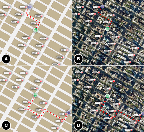
Notes (A) Short route on a schematic map, (B) short route on a cluttered map, (C) Long route on a schematic map, (D) long route on a cluttered map.
Cluttered maps offer a more realistic experience than schematic ones, but irrelevant details are often considered disturbing (e.g., Agrawala & Stolte, 2001). Navigation studies offer very little support for the beneficial effect of visual richness. For example, Devlin and Bernstein (1997) varied color and detail, but did not find a difference in efficiency when people searched for locations on these maps. Other studies, not focussing on navigation, show that visual clutter results in higher visual short-term memory load (Alvarez & Cavanagh, 2004; Rosenholtz et al., 2007). Conversely, Holmes and Wolff (2010) show that schematic depictions facilitate the processing of implied motion better than photorealistic depictions. Visual clutter also affects language production. Coco and Keller (2009) presented participants with more or less cluttered photographs of scenes and concluded that cluttered scenes tended to result in the production of more complex constructions. In a follow-up experiment Coco and Keller (2010) also found more complex eye tracking patterns.
How can we expect visual clutter to affect the use of internal and external landmarks? Cluttered (photographic) maps provide a larger amount of environmental details. This diminishes the relative saliency of the route, and may hence promote the use of environmental features as landmarks. Also, the higher visual memory load associated with visual clutter may increase the feeling of disorientation on the part of speaker and hearer. This in turn may discourage landmarks that make use of ambiguous concepts and that depend on the route perspective, and it may promote landmarks based on concepts with a higher chance of uniqueness within the scope of the map instead.
An interesting question concerning internal and external landmarks is which of the two types is considered to be the most basic or skeletal. To address this question, we systematically varied the memory load of the description task by designing short and long routes for the respondents to remember and describe. We expected respondents to gradually keep descriptions more minimal and skeletal as the memory load increased. What we wanted to know is which of the two types of landmarks was considered to be the most basic or skeletal. On the one hand, external landmarks are considered the most genuine and real landmarks, as we noted above, which may result in more external landmarks in tasks eliciting a higher memory load. On the other hand, short-term memory is limited (Miller, 1956), so respondents may well skip external landmarks (and their extensive and diverse semantic domains), and stick to the route itself instead and the restricted vocabulary of internal landmarks.
Table of contents
Experiment
Forty-two Dutch-speaking Tilburg University undergraduate students in communication sciences participated for course credit. They were randomly assigned to one of the two map conditions (cluttered or schematic). Men and women were almost evenly distributed in both conditions (cluttered: 18 women and 3 men; schematic: 17 women and 4 men). The median age of the participants was 22 years, ranging from 18 to 35. They were unaware of the conditions in the experiment. All participants had normal or corrected-to-normal vision. No formal training in geography or cartography was part of their study curriculum. The experiment was conducted in accordance with the ethical guidelines of our faculty, and all participants gave their consent to the use of their data.
The data of three additional participants was not analyzed (two because of technical problems, one participant did not follow the instructions and did not produce route descriptions).
We constructed twenty-four routes in two versions. Each route was set out on the same map, derived from a section of Upper East Side Manhattan (New York City, NY, USA), represented under an angle of about 30 degrees from true north, so that no road ran truly vertically or horizontally on the map. Eight routes covered three blocks on the map (short routes, as in Figure 4.1), the other sixteen covered six blocks (long routes). In the routes, each intersection following a block was considered a choice point, as it resulted in a choice for the navigator (going left, right, straight, or reach the end point). Short routes had three choice points, at the end of each block, long routes had six. All routes had the same starting point, located in the middle of the map. On every choice point that was present in at least one of the routes, a labeled icon was added indicating an external landmark. The icons were identical (red, representing a house), their white caption labels differed. Each map showed the same fifteen route-external landmarks on the same location of the map, so that any potential influence of the nature of the landmarks was kept constant in all the experimental conditions. The starting point of the routes was a green circle with the word “start” in it, pointing in the direction of the route. The route itself was depicted as a thick red, dashed line. The end point of the routes was designated by a purple circle with a black and white checkered flag pattern. Together, the 24 routes represented all configurations possible in a four-block area. The routes were set out on the maps in such a way that long routes did not contain parts that also appeared as short routes throughout the experiment. The cluttered map versions were photorealistic real-world examples taken from Google Maps, slightly modified to remove obvious landmarks (using Adobe Photoshop). The schematic versions were made by tracing the satellite pictures in Adobe Illustrator. The maps, 700 by 700 pixel uncompressed colored bitmaps, were presented on a 22 inch, 60 Hertz, 32-bit color Dell LCD screen, at a resolution of 1680 by 1050 pixels. The maps measured about 20 by 20 centimeters on the screen. We checked the data compression rate of the two map types, by converting them to compressed jpeg-files. Since cluttered maps contain more visual information, their compression rate is lower (e.g., Rosenholtz et al., 2007). The compression rate of cluttered maps was significantly lower than that of the the schematic maps (89 % vs. 95 % of the uncompressed bitmap originals, t(7) = 2782.60, p < .001).
The experiments took place in a sound proof and dimly lit cabin. The participants sat behind a desktop computer equipped with a table-top microphone. They pressed the space bar on the keyboard to bring up the instructions on the computer screen. In these instructions, the participants read that they would get to see route maps for six seconds and that they had to produce a spoken description of the route they had just seen directly after the map disappeared from the screen. There was no information about any potential addressee in the instructions, nor were the participants informed about the distinction between short and long routes, the map conditions, the location (New York City) and different types of landmarks. After the instructions, a practice trial consisting of two medium-length maps started, during which questions could be asked to the experimenter. Then the participants were left alone in the cabin to perform the actual task. Each of the twenty-four map trials started with the display of a fixation cross for 50 milliseconds, located at the screen where the starting point of the map would appear. Next, a map was presented for 6500 milliseconds. Then the screen turned black, indicating that the participants could describe the route they had just seen. After they had described the route, participants pressed the space bar to start the next trial, until they completed all twenty-four trials.
The presentation time (respondents were told that maps would be shown for 6 seconds, maps were actually presented a bit longer, 6.5 seconds) was based on a small-scale pretest designed to determine average first pass map study time. It turned out that respondents in the pretest needed 6 to 7 seconds study time before starting their route description. Speech was recorded with the microphone. Stimulus presentation time and audio recordings of the responses were controlled and registered using E-prime (Schneider, Eschman, & Zuccolotto, 2012). The order of the routes within a set was randomized for each participant, mixing short and long routes, while controlling that the first part of each route did not coincide with that of the previous one.
After completing all trials, the participants filled out a pen and paper questionnaire with eight semantic differential scales on perceived difficulty of the task they had just completed. These questions were taken from the NASA Task Load Index (Hart & Staveland, 1988). We added three five-point semantic differentials on aesthetic appreciation, clarity and complexity of the maps (beautiful−ugly, messy−clear, simple−complex). The participants took approximately fifteen minutes each to complete the experiment.
Of each choice point in the route descriptions, the usage of route-external and route-internal landmarks was flagged. This resulted in two values for each choice point: presence of an external landmark (present or absent) and presence of an internal landmark (present or absent). Note that not all route descriptions contained all choice points that were present in their corresponding maps, as description errors occurred.
We then coded each choice point description on a three-point scale. When only an external landmark was mentioned (e.g., “turn left at the bank”), the code −1 was assigned. For choice points localized with an internal landmark only (e.g., “take the second on your right”), we assigned +1. A zero (0) was associated with choice points where both landmark types were used (e.g., “at the next intersection at the cafe you go left”). When there was no landmark specified, no value was assigned.
This analysis resulted in an average landmark score ranging from −1 to 1 for each route map in each clutter condition. The score indicated a preference for either external or internal landmarks.The higher the score, the more often participants opted for using internal landmarks (as compared to opting for external landmarks). A score below zero indicated more frequent use of external landmark descriptions over internal descriptions.
Initially all route descriptions were coded by a single coder. Reliability was assessed by having a second coder code a sample of 25 % of the route descriptions, with an equally large but random subsample of each participant (n = 252). The two coders agreed on the usage of internal landmarks in 90 % of the cases, Cohen’s κ = .85 (p < .001, 95 % CI = .81 − .89), indicating almost perfect agreement (Landis & Koch, 1977). Given the observed marginal frequencies of the labels, the maximum value of κ was 1. The two coders agreed on the usage of external landmarks in 91 % of the cases, Cohen’s κ = .85 (p < .001, 95 % CI = .81 − .90), indicating almost perfect agreement (Landis & Koch, 1977). Given the observed marginal frequencies of the labels, the maximum value of κ was .91 in this case. In all our analyses, we used the codings of the first coder only.
As especially the long routes resulted in a large number of incomplete and wrong descriptions, we considered a route description ‘correct’ if it contained the correct direction changes in the correct order (i.e., in Figure 4.1 these correct orders or patterns are left-right and left-left-right-left, respectively). This analysis resulted in a percentage of correct pattern descriptions for each route in each map condition.
Each route description consists of a number of propositions, most of them instructional units as defined by Barshi and Healy (2002). A distinction can be made between crucial instructions (actions at choice points) and non-crucial instructions (actions between choice points). As explained above, people tend to include non-crucial instructions in natural route descriptions (e.g., Denis et al., 1999). Typical non-crucial instructions in our experiment are “keep walking” and “go straight ahead”. It should be noted that the Dutch word for going straight ahead (“ga rechtdoor”) is ambiguous, as it can either mean that one has to keep on walking ahead, or that one has to go straight at a street crossing. However, with the original maps in hand these expressions could be disambiguated.
The relatively low importance of between choice point instructions like “keep walking” and “go straight ahead” was confirmed in a small scale evaluation experiment, in which 20 respondents rated the relevance of these elements on a ten-point scale as compared to instructions at choice points (Mat = 9.72; Mbetween = 6.06; t(19) = 7.30, p <.001). None of the respondents in this evaluation took part in the main experiment.
For each produced route description, the total number of propositions was counted, and the number of non-crucial instructions was registered. Initially all route descriptions were coded by a single coder. Reliability was assessed by having a second coder code a sample of 25 % of the route descriptions, with an equally large but random subsample of each participant (n = 252). The two coders agreed on the presence of non-crucial actions in 89 % of the cases, Cohen’s κ = .81 (p < .001, 95 % CI = .77 − .86), indicating almost perfect agreement (Landis & Koch, 1977). Given the observed marginal frequencies of the labels, the maximum value of κ was .90 in this case.
Also, the number of words in each route description was counted. These analyses resulted in three means for each route map: the number of propositions, the number of non-crucial instructions, and the number of words.
In all our analyses, visual clutter was implemented as a within-maps variable, and route length was implemented as a between-maps variable in a multifactorial analysis of variance.
Table 4.1 presents the mean landmark score for each condition (first row). A higher score represents a higher preference for internal landmark NPs, as these were coded as +1. A lower score represents a higher preference external landmark NPs, as these were coded as −1. Analysis of landmark type reveals a main effect of visual clutter, as cluttered maps evoked a relatively higher preference for external landmark NPs than schematic maps, F(1, 22) = 110.21, p < .001, ηp2 = .834. Additionally, long routes elicited relatively more internal landmark NPs than short routes, F(1, 22) = 38.51, p < .001, ηp2 = .636. Visual clutter and route length did not interact, F(1, 22) = 1.62, p = .07.
Table 4.1 Mean and standard deviations for landmark score, percentage of pattern correct route descriptions, number of propositions, number of non- crucial instructions, and number of words for each map condition, split by route length.
Notes * p < .05, ** p &t; .005, *** p < .001. These p-values concern effects of visual clutter.
|
Short routes |
|
Long routes |
|
|
Cluttered maps |
|
Schematic maps |
|
Cluttered maps |
|
Schematic maps |
|
|
M |
(SD) |
|
M |
(SD) |
|
M |
(SD) |
|
M |
(SD) |
|
| Landmark score per description |
–0.16 |
(0.18) |
|
0.16 |
(0.16) |
|
0.17 |
(0.19) |
|
0.58 |
(0.11) |
*** |
| % Route patterns correct |
94.0 |
(4.9) |
|
91.1 |
(5.9) |
|
54.2 |
(18.4) |
|
52.9 |
(19.2) |
|
| Propositions per description |
3.65 |
(0.37) |
|
3.36 |
(0.27) |
|
5.09 |
(0.61) |
|
4.94 |
(0.45) |
** |
| Non-crucial instructions per description |
0.98 |
(0.15) |
|
0.86 |
(0.20) |
|
1.24 |
(0.31) |
|
1.05 |
(0.25) |
** |
| Words per description |
22.4 |
(2.3) |
|
19.4 |
(1.0) |
|
29.0 |
(3.2) |
|
26.3 |
(2.0) |
*** |
Table 4.1 presents the percentage of correct route patterns for each condition (second row). Visual clutter did not affect the correctness of the produced route patterns, F < 1. Short routes evoked more correct pattern descriptions than long routes, F(1, 22) = 37.43, p < .001, ηp2 = .630. Visual clutter and route length did not interact, F < 1.
Analysis of the mean number of propositions per route description, shown in Table 4.1 (third row), reveals a main effect of visual clutter, as cluttered maps evoked more propositions than schematic maps, F(1, 22) = 6.91, p < .025, ηp2= .239. Additionally and unsurprisingly, long routes elicited more propositions than short routes, F(1, 22) = 63.28, p < .001, ηp2 = .742. Visual clutter and route length did not interact, F < 1.
Analysis of the mean number of non-crucial instructions per route description, shown in Table 4.1 (fourth row), reveals a main effect of visual clutter, as cluttered maps evoked more non-crucial instructions than schematic maps, F(1, 22) = 8.07, p < .025, ηp2 = .268. Additionally and unsurprisingly, long routes elicited more non-crucial instructions than short routes, F(1, 22) = 5.86, p < .025, ηp2 = .210. Visual clutter and route length did not interact, F < 1.
Analysis of the mean number of words per route description, shown in Table 4.1 (fifth row), reveals a main effect of visual clutter, as cluttered maps evoked longer route descriptions than schematic maps, F(1, 22) = 25.25, p < .001, ηp2 = .534. Additionally and unsurprisingly, long routes elicited longer descriptions than short routes, F(1, 22) = 58.65, p < .001, ηp2 =.727. Visual clutter and route length did not interact, F < 1.
The participants indicated that the mental load associated with the task using six seven-point Likert scales based on the NASA Task Load Index (Hart & Staveland, 1988) was relatively high. Participants in the cluttered condition indicated that they found the task slightly more difficult than participants in the schematic condition did (Mcluttered = 5.82, Mschematic = 5.09; t(28.83) = 2.16, p < .05). Additionally, they indicated that they thought their performance was less perfect (Mcluttered = 5.45, Mschematic = 4.52; t(43) = 2.28, p < .05). There were no significant differences between the two conditions on perceived physical and temporal demand of the task, as well as on perceived effort and frustration associated with the task.
As to the three five-point scales (aesthetic appreciation, clarity and complexity), the cluttered maps were judged as more ugly (Mcluttered = 2.55, Mschematic = 1.96; t(43) = 2.04, p < .05) and more messy (Mcluttered = 3.00, Mschematic = 1.65; t(34.42) = 4.27, p < .001) than the schematic maps. There was no significant difference between the two conditions on the perceived complexity of the maps.
Table of contents
Discussion
Map design influences the strategies people use to describe a route. Systems like Google Maps provide users with the option to actively switch between cluttered and uncluttered maps. This variation in map design influences whether people use route-external or route-internal landmark NPs to locate choice points in a route description. So, when we tell somebody how to go to Grand Central Station (as we did in the introduction), the choice for a map design has likely influenced the way we instructed the inquirer. And if Grand Central was further away and the route was longer, that would have also affected our instructions.
In our experiment, participants studied route maps and produced route descriptions from short-term memory. To refer to choice points in a route, people made use of either route-external landmark NPs (e.g., “go left at the pharmacy”) or route-internal landmark NPs (e.g., “go left at the second street”). Confirming our hypotheses, we have found that when a map contains a high degree of visual clutter, a route description based on that map is more likely to contain external landmark NPs than when a map is less cluttered. At the same time, a preference for internal landmark NPs is stronger when a route is longer and the accompanying route description therefore contains more choice points. We have also seen that visual clutter in a map evokes more words, propositions, and more non-crucial instructions in route descriptions.
Why do people use different strategies in route descriptions when visual clutter in a map varies? Both landmark types are obvious descriptives for localizing changes of directions in a route description, but their referential properties differ. We reason that external landmarks provide additive information to a route description (i.e., they ‘add up to’ the path one has to walk), are relatively unambiguous, and identify a choice point in a perspective independent manner, independent of the current location of the traveller. On the other hand, internal landmarks are intrinsic parts of the route and therefore do not provide route-additive information. These internal landmarks are localized relative to the current location of the traveller in a route.
The preferences resulting from our post-task questionnaire suggest that visual clutter makes the referential task more demanding. When the going gets tough, language users tend to put more referential effort in producing referential expressions: They use more information to identify referents, and put more effort in avoiding ambiguous expressions. The relative use of internal and external landmarks in the produced route descriptions aligns with this view. Using more external landmarks in the cluttered condition can be seen as a way of including additional information, and at the same time as a way of using concepts with broad scope in the visual environment. Conversely, using less internal landmarks suggest a strategy of avoiding concepts of which many instances are present in the visual environment, and avoiding expressions which are dependent on one perspective only. And, as we have demonstrated, when a map is cluttered people tend to avoid this referential ambiguity more often than when a map contains no clutter. But, producing external landmarks from memory comes at the cost of higher memory demands. This is reflected by two findings. First, participants in the cluttered map condition rated their task as more difficult than participants in the schematic map condition did. Second, when a route is longer, and more descriptives have to be remembered, people show a higher preference for internal landmarks.
The results suggest that landmark preferences are caused by different strategies resulting from a more or less demanding referential task (due to a higher or lower degree of visual clutter). The preferences, however, may well relate also to viewers attending differently to external and internal landmarks in the two map versions. Obviously, we need other data (e.g., with eye tracking as a method) to find out the details of such a relationship. For current purposes, we started from two well known map versions: map (schematic) and satellite (cluttered). It is more than likely that the visual salience of both external and internal landmarks is higher in the schematic version, compared to the cluttered version. In the cluttered version, the two landmark types are surrounded by many other visual details, making the landmarks less salient. It is unlikely, however, that external landmarks are relatively more prominent in the cluttered version and internal landmarks more prominent in the schematic version.
Apart from the choice between external and internal landmarks, the increase of visual clutter also resulted in a number of collateral effects on descriptive efficiency and on perceived difficulty of the route description task. Participants who used a cluttered map to produce a route description produced more propositions and words than participants that used schematic maps. At the same time, they included more non-crucial instructions in their route descriptions (i.e., instructions like “you start to walk” and “keep walking”). This suggests an association between irrelevant visual detail on the input side and irrelevant verbal detail as output. It should be noted that the instructions that we label ‘non-crucial’ or ‘irrelevant’ are only irrelevant with respect to the route pattern, but may very well be relevant and useful from a pragmatic perspective, as is reflected by our finding that people still rate the importance of ‘non-crucial’ instructions with a six on a ten point scale.
Our findings pose a number of interesting implications for research on route maps and route descriptions. Many previous studies (e.g., Allen, 2000; Daniel & Denis, 1998, 2004; Lee & Tversky, 2005; Lovelace et al., 1999; Tversky & Lee, 1999) did not systematically distinguish internal and external landmarks, and almost exclusively focused on external landmarks. However, we have demonstrated that other descriptive strategies for locating choice points can very likely occur in route descriptions as well. Especially in a setting where external and internal landmarks are equally available at each choice point (like in our task) people are at least as likely to use internal landmark NPs as they would use external landmark NPs. Additionally, map design has not been studied extensively yet, but we have seen that a general and real-world variation in map design, namely the presence of visual clutter (or the use of realistic satellite maps and schematic drawn maps as provided by Google Maps), does influence the way people describe routes depicted on these maps. Moreover, a simple and obvious difference in route length also exerts an effect on the referential strategy people use to refer to choice points.
As was already proposed by Tversky and Lee (1998, 1999), research on the interplay between maps and route descriptions suggests that it may be possible to automatically translate visual information on maps and in environments into spoken or written route descriptions. The GIVE challenge (Koller et al., 2010) poses researchers a very similar question: Can you use natural language generation (NLG) to automatically formulate usable route instructions for a treasure hunt in a virtual environment, where only visual properties of the environment function as input? The research presented in this chapter proposes an interesting connection between visual input and route directions or instructions, namely that visual aspects of a scene (i.e., visual clutter) affect the way people select and communicate aspects of the environment in a route description.
Our results and experimental set-up raise some new empirical questions. First, the simplicity and organized nature of the environment we have used may have promoted the participant’s confidence to use internal landmark NPs. Typical route-internal landmarks such as streets intersections are very prominent in the grid-like street plan of Manhattan. A more complex task with more natural and varying environments may challenge our findings. Second, it might be interesting to further test our findings with respect to individual differences, as it is known that factors such as gender and age affect navigational behavior (e.g., Harrell, Bowlby, & Hall-Hoffarth, 2000). It is reasonable to assume that people with different visual abilities use landmarks and intersections differently, for example based on their different visual-object and visual-spatial abilities (e.g., Blazhenkova & Kozhevnikov, 2010). We have balanced gender and age in our research design. Finally, we have focused on production of route descriptions only, leaving questions concerning comprehension of route descriptions on the table. Which type of landmark is the most effective or desirable for wayfinding, and does that depend on the environment and on user-specific needs?
The discussion of our findings result in at least two suggestions for the design of mobile navigation software. One is that, in order to sound natural, automatically produced route descriptions should be adapted to design characteristics of the maps used. The other is that it is worthwhile to explore the inclusion of more external landmarks in such descriptions, as they tend to be more useful as the visual complexity of the map increases. To investigate these suggestions more fully, more evidence is needed, coming from a larger variation of navigation tasks and from other methods. We fully realize that the lab task used in this experiment does not sufficiently generalize over all aspects of the behavior people naturally exhibit while producing route descriptions. We collected descriptions all produced in the same time frame and the same communicative condition, which undoubtedly took away options we have readily available in natural communicative settings (e.g., the presence of a real addressee, feedback options, looking back at the map). Still, we think the lab task can validly generalize over communicative situations as the one presented in the introduction: The size of a smart phone prevents speaker and addressee to jointly look at the screen, which means that speakers look at the addressee for most of the time while explaining the route, for politeness reasons perhaps. This made us decide to ask respondents to produce a route description without looking at the map. Of course the lab simulation is not the same as its real-world counterpart. In particular, in reality speakers go back more often to the map, and addressees often interrupt and interact with the speaker. These are phenomena which were excluded here to make the production output more comparable, but which also pose interesting directions for follow-up research.
To conclude, our findings suggest that a cluttered visual input leads to more absolute and perspective-independent references in language production. While we have used route maps and route descriptions to create a task wherein a natural translation from visual information to verbal descriptions is evoked, it is very interesting to test the individual effects of the potentially confounding variables that we have ruled out in our design.
Table of contents
References
Agrawala, M., & Stolte, C. (2001). Rendering effective route maps: Improving usability through generalization. In Proceedings of the 28th international conference on computer graphics and interactive techniques (SIGGRAPH), Los Angeles, CA.
Allen, G. L. (2000). Principles and practices for communicating route knowledge. Applied Cognitive Psychology, 14(4), 333—359.
Alvarez, G. A., & Cavanagh, P. (2004). The capacity of visual short-term memory is set both by visual information load and by number of objects. Psychological Science, 15(2), 106—111.
Barshi, I., & Healy, A. (2002). The effects of mental representation on performance in a navigation task. Memory & Cognition, 30(8), 1189—1203.
Blazhenkova, O., & Kozhevnikov, M. (2010). Visual-object ability: A new dimension of non-verbal intelligence. Cognition, 117(3), 276—301.
Brunye, T. D., & Taylor, H. A. (2008). Extended experience benefits spatial mental model development with route but not survey descriptions. Acta Psychologica, 127, 340—354.
Coco, M. I., & Keller, F. (2009). The impact of visual information on reference assignment in sentence production. In Proceedings of the 31th annual meeting of the Cognitive Science Society (CogSci), Amsterdam, The Netherlands.
Coco, M. I., & Keller, F. (2010). Sentence production in naturalistic scenes with referential ambiguity. In Proceedings of the 32nd annual meeting of the Cognitive Science Society (CogSci), Portland, OR.
Cohen, G., & Burke, D. M. (1993). Memory for proper names: A review. Memory, 1(3), 249—263.
Couclelis, H., Collegde, R. G., Gale, N., & Tobler, W. (1987). Exploring the anchor-point theory of spatial cognition. Journal of Environmental Psychology, 7(2), 99—122.
Daniel, M., & Denis, M. (1998). Spatial descriptions as navigational aids: A cognitive analysis of route directions. Kognitionswissenschaft, 7, 45—52.
Daniel, M., & Denis, M. (2004). The production of route directions: Investigating conditions that favour conciseness in spatial discourse. Applied Cognitive Psychology, 18(1), 57—75.
Denis, M., Pazzaglia, F., Cornoldi, C., & Bertolo, L. (1999). Spatial discourse and navigation: An analysis of route directions in the city of Venice. Applied Cognitive Psychology, 13(2), 145—174.
Devlin, A. S., & Bernstein, J. (1997). Interactive way-finding: Map style and effectiveness. Journal of Environmental Psychology, 17(2), 99—110.
Donderi, D. C. (2006). Visual complexity: A review. Psychological Bulletin, 132(1), 73—97.
Donnellan, K. S. (1970). Proper names and identifying descriptions. Synthese, 21(3), 335—358.
Harrell, W. A., Bowlby, J. W., & Hall-Hoffarth, D. (2000). Directing wayfinders with maps: The effects of gender, age, route complexity, and familiarity with the environment. The Journal of Social Psychology, 140(2), 169—178.
Hart, S. G., & Staveland, L. E. (1988). Development of NASA-TLX (Task Load Index): Results of empirical and theoretical research. In P. Hancock & N. Meshkati (Eds.), Human Mental Workload. Amsterdam: Elsevier.
Holmes, K. J., & Wolff, P. (2010). Simulation from schematics: Dorsal stream processing and the perception of implied motion. In Proceedings of the 32nd annual meeting of the Cognitive Science Society (CogSci), Portland, OR.
Izaute, M. (1999). De la dénomination: La spécificitédes noms propres. L’année Psychologique, 99(4), 731—751.
Kalakoski, V., & Saariluoma, P. (2001). Taxi drivers’ exceptional memory of street names. Memory & Cognition, 29(4), 634—638.
Klippel, A., & Winter, S. (2005). Structural salience of landmarks for route directions. In Proceedings of the 2005 international conference on Spatial Information Theory (COSIT), Ellicottville, NY.
Koller, A., Streignitz, K., Bryron, D., Cassel, J., Dale, R., Moore, J. et al. (2010). The first challenge on generating instructions in virtual environments. In E. Krahmer & M. Theune (Eds.), Empirical Methods in Natural Language Generation: Data-oriented Methods and Empirical Sciences (pp. 328—352). Berlin: Springer.
Landau, B., & Jackendoff, R. (1993). “What” and “where” in spatial language and spatial cognition. Behavioral and Brain Sciences, 16(2), 217—265.
Landis, J. R., & Koch, G. G. (1977). The measurement of observer agreement for categorical data. Biometrics, 33(1), 159—174.
Lee, P. U., & Tversky, B. (2005). Interplay between visual and spatial: The effect of landmark descriptions on comprehension of route/survey spatial descriptions. Spatial Cognition and Computation, 5(2), 163—185.
Lovelace, K. L., Hegarty, M., & Montello, D. R. (1999). Elements of good route directions in familiar and unfamiliar environments. Lecture Notes in Computer Science, 1661, 65—82.
MacEachren, A. (2004). How maps work: Representation, visualization, and design. New York: The Guilford Press.
Miller, G. A. (1956). The magical number seven, plus or minus two: Some limits on our capacity for processing information. Psychological Review, 63(2), 81—97
Rosenholtz, R., Li, Y., & Nakano, L. (2007). Measuring visual clutter. Journal of Vision, 7(2), 17.
Russell, B. (1911). Knowledge by acquaintance and knowledge by description. Proceedings of the Aristotelian Society, 11, 108—128.
Sadalla, E. K., Burroughs, W. J., & Staplin, L. J. (1980). Reference points in spatial cognition. Journal of Experimental Psychology: Human Learning and Memory, 6(5), 516—528.
Schneider, W., Eschman, A., & Zuccolotto, A. (2012). E-prime 2.0 user’s guide. Psychology Software Tools, Inc., Pittsburg, PA.
Smallman, H. S., & Cook, M. B. (2011). Naïve realism: Folk fallacies in the design and use of visual displays. Topics in Cognitive Science, 3(3), 579—608.
Strawson, P. F. (1959). Individuals. London: Methuen & Co. Ltd.
Taylor, H. A., & Tversky, B. (1992). Spatial mental models derived from survey and route descriptions. Journal of Memory and Language, 31(2), 261—292.
Tom, A., & Denis, M. (2003). Referring to landmark or street information in route directions: What difference does it make? In W. Kuhn, M. F. Worboys & S. Timpf (Eds.), Spatial Information Theory: Foundations of Geographic Information Science (pp. 384—397). Berlin: Springer.
Tom, A., & Denis, M. (2004). Language and spatial cognition: Comparing the roles of landmarks and street names in route instructions. Applied Cognitive Psychology, 18(9), 1213—1230.
Tom, A., & Tversky, B. (2012). Remembering routes: Streets and landmarks. Applied Cognitive Psychology, 26(2), 182—193.
Tversky, B. (2002). Some ways that graphics communicate. In N. Allen (Ed.), Words and Images: Working Together Differently (pp. 57—74). New York: JAI Press.
Tversky, B., & Lee, P. (1998). How space structures language. In C. Freksa, C. Habel & K. Wender (Eds.), Spatial Cognition (Vol. 1404, pp. 157—175). Berlin: Springer.
Tversky, B., & Lee, P. (1999). Pictorial and verbal tools for conveying routes. In C. Freksa & D. M. Mark (Eds.), Spatial Information Theory: Cognitive and Computational Foundations of Geographic Information Science (Vol. 1661, pp. 752—752). Berlin: Springer.
Table of contents
Chapter 5
Learning with schematic, realistic, and hybrid pictures
This chapter is based on:
Westerbeek, H., Van Amelsvoort, M., Maes, A., & Swerts, M. (submitted). Benefits of schematic line drawings compared to detailed photographs in educational materials: Effects of visual emphasis on text-picture integration and comprehension.
An earlier version of this work has been presented in:
Westerbeek, H. G. W., Van Amelsvoort, M., Maes, A., & Swerts, M. (2014). Contents and graphics in line: When is it beneficial to schematize pictures in expository prose? In Building bridges: Improving our understanding of learning from text and graphics by making the connection (EARLI SiG 2), Rotterdam, The Netherlands.
Abstract For the design of representational pictures in educational materials, research suggests that schematic line drawings facilitate comprehension more than detailed photographs. We extend research on the potential advantage of schematic graphics by disentangling visual detail from visual emphasis, and by focusing on the perceptual integration of text and graphics. In an experiment on learning about mitosis, secondary school students studied text with either schematic drawings, detailed photographs, or hybrid pictures (photographs with superimposed line drawings). The results reveal that as students attempt to integrate text and pictures by making referential connections between them, they do so better with schematic and hybrid pictures compared to the detailed photographs. Moreover, students who are able to make more correct connections, typically score higher on comprehension. By comparing the three picture types, we attribute the advantage of schematic drawings to visual emphasis, and not to leaving out irrelevant detail compared to photographs.
Introduction
Schoolbooks, educational web sites, and other instructional materials typically provide students with visual materials in combination with expository text. A considerable subset of these materials consist of pictures that are representational, in the sense that they show what the topic of the text and its parts looks like, and how these parts are located (e.g., Carney & Levin, 2002; Levin, 1981). As such, representational pictures provide visual referents to concepts described in the text. Adding pictures to text is generally found to improve comprehension and learning of the materials, compared to when only text is studied (e.g., Carney & Levin, 2002; Hannus & Hyönä, 1999; Levie & Lentz, 1982; Mayer, 1997, 2005; Schroeder et al., 2011; i.e., the multimedia effect).
One variable in picture design that has received scholarly attention over the years is the degree of visual detail in static (e.g., Butcher, 2006; Dwyer, 1976; Imhof, Scheiter, & Gerjets, 2011; Mason, Pluchino, Tonatora, & Araisi, 2013; Moreno, Ozogul, & Reisslein, 2011), and dynamic visualizations (e.g., Höffler & Leutner, 2007; Jenkinson & McGill, 2013; Rodicio, 2012; Scheiter, Gerjets, Huk, Imhof, & Kammerer, 2009). Research on the effect of visual detail in representational pictures in combination with expository text typically focuses on comparing detailed graphics (e.g., photographs) to schematic graphics with regard to effectiveness for comprehension, retention, and transfer (Butcher, 2006; Dwyer, 1976; Imhof et al., 2011; Joseph & Dwyer, 1984; Mason et al., 2013; Rodicio, 2012; Scheiter et al., 2009). Figure 5.1a and 1b show examples of a detailed photograph and a schematic drawing of a biological cell. Schematization is achieved by abstracting from a detailed picture, thus by leaving out nonessential information, and at the same time by putting visual emphasis on the important parts of a cell by highlighting important information through the addition of thick contrasting lines, dots, and other markings.
Figure 5.1 Examples of a picture showing the metaphase of mitosis.
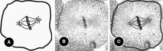
Notes (A) schematic line drawing, (B) detailed photograph, (C) hybrid: photograph with drawing superimposed.
Schematic drawings are (intuitively) considered to be more legible and more clear than photographs, and such pictures are therefore argued to be easier to understand, and are thus advised to be used in practical applications (e.g., Pettersson, 2013; Tversky et al., 2002). In contrast, in a visually detailed picture it may be hard to tell what is important and what is not. Especially when the domain or topic of study is unfamiliar for students, an advantage of schematic pictures seems evident. These intuitions are formalized in prescriptive advice for (educational) picture design: Instructional designers are advised to avoid unnecessary elements in pictures, arguing in favor of simple line drawings over detailed photographs (e.g., Pettersson, 2013; Rieber, 2000).
In cognitive psychology, explanations for the potential benefits of schematic pictures in educational materials mainly focus on one side of schematization: differences in the amount of visual information present in detailed and schematic pictures. Detailed pictures contain a higher degree of irrelevant visual details than schematic pictures. It is argued that processing these details in working memory comes at the cost of processing the essential information (e.g., Butcher, 2006; Mason et al., 2013; Pettersson, 2013; Rodicio, 2012; Scheiter et al., 2009). This explanation is embedded in the Cognitive Theory of Multimedia Learning (CTML; Mayer, 1997, 2005): a theoretical framework which allows researchers to compare instructional formats on the basis of the cognitive load in working memory they imply. It proposes that learning from text and pictures takes place in a number of consecutive stages: Information is perceived by the eyes and ears (perception); processed in a perceptual short term memory store; and passed on to working memory. Working memory contains separate subsystems for visual (pictorial) and verbal (textual) information. Importantly, the capacity of these subsystems is limited: Only a small amount of information can be processed simultaneously (Baddeley, 1992; Miller, 1956). It is assumed that pictorial and textual information is integrated in working memory. in coordination with students’ prior knowledge (stored in long term memory), this entails comprehension and learning.
When manipulations of visual detail in representational pictures are discussed in terms of the CTML, it is hypothesized that because nonessential visual detail is processed in working memory, detailed pictures may lead to extraneous (i.e., superfluous) demand for working memory resources (e.g., Höffler & Leutner, 2007; Imhof et al., 2011; Joseph & Dwyer, 1984; Scheiter et al., 2009). In other words, visual detail in materials presents students with nonessential information, and induces them to process details that are not necessary for comprehending the contents of the expository text. In terms of the CTML, detailed pictures may cause a coherence or seductive details effect (i.e., details in the materials activate unnecessary knowledge; e.g., Harp & Mayer, 1998; Mayer et al., 2001), or a modality effect (i.e., the visual subsystem of working memory is overloaded; e.g., Mayer & Moreno, 2003), and working memory is overloaded with information that is not central to the learning objective. This arguably hampers the integrative processes in working memory.
Support for this reasoning comes from studies in which presenting students with schematic pictures lead to better comprehension and learning than detailed photographs. In an extensive body of research, Dwyer and colleagues compared learning about the human heart and circulatory system with text, adjoined by pictures of various levels of visual detail. They found that schematic line drawings were more effective for most learning goals and general levels of prior knowledge (e.g., Dwyer, 1968; Joseph & Dwyer, 1984). In a more recent study, Butcher (2006) report that students who learn about the heart and circulatory system by reading text and viewing simplified line drawings acquired more factual knowledge than students whom received visually detailed pictures. For animations, Scheiter et al. (2009) report better comprehension when animations are schematic line drawings compared to detailed microscopic videos in an experiment on learning about the biological process of mitosis. Rodicio (2012) reports similar effects in a study on learning about geology and plate tectonics.
However, other studies report no effects of using schematic graphics on comprehension and learning. Some studies in Dwyer’s research remain inconclusive about effects of visual detail on learning (e.g., Dwyer, 1976). In a more recent study by Mason et al. (2013), high school students learned about physics (gravitational forces on an inclined plane) from a text with either a detailed picture or a more schematic one, but no effects of picture type on knowledge and transfer tests were found. Michas and Berry (2000) report no differences in performance after learning how to carry out first aid tasks (i.e., bandaging) with schematic line drawings or detailed video stills. Null effects are reported for animations as well: Imhof et al. (2011) instructed students about different locomotion patterns of fish using detailed videos of actual fish and schematic line drawn animations, but no difference in classifying and recognizing locomotion patterns between the groups was found. Partly, this null effect may be attributable to the detailed videos offering more useful information than the schematic animations (as suggested by Imhof et al.). Additionally, meta-analyses do not find reliable support for schematic advantages either. Reinwein and Huberdeau (1988) conducted a meta-analysis on twenty-one experiments by Dwyer and colleagues, and report that there is no support for the hypothesis that visual detail affects comprehension. Reviewing studies on instructional animations, Höffler and Leutner (2007) conclude that research concerning visual detail in representational animations is inconclusive, to a great extent because detailed video-based animations more often have a representational function than computer-based low detail animations, which are generally decorational. For representational animations, Höffler and Leutner conclude that it is yet unclear what the effects of schematization may be.
Taken together, despite inconclusive results, the literature suggests that schematic line drawings may facilitate comprehension compared to detailed photographs. However, the question why students may benefit from schematic line drawings warrants further investigation. Therefore, it is fruitful to consider means by which explanations for the effect can be extended. In the remainder or this introduction, we elaborate on two ways in which the effects of schematic line drawings in comparison with detailed photographs may be further understood. One way is to advocate a more precise comparison between schematic and detailed graphics, by focusing on the question what underlies the potential benefit of schematic line drawings over detailed photographs. Is it leaving out irrelevant detail, emphasizing what is important, or both? The second way to further understand effects of using schematic line drawings is to shift our attention to the study process instead of learning results. So, we consider the potential effects of schematic line drawings in relation to how students process (read) a multimedia instruction composed of text and pictures. In turn, this should lead to more insight into how findings with regard to schematization can be applied in cognitively inspired instructional design.
Firstly, in the studies reviewed above, two different approaches to describing the differences between schematic or detailed conditions can be discerned. The differences between the conditions are described in terms of excessive or irrelevant detail, as schematic pictures leave out such details (e.g., Scheiter et al., 2009; Dwyer, 1976; Butcher, 2006; Imhof et al., 2011). But it has also been argued that schematic pictures highlight important information (Mason et al., 2013; Scheiter et al., 2009; Tversky et al, 2002). A closer inspection of the examples in Figure 5.1 makes clear that the schematic picture, compared to the detailed one, can be defined both in terms of leaving out irrelevant details and in terms of signaling or highlighting. In other words, the schematic picture gains clarity because it does not contain nonessential visual detail and because it emphasizes essential visual information by means of thick contrasting lines, dots, and other markings. This visual emphasis may work much like visual cues that are employed to add visual emphasis that directs students’ (visual) attention towards what is important (e.g., De Koning, Tabbers, Rikers, & Paas, 2009; De Koning, Tabbers, Rikers, & Paas, 2010). This raises the question whether effects of schematization are primarily related to differences in visual detail, or differences in visual emphasis. Therefore, in this study we aim to disentangle the two variables of visual detail and visual emphasis, by experimentally comparing schematic and detailed pictures to a third condition where visual emphasis is present, but visual detail is not reduced (as in Figure 5.1c). This hybrid condition also yields a picture format that may be interesting to be applied in instructional design.
Secondly, it remains unclear which phases of the learning process are affected by using schematic line drawings instead of detailed photographs. It is likely to assume that learners benefit most from pictures when they try to connect words in the text to parts of the pictures. It may be likely that schematic line drawings, albeit related to differences in visual detail and/or visual emphasis, help students during this phase of making such text-picture connections. These connections are considered to be referential: Words in the text refer to elements in the picture (e.g., Crooks, Cheon, Omam. Ari, & Flores, 2012; Mason et al., 2013). Such referential connections are made during reading, when students are involved in finding visual referents in the pictures that are related to the concepts mentioned in the text. Because visual attention is selective − viewers do not attend to and process all or many details of their visual environment, but they make meaningful selections in early perceptual stages instead (e.g., see Eimer, 2014, and Peelen and Kastner, 2014 for recent overviews) − irrelevant visual details may hamper this process of identifying visual referents. We therefore propose to investigate how schematization of representational pictures combined with text may affect how well students can identify these visual referents in pictures.
Thirdly, irrespective of what exactly causes schematic pictures to be clearer than detailed ones, if making connections between text and pictures is improved when pictures are schematized, it is expectably easier to integrate information from both modalities into one representation. A better integration of information from text and pictures may be beneficial for comprehension (e.g., Ainsworth, 1999, 2006; Bodemer et al., 2004; De Koning et al., 2009; Gyselinck, Jamet, & Dubois, 2008; Hannus & Hyönä, 1999; Scheiter & Eitel, 2015; Schüler, Arndt, & Scheiter, 2015). So, we investigate the relationship between schematization, finding visual referents, and comprehension. Schematization is expected to support the process of finding visual referents, thus supporting integration of text and pictures. This integration probably leads to better comprehension.
The idea that making referential connections between text and pictures leads to better comprehension has been proposed in the literature before, although not in relation to schematization of representational pictures (e.g., Ainsworth, 1999, 2006; Butcher, 2006; Crooks et al., 2012; Schüler et al., 2015). An association between finding visual referents and comprehension is most directly measured in eye tracking studies on text-picture combinations (Hannus & Hyönä, 1999; Hegarty, Carpenter, Just, 1991; Mason et al., 2013). If learners can successfully find visual referents to concepts in the text, the more helpful the pictures are expected to be for them, and comprehension is improved (e.g., Kalyuga, Chandler, & Sweller, 1999; Schüler et al., 2015). Research on cueing and explicit attention guidance in learning specifically supports this proposed relation between making the correct referential connections between text and picture on the one hand, and comprehension and learning on the other. Cueing is aimed specifically at guiding students in making the right referential connections between representations, by visually emphasizing relevant visual referents. Among the types of cues found in the literature are colored labels (Ozcelik, Aslan-Ari, & Cagiltay, 2010), color coding (Crooks et al., 2012), temporarily shading (fading) unimportant parts in animations (De Koning et al., 2010; Lowe & Boucheix, 2011), and arrows pointing from words in the text to parts of the pictures (Liu, Lin, & Paas, 2013). These cues function as guiding attention to specific locations in the pictures, thereby selecting what is important, and making explicit which parts of the text refer to which parts of the picture (De Koning et al., 2009; 2010). These studies show the beneficial effect of cueing on learning and comprehension. In our study, we add to this evidence by using a method that enables us to explicitly study the association between identification of visual referents and comprehension, and how that is related to schematization of representational pictures.
Our expectations regarding the effects of schematization of representational pictures lead to a number of research questions. As it is unclear what schematization of representation exactly entails, we want to investigate whether schematic drawings lead to benefits because they visually emphasize what is important, or because they leave out irrelevant details, or both (Research Question 1). These benefits are expected to be found in the process of finding visual referents. But is finding visual referents to words in the text facilitated by pictures being schematic drawings, compared to when they are detailed photographs, or hybrid pictures (Research Question 2)? Finally, we aim to test whether finding visual referents predicts comprehension. If schematic pictures indeed make the identification of visual referents easier, is successful finding of visual referents related to better comprehension of the materials (Research Question 3)?
We address these questions in an experiment in which secondary school students study a text about the biological process of mitosis, accompanied by pictures in three visual detail conditions.
Table of contents
Experiment
We conduct an experiment on learning from a text about mitosis, that is, the biological process of cell reduplication. Crucially, the mitosis text is accompanied by either schematic line drawings, by detailed photographs, or a by hybrid version of these pictures (Figure 5.1). The three conditions make it possible to disentangle effects of reducing irrelevant visual detail from effects of visual emphasis in schematic pictures: The hybrid pictures do provide visual emphasis, but do not contain less visual detail than the detailed photographs (RQ 1). After studying a text with pictures, the secondary school students perform an arrow drawing task to measure how well they can make referential connections between the two modalities (RQ 2). This combination of tasks allows us to study effects of visual detail on finding these referential connections, and the relationship between making these connections and comprehension (RQ 3).
We believe that studying the effects of schematization in the domain of mitosis and biology is representative for learning about an inherently visual domain (Jenkinson & McGill, 2013), which is argued to be a difficult topic in secondary education (Çimer, 2012; Scheiter et al., 2009; She & Chen, 2009). Like other more abstract topics, understanding mitosis may be hard for students because it encompasses objects and processes that are not visible to the unaided human eye (She & Chen, 2009). Textual explanations of the processes and phases in mitosis contain a relatively high amount of domain-specific terms that refer to concrete objects, which can be shown in representational pictures (e.g., chromosomes, microtubuli, centrioles). We expect that the proposed difficulties with this topic motivate students to search for referential connections between difficult concepts in the text and parts of the pictures.
By means of an eye tracking pretest, we aim to establish that students typically look to these pictures in our materials and that they make meaningful connections between the two modalities while studying, allowing them to identify visual referents. As such, it provides an on-line control measure of the processes that we aim to study with the (off-line) arrow drawing task.
121 Secondary school students (seventy-one women and fifty men, with a median age of 16 years, ranging from 15 to 19) participated, in seven groups of about twenty students each. All were students of the fourth, fifth or sixth year of the (Dutch) secondary school level called HAVO or VWO (comparable to British A-level or US pre-university education). They were randomly assigned to one of the three conditions in the study: 44 in the schematic pictures condition, 43 in the detailed photographs condition, and 34 in the hybrid condition. Participants were enrolled in three different educational programs (called “culture and society”, “economy and society”, and “nature and technology” in the Dutch school system), but none of the participants had biology as a compulsory subject in their curriculum. Their level of prior knowledge is assumed to be comparable.
A 303-word expository text about mitosis was constructed. Its contents were based on various educational texts on the subject aimed at a secondary school audience. It was deliberately difficult for the target group, i.e., it had a Flesch reading ease score of about 42, which is lower than what is argued to be easily understood by secondary school students (Flesch, 1948). This was done to avoid ceiling effects in comprehension, and to motivate thorough study and inspection of the pictures. The text was divided into six sub-headed sections of about equal length, each corresponding to one of the six phases of mitosis (interphase, prophase, prometaphase, metaphase, anaphase, and telophase). Each section was accompanied by an approximately 4 by 4 centimeter picture, which was positioned on the left side of the text. There were no explicit exophoric references (e.g., “see picture”) to the pictures in the text.
Critically, we manipulated whether these pictures were schematic line drawings, detailed microscope photographs, or hybrid versions in which the line drawings were superimposed on the photographs. The detailed photographs were gathered from educational web sites, where representative microscopic photographs of each of the six phases of mitosis were selected. The photographs were converted to grayscale with the goal of equalizing contrasts between the six pictures. The schematic line drawing versions of the pictures were created by (digitally) tracing the photographs. By tracing, aspects such as the positioning of cell parts, their scale, and spatial ratios were preserved in the process of schematization. Hybrid pictures were created by superimposing the line tracings on the photographs. Figure 5.2 presents the text and six pictures in the three picture type conditions.
Figure 5.2 The text and six pictures as used in the experiment, in three conditions.
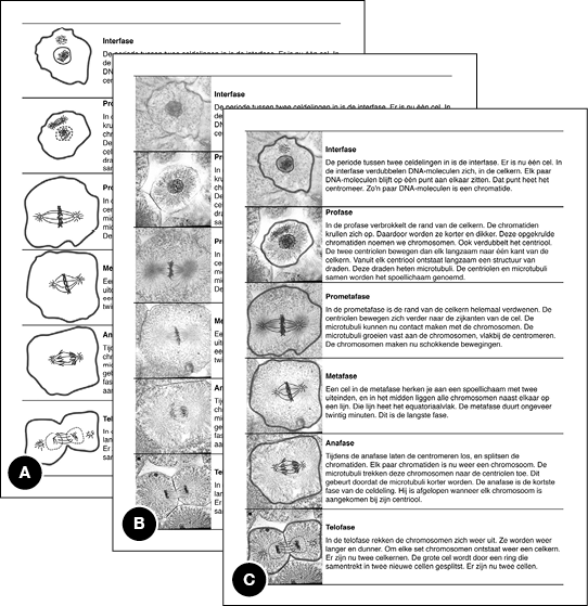
Notes (A) Schematic line drawings, (B) detailed photographs, (C) hybrid pictures.
To test our assumption that, while studying, students will search for visual referents in the pictures that accompany each text section, we obtained eye tracking measures in a materials test. We aimed to answer two questions: Do students fixate on the pictures when they study the materials, and do they make transitions between text sections and relevant pictures? Pictures are considered relevant when they show the respective mitosis phase that the text that is being read is about. As such, only “horizontal” transitions in our materials (see Figure 5.2) are considered to be between text and relevant pictures.
Eye tracking yields an on-line record of where students gaze, and how long they fixate on text and pictures, and whether they make transitions between these modalities. In eye tracking research, a convincing relationship between where the eyes gaze and to what viewers attend to has been established (see, for example, Hannus & Hyöna, 1999; Mason et al., 2013; Rayner, 1992). Therefore, we regard the measurement of eye fixations and gaze patterns as a suitable method to assess our materials.
Twenty-two undergraduate students from our university participated for course credit (20 females and 2 males, with a median age 21 years, ranging from 18 to 24). All indicated to have completed their final secondary school exam within five years prior to the study, and none did a final exam in biology. They followed the same procedure as the participants in the main experiment (explained below), with one exception: They read the mitosis text from a computer screen, and their eye movements were registered using an SMI RED250 eye-tracker (SensoMotoric Instruments, Berlin, Germany). The eye-tracker was paired with a vertically oriented 22 inch, 60 Hertz, 32-bit color Dell LCD screen, at a resolution of 1050 by 1680 pixels. The screen was set up in a vertical position in order to display the questionnaire page with the mitosis text in a size comparable to the A4 paper sheet that was used in the main experiment. Participants were randomly were assigned to one of the three versions of the material (schematic line drawings, detailed photographs, hybrid pictures), and were given five minutes to study it, before they had to answer questions about mitosis. They were seated at a normal operating distance to the monitor, and the RED250 was calibrated one or more times until the validation yielded satisfactory results. Calibration, stimulus presentation, timing, as well as the collection of fixation data, was administered using SMI iViewX and SMI Experiment Center. Eye movements of two participants were not analyzed due to problems with calibration and validation.
To answer the question whether students fixate on the pictures while studying, we analyzed the mean fixation duration on text and pictures. This analysis revealed that more visual attention was spent on the text (M = 181.7 s, SD = 39.4 s) than on the pictures (M = 19.0 s, SD = 10.9 s), F(1, 19) = 295.55, p < .001, ηp2 = .946. This is in line with other eye tracking studies on multimedia materials, as participants’ studying behavior is largely text-directed (e.g., Hannus & Hyönä, 1999; Schmidt-Weigand et al., 2010). About one tenth of the total fixation time was spent on inspecting the pictures though, which warrants the conclusion that the pictures are attended to during studying the materials, and that the total fixation time on the pictures can be considered normal. Further analysis showed that there were no significant differences in mean fixation time between the six pictures of the respective mitosis phases in terms of mean fixation duration, F < 1, nor was there a difference in fixation time on text and pictures between the three versions of the materials, F < 1.
To test whether students make relevant (i.e., horizontal) transitions between text and pictures, four types of transitions between areas of interest (AOI) were defined. We annotated transitions between text sections, between pictures, between a text section and the relevant picture, and between a text section and a non-relevant picture. Analyses on the proportions of transitions showed a main effect of type of transition on the number of transitions, F(3, 51) = 38.65, p < .001, ηp2 = 0.695. Most transitions were made between text sections (M = .50, SD = .04), followed by transitions between text and related pictures (M = .31, SD = .01). Pairwise comparisons (LSD) showed that the proportion of transitions between related text and pictures was significantly higher than the proportion of transitions between unrelated text and pictures (M = .11, SD = .01), p < .001. Thus, meaningful transitions between text and related pictures occurred regularly. Students switched their visual attention back and forth between text section and picture, and generally did this between text sections and pictures concerning the same phase of mitosis.
Participants in the main experiment worked through a pen and paper questionnaire, composed of five parts. In the first part, the participants read general instructions about the experiment. These emphasized that they were not allowed to browse through the pages, and were only allowed to go to the next page when that was indicated by the experimenter. Consecutively, they filled out general demographic questions, and estimated their last final grade for biology class on a scale from one to ten. This scale is the common way in which Dutch student tests are graded, with one being the lowest possible grade, and ten being a perfect score. They also indicated whether they liked biology on a ten-point Likert scale.
The second part of the questionnaire consisted of a short general introduction on cells and mitosis, explaining that mitosis was a biological process in which single cells split into two cells. When all students indicated that they understood this introduction, they were instructed to go to the next page, which contained the text and pictures about mitosis. The students had exactly five minutes to study this page, to ensure that there were no differences in study time between participants and conditions. They were instructed to study in a similar way as how they would prepare for an exam, and that they had to answer a number of questions on this text later on.
Following the study phase, the third part of the questionnaire was composed of six ten-point Likert scales measuring the perceived usefulness of the pictures (e.g., “Have you looked at the pictures”, “How useful did you think these pictures were in general?”). Also, there were five ten-point Likert scales inquiring the perceived cognitive effort involved in studying the text. These questions were based on the NASA Task Load Index (TLX), which measures perceived cognitive load and experienced time pressure (Hart & Staveland, 1988).
The fourth part of the questionnaire measured comprehension. Seventeen four-choice questions were answered. Six questions concerned the functions of parts of the cells during mitosis (e.g., “What is the function of the centromere?”). Six other questions inquired definitions of names of cell parts (e.g., “What are microtubuli?”). The remaining five questions measured knowledge of dynamics and processes during mitosis (e.g., “How do the centrioles move in the prometaphase?”). After answering these questions, the students performed a sorting task. In this sorting task, they saw the six pictures from the text again (in the same condition as in which were studied), in a random order. The students were asked to write the name of each mitosis phase on each picture, as well as a number from 1 to 6 to indicate the correct order of the pictures. The comprehension tests were based on Scheiter et al. (2009)’s comprehension test on the same topic.
The fifth and final part of the questionnaire presented the text once again (in the same condition as in which it was studied), but with nineteen key concepts in the text underlined (e.g., “chromosome”, “microtubuli”, “centriole”). The students were instructed to draw arrows from the underlined words to the corresponding parts of the picture for that mitosis phase. For reasons of clarity, they were asked to draw circles around these parts in the pictures as well.
The questionnaire was administered in a classroom at the students’ respective schools. An experimenter, present during the entire procedure, made sure that students were not able to look at each other’s answers and kept track of time. The experiment took about 30 minutes to complete per group of participants.
A comprehension score was calculated by awarding a point for each correctly answered multiple choice question, by awarding a point for each correctly named phase in the sorting task, and by giving points for sorting the pictures in the sorting task correctly. This yielded a total score of maximally 29 points. For the arrow drawing task, a point was awarded for each correctly drawn arrow, yielding a maximum score of 19. Because not all participants drew nineteen arrows or answered all questions, analyses were performed on proportions of the total number of arrows drawn or the total number of questions answered. So, unanswered questions and non-drawn arrows were not rated as incorrect, but where excluded from analysis.
These analyses yielded a between-participants experimental design with picture type as the independent variable with three levels: schematic drawings, detailed photographs, and hybrid pictures. Dependent variables were the perceived usefulness of the pictures, perceived cognitive load, the proportional comprehension score, and the proportion of correctly drawn arrows. We analyzed whether these dependent measures were affected by our manipulation using GLM ANOVA’s, and pairwise comparisons following Tukey’s LSD procedure. Whether arrow drawing performance was associated with learning outcomes was tested by means of linear regression.
As said, none of the participants had biology as a compulsory subject in their study curriculum. Students in the three student programs were equally distributed over the three picture type conditions, χ2(4) = 1.46, p = .833. The same holds for school year and level, χ2(6) = 2.95, p = .815, and age (F < 1). Also, self-reports of the average grade for biology in the past and liking biology did not differ across conditions, F’s < 1.
For perceived usefulness of the pictures, the rating was averaged over six 10-point Likert scales (Cronbach’s α = .86). Analysis of the mean perceived usefulness revealed an effect of picture type, F(2, 118) = 9.52, p < .001, ηp2 = .139. Ratings were the highest for hybrid pictures (M = 6.75, SD = 1.84), followed by the schematic drawings (M = 5.86, SD = 1.77), and lowest for detailed photographs (M = 4.94, SD = 1.84). Pairwise comparisons showed that all conditions differed from each other (hybrid vs. schematic: p = .034; schematic vs. detailed: p = .020; hybrid vs. detailed p < .001).
The five scales for perceived cognitive effort were not reliably related (Cronbach’s α = .47), so these measures were analyzed separately. These analyses showed no significant effects of picture type (F’s < 1.6). Analysis of perceived cognitive effort also indicated that participants said not to have experienced a high level of time pressure during the study phase (i.e., the mean score on the time pressure scale was 4.83 out of 10).
The mean proportion of correctly answered questions per picture type is shown in Figure 5.3 (left). Analysis of comprehension scores revealed a main effect of picture type, F(2, 118) = 3.61, p = .030, ηp2 = .058. Comprehension scores in the detailed photographs condition (M = 42.7 %, SD = 16.7 %) were lower than in the schematic drawings (M = 50.0 %, SD = 18.4 %) and hybrid pictures conditions (M = 52.7 %, SD = 15.9 %). Pairwise comparisons showed that the difference between the detailed photographs and the other two picture types was significant (detailed vs. schematic: p = .050; detailed vs. hybrid: p = .012). The schematic drawings and the hybrid pictures did not differ from each other (p = .489).
Figure 5.3 Results of the experiment.
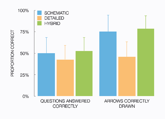
Notes (Left) Mean proportion of correctly answered questions, (Right) mean proportion of correctly drawn arrows, each split by picture type condition (error bars are +1 standard deviation).
The mean proportion of correctly drawn arrows (i.e., referential connections between text and picture) per picture type condition is shown in Figure 5.3 (right). Analysis of arrow drawing scored revealed a main effect of picture type, F(1, 117) = 40.82, p < .001, ηp2 = .411. Scores in the detailed drawings condition (M = 45.9 %, SD = 17.3 %) were lower than for schematic drawings (M = 74.9 %, SD = 19.7 %) and hybrid pictures (M = 78.3 %, SD = 15.6 %). Pairwise comparisons showed that the difference between the detailed drawings and the other two picture types was significant (detailed vs. schematic: p < .001; detailed vs. hybrid: p < .001). The schematic drawings and the hybrid pictures conditions did not differ from each other (p = .399).
To measure whether a higher proportion of correctly drawn arrows (i.e., referential connections) predicted a higher proportional comprehension score, we carried out linear regressions between the two variables. A higher proportion of correct referential connections was associated with higher comprehension scores, β = .47, t(118) = 5.71, p < .001. The proportion of correctly drawn arrows significantly predicted comprehension scores, R2 = .22, F(1, 118) = 32.61, p < .001.
Per picture type, the two measures were similarly associated (schematic drawings: β = .44, t(42) = 3.15, p = .003; detailed photographs: β = .47, t(41) = 3.39, p = .002; hybrid pictures: β = .35, t(31) = 2.06, p = .047). For all picture types, the proportion of correctly drawn arrows significantly predicted comprehension scores (schematic drawings: R2 = .19, F(1, 42) = 9.89, p = .003; detailed photographs: R2 = .22, F(1, 41) = 11.52, p = .002; hybrid pictures: R2 = .12, F(1, 31) = 4.26, p = .047).
Table of contents
Discussion
We have studied secondary school students’ comprehension of an expository text combined with representational pictures. These pictures were either schematic line drawings, detailed photographs, or hybrid pictures (see Figures 5.1 and 5.2). We measured whether the type of picture affected students’ ability to identify the referential connections between text and pictures, and we tested their comprehension of the material. The results show that making referential connections is supported best by schematic and hybrid pictures, and that detailed photographs lead to worse performance on this task. Furthermore, better performance on identifying referential connections predicts better comprehension.
These results show that the advantage of schematic line drawings over detailed photographs is solely attributable to added visual emphasis, and not to a reduction of visual detail (RQ 1). Compared to detailed photographs, schematic line drawings provide legibility by leaving out (irrelevant) visual detail and by visually signaling what is important through graphical devices such as thick lines and dots. The hybrid condition in our experiment also provided visual emphasis, but did not contain less visual detail compared to photographs (see Figure 5.1). Results of both arrow drawing and of comprehension show no significant differences between schematic and hybrid pictures, while both are more effective than detailed photographs. So, adding visual emphasis alone leads to learners’ benefits, and leaving out visual detail is not necessary for obtaining such an advantage.
Secondly, our results support the view that finding visual referents in representation pictures is affected by visual emphasis. Detailed photographs proved detrimental for students’ abilities to identify the (correct) visual referents to concepts in the text, compared to schematic and hybrid pictures (RQ 2).
Thirdly, the ability to make referential connections is related to comprehension. Better performance in the arrow drawing test is found to (i.e., identifying visual referents) reliably predict higher comprehension scores (RQ 3). These results advocate the proposed relationship between schematization in representational pictures, students’ ability to identify visual referents, and comprehension. Finding visual referents is facilitated by the addition of visual emphasis in pictures, which is achieved by schematizing them or by creating hybrid versions. Consequently, students are aided in making the correct referential connections between text and pictures, which may make integration the two modalities in a single representation cognitively less effortful, which means better comprehension. This is in line with research on explicit cueing or signaling of referential connections between the two modalities, which also shows that comprehension is improved when students’ attention is explicitly guided towards the relevant visual referents (e.g., Crooks et al., 2012; De Koning et al., 2009; 2010; Lowe & Boucheix, 2011; Scheiter & Eitel, 2015).
In terms of the CTML (e.g., Mayer, 1997, 2005), our study suggests that detrimental effects of visually detailed pictures (without visual emphasis) on comprehension and learning are not solely attributable to increased cognitive load caused by seductive details, coherence, or redundancy effects in working memory, but also to perceptual constraints caused by a contiguity effect in finding visual referents and making meaningful connections between text and picture (Harp & Mayer, 1998; Mayer et al., 2001; Mayer, 2005). Finding visual referents and thus connecting information is impeded with detailed and/or less legible pictures, and this may hamper the formation of a presumably unified mental representation (e.g., Ainsworth, 1999, 2006; Schüler et al., 2015). Adding visual emphasis to detailed pictures (by creating schematic or hybrid pictures) aids students in finding these visual referents.
As our study focused on the earlier phases of learning, where students make meaningful connections between text and pictures by finding visual referents, this may allow us to speculate on why earlier comparisons of schematic and detailed graphics have resulted in unstable effects on comprehension and learning. In some cases, as in the aforementioned studies by Mason et al. (2013) and Michas and Berry (2000), manipulations of visual detail may have had little effect on finding and identifying visual referents. This could be caused by detailed/concrete graphics to be still relatively simple (as in Mason et al.’s materials). In Michas and Berry’s study, students learned about procedural first aid tasks, and pictures showed concrete situations involving people. Detecting limbs and bandages in realistic visual settings is arguably such an everyday cognitive task that identifying referents in pictures should not have been problematic. Finally, as suggested by Imhof et al. (2011), visual detail may also in some settings offer additional clues for some specific tasks. In Imhof et al.’s experiment, participants’ task was to identify fish, which may also be achieved by considering the specific backgrounds (habitats) of the fish species. So, for some tasks, identifying visual referents is not an important subprocess in accomplishing the task at hand.
Our results are reminiscent of the eye tracking study by Mason et al. (2013) on learning about physics and gravitational forces from a written text with either a simplified or a more detailed picture. Although their picture can be argued to be more of a diagram than a representational picture (it shows an abstract situation of an object on a slope, with arrows to indicate forces), their analysis of eye gaze patterns during studying suggests similar findings than our present work does. Mason et al. report that making transitions between picture and text is facilitated by the simplified picture, and that there is a correlation between the number of picture-to-text transitions and performance on an immediate knowledge test in their simplified picture condition. So, together with our findings, Mason et al.’s results suggest that integration between text and picture is facilitated by using simpler graphics, and that this positively affects comprehension. However, transitions between picture and text do not directly measure how well students can accomplish this integration (i.e., by making referential connections). We consider our arrow drawing results a valuable addition to this line of research. Our results possibly add to this converging evidence, as it supports a more perception-based account for the potential benefits of schematic representational graphics for learning and comprehension.
Our work also brings to mind other studies that focused on the case of learning about mitosis (e.g., She & Chen, 2009), and in particular Scheiter et al.’s (2009) work on schematic animations versus detailed microscopic videos of mitosis, accompanied by spoken text. Scheiter et al. also report an advantage of schematization on comprehension, and their effects seem to be somewhat stronger than what we report in this chapter. We speculate that this is attributable to differences between time-critical animation and static text and pictures. Although an animation provides more explicit information about temporal changes in the process of mitosis, it arguably comes at the cost of needing to process considerable quantities of information that is available for only a restricted time (e.g., Lowe, 1999; Lowe & Boucheix, 2011; Lowe, Schnotz, & Rasch, 2011). Not only the spoken text does not remain available during learning, the graphics change over time as well. This expectably hampers making meaningful referential connections, and amplifies benefits of schematization. Comparing static to animated graphics is an interesting direction for future research in the context of our investigation into the benefits of schematic graphics over detailed ones. It would however require substantially more complex methodology.
Practical applications and advise for instructional designers arise from our work as well. The fact that hybrid pictures did not perform worse than schematic pictures on our dependent measures, and that students appear to appreciate this type of picture the most, advocates in favor of using hybrid pictures in expository materials. To our knowledge, such hybrid pictures, in which detailed photographs are superimposed with schematic line drawings, are relatively rare in (educational) practice. Still, hybrid pictures may have an additional advantage in some domains and circumstances when students can benefit from knowing what the subject of study looks like in reality, without suffering from the detrimental effects of using detailed, realistic pictures without visual emphasis. A second practical implication of our findings is, in line with previous research on cueing, is that visual emphasis that explicitly guides student’s attention may help them to identify relevant visual referents, which entails better comprehension. Overall, it can be argued that providing students with support for making relevant connections between text and pictures is very much advisable in practice.
This chapter fits in a recently renowned interest in the effectiveness of schematic or simplified graphics versus detailed or photographic ones, that is observed in the research literature (e.g., Butcher, 2006; Imhof et al., 2011; Mason et al., 2013; Rodicio, 2012; Scheiter et al., 2009). Research into the potential benefits and drawbacks of visual detail on comprehension and learning remains an imminent direction for research. Especially in the light of recent technological advances, and how expository materials are moving away from print towards high quality digital displays, the degree of visual detail that such materials can encompass has never been higher than today.
Table of contents
References
Ainsworth, S. (1999). The functions of multiple representations. Computers & Education, 33(2), 131—152.
Ainsworth, S. (2006). DeFT: A conceptual framework for considering learning with multiple representations. Learning and Instruction, 16(3), 183—198.
Baddeley, A. (1992). Working memory. Science, 255(5044), 556—559.
Bodemer, D., Ploetzner, R., Feuerlein, I., & Spada, H. (2004). The active integration of information during learning with dynamic and interactive visualisations. Learning and Instruction, 14(3), 325—341.
Butcher, K. R. (2006). Learning from text with diagrams: Promoting mental model development and inference generation. Journal of Educational Psychology, 98(1), 182—197.
Carney, R. N. & Levin, J. R. (2002). Pictorial illustrations still improve students’ learning from text. Educational Psychology Review, 14(1), 5—26.
Çimer, A. (2012). What makes biology learning difficult and effective: Students’ views. Educational Research and Reviews, 7(3), 61—71.
Crooks, S. M., Cheon, J., Inan, F., Ari, F., & Flores, R. (2012). Modality and cueing in multimedia learning: Examining cognitive and perceptual explanations for the modality effect. Computers in Human Behavior, 28(3), 1063—1071.
De Koning, B. B., Tabbers, H. K., Rikers, R. M., & Paas, F. (2009). Towards a framework for attention cueing in instructional animations: Guidelines for research and design. Educational Psychology Review, 21(2), 113—140.
De Koning, B. B., Tabbers, H. K., Rikers, R. M., & Paas, F. (2010). Attention guidance in learning from a complex animation: Seeing is understanding? Learning and Instruction, 20(2), 111—122.
Dwyer, F. M. (1968). Effect of varying amount of realistic detail in visual illustrations designed to complement programmed instruction. Perceptual and Motor Skills, 27(2), 351—354.
Dwyer, F. M. (1976). Adapting media attributes for effective learning. Educational Technology, 16(8), 7—13.
Eimer, M. (2014). The neural basis of attentional control in visual search. Trends in Cognitive Sciences, 18(10), 526—535.
Flesch, R. (1948). A new readability yardstick. Journal of Applied Psychology, 32(3), 221—233.
Gyselinck, V., Jamet, E., & Dubois, V. (2008). The role of working memory components in multimedia comprehension. Applied Cognitive Psychology, 22(3), 353—374.
Hannus, M. & Hyönä, J. (1999). Utilization of illustrations during learning of science textbook passages among low-and high-ability children. Contemporary Educational Psychology, 24(2), 95—123.
Harp, S. F. & Mayer, R. E. (1998). How seductive details do their damage: A theory of cognitive interest in science learning. Journal of Educational Psychology, 90(3), 414—434.
Hart, S. G., & Staveland, L. E. (1988). Development of NASA-TLX (Task Load Index): Results of empirical and theoretical research. In P. Hancock, & N. Meshkati (Eds.), Human Mental Workload (pp. 239—250). Amsterdam: Elsevier.
Hegarty, M., Carpenter, P., & Just, M. (1991). Diagrams in the comprehension of scientific text. In: R. Barr, M. Kamil, P. Mosenthal, & P. Pearson (Eds.), Handbook of Reading Research (pp. 641—668). New York: Longman.
Höffler, T. N. & Leutner, D. (2007). Instructional animation versus static pictures: A meta-analysis. Learning and Instruction, 17(6), 722—738.
Imhof, B., Scheiter, K., & Gerjets, P. (2011). Learning about locomotion patterns from visualizations: Effects of presentation format and realism. Computers & Education, 57(3), 1961—1970.
Jenkinson, J. A. & McGill, G. (2013). Using 3d animation in biology education: Examining the effects of visual complexity in the representation of dynamic molecular events. Journal of Biocommunication, 39(2), E42-E49.
Joseph, J. H. & Dwyer, F. M. (1984). The effects of prior knowledge, presentation mode, and visual realism on student achievement. Journal of Experimental Education, 52(2), 110—121.
Kalyuga, S., Chandler, P., & Sweller, J. (1999). Managing split-attention and redundancy in multimedia instruction. Applied Cognitive Psychology, 13(4), 351—371.
Levie, H. W. & Lentz, R. (1982). Effects of text illustrations: A review of research. Education Communication and Technology Journal, 30(4), 195—232.
Levin, J. R. (1981). On functions of pictures in prose. In F. J. Pirozzolo & M. C. Wittrock (Eds.), Neuropsychological and Cognitive Processes in Reading (pp. 203—228). New York: Academic press.
Liu, T.-C., Lin, Y.-C., & Paas, F. (2013). Effects of cues and real objects on learning in a mobile device supported environment. British Journal of Educational Technology, 44(3), 386—399.
Lowe, R. & Boucheix, J.-M. (2011). Cueing complex animations: Does direction of attention foster learning processes? Learning and Instruction, 21(5), 650—663.
Lowe, R. K. (1999). Extracting information from an animation during complex visual learning. European Journal of Psychology of Education, 14(2), 225—244.
Lowe, R., Schnotz, W., & Rasch, T. (2010). Aligning affordances of graphics with learning task requirements. Applied Cognitive Psychology, 25(3), 452—459.
Mason, L., Pluchino, P., Tornatora, M. C., & Ariasi, N. (2013). An eye-tracking study of learning from science text with concrete and abstract illustrations. The Journal of Experimental Education, 81(3), 356—384.
Mayer, R. E. (1997). Multimedia learning: Are we asking the right questions? Educational Psychologist, 32(1), 1—19.
Mayer, R. E. (2001). Multimedia learning. Cambrigde, UK: Cambridge University press.
Mayer, R. E. (2005). The Cambridge handbook of multimedia learning. Cambridge: Cambridge University press.
Mayer, R. E. & Moreno, R. (2003). Nine ways to reduce cognitive load in multimedia learning. Educational Psychologist, 38(1), 43—52.
Michas, I. C. & Berry, D. C. (2000). Learning a procedural task: Effectiveness of multimedia presentations. Applied Cognitive Psychology, 14(6), 555—575.
Miller, G. A. (1956). The magical number seven, plus or minus two: Some limits on our capacity for processing information. Psychological Review, 63(2), 81—97.
Moreno, R., Ozogul, G., & Reisslein, M. (2011). Teaching with concrete and abstract visual representations: Effects on students’ problem solving, problem representations, and learning perceptions. Journal of Educational Psychology, 102(1), 32—47.
Ozcelik, E., Arslan-Ari, I., & Cagiltay, K. (2010). Why does signaling enhance multimedia learning? Evidence from eye movements. Computers in Human Behavior, 26(1), 110—117.
Peelen, M. V. & Kastner, S. (2014). Attention in the real world: Toward understanding its neural basis. Trends in Cognitive Sciences, 18(5), 242—250.
Pettersson, R. (2013). Image design. Tullinge, Sweden: Rune Pettersson.
Rayner, K. (1998). Eye movements in reading and information processing: 20 years of research. Psychological Bulletin, 124(3), 372—442.
Reinwein, J. & Huberdeau, L. (1998). A second look at Dwyer’s studies by means of meta-analysis: The effects of pictorial realism on text comprehension and vocabulary. ERIC Document 407 671.
Rieber, L. P. (2000). Computers, graphics, & learning. Hull, GA: Lloyd P. Rieber.
Rodicio, H. G. (2012). Learning from multimedia presentations: The effects of graphical realism and voice gender. Electronic Journal of Research in Educational Psychology, 10(2), 885—906.
Scheiter, K., Gerjets, P., Huk, T., Imhof, B., & Kammerer, Y. (2009). The effects of realism in learning with dynamic visualizations. Learning and Instruction, 19(6), 481—494.
Scheiter, K. & Eitel, A. (2015). Signals foster multimedia learning by supporting integration of highlighted text and diagram elements. Learning and Instruction, 36(1), 11—26.
Schmidt-Weigand, F., Kohnert, A., & Glowalla, U. (2010). A closer look at split visual attention in system-and self-paced instruction in multimedia learning. Learning and Instruction, 20(2), 100—110.
Schroeder, S., Richter, T., McElvany, N., Hachfeld, A., Baumert, J., Schnotz, W., Horz, H., & Ullrich, M. (2011). Teachers’ beliefs, instructional behaviors, and students’ engagement in learning from texts with instructional pictures. Learning and Instruction, 21(3), 403—415.
Schüler, A., Arndt, J., & Scheiter, K. (2015). Processing multimedia material: Does integration of text and pictures result in a single or two interconnected mental representations? Learning and Instruction, 35(1), 62—72.
She, H.-C. & Chen, Y.-Z. (2009). The impact of multimedia effect on science learning: Evidence from eye movements. Computers & Education, 53(4), 1297—1307.
Tversky, B., Morrison, J. B., & Bétrancourt, M. (2002). Animation: Can it facilitate? International Journal of Human-Computer Studies, 57(4), 247—262.
Table of contents
Chapter 6
Understanding a visually rich information display
This chapter is based on:
Westerbeek, H., Van Amelsvoort, M., Maes, A., & Swerts, M. (2014). Effects of cognitive design principles on user’s performance and preference: A large scale evaluation of a soccer stats display. Information Design Journal, 21(2), 129—145.
An earlier version of this work has been presented in:
Van Amelsvoort, M. & Westerbeek, H. (2012). Visualizing football statistics: Performance and Preference. In Proceedings of Staging knowledge and experience: How to take advantage of representational technologies in education and training? (EARLI SiG 2), Grenoble, France.
Abstract We present an analytic and a large scale experimental comparison of two informationally equivalent information displays of soccer statistics. Both displays were presented by the BBC during the 2010 FIFA World Cup. The displays mainly differ in terms of the number and types of cognitively natural mappings between visual variables and meaning. Theoretically, such natural form-meaning mappings help users to interpret the information quickly and easily. However, our analysis indicates that the design which contains most of these mappings is inevitably inconsistent in how forms and meanings are mapped to each other. The experiment shows that this was detrimental for how fast people can find information in the display, and for which display people prefer to use. Our findings shed new light on the well-established cognitive design principle of natural mapping: While in theory information designs may benefit from natural mapping, in practice its applicability may be limited. Information designs that contain a high amount of form-meaning mappings, for example for aesthetic reasons, risk being inconsistent and too complex for users, leading them to find information less quickly and less easily.
Introduction
Soccer is one of the most popular sports worldwide. Print and online media present reports to communicate what happened during important games. Often, these reports contain displays that visualize quantitative information about the games, such as possession of the ball, free kicks taken, and goals scored. Such displays come in visually attractive formats, designed not only to be clear and efficient, but also to be engaging and fun to consult. In this chapter, we analyze and experimentally evaluate two examples of such displays, focusing on how efficiency and use are affected by their design.
During and after the 2010 FIFA World Cup, the BBC presented two different displays of soccer stats (British Broadcasting Corporation, 2010). There was an innovative field-based display (reproduced in Figure 6.1), and a more conventional and simple list-based one (Figure 6.2). Both displays show the same statistics (i.e., they are informationally equivalent; Larkin & Simon, 1987), but do so in a different way. The field display is more ‘realistic’ as it shows some analogies to the real world: It looks like a football field, and there is a clock in the middle of the field. A more general difference between the displays is that the field display uses more design features to convey meaning. Information elements (for example the number of corners) are defined by using different colors, different sizes and different forms, and the positioning of these elements also plays a role in their interpretation. These differences raise the question: Which of these visualizations is better? Do the added design features and analogies in the field display help users to find information more quickly, or do they lead to a ‘design overload’ that may be more pleasurable, but harder to interpret?
Figure 6.1 The field display, as used in our analysis and experiment.

Below: the “more stats” panel of the field display.

Figure 6.2 The list display, as used in our analysis and experiment.
The goal of asking these questions however is not to propose a more efficient, more pleasurable, and easier to interpret redesign of the stats display. Instead, the relevance of our question goes beyond these two displays and soccer (stats). It touches upon a more fundamental question in data visualization and human cognition, namely how complex real-world data should be visualized, tailored to the workings of human perception (e.g., Larkin & Simon, 1987; Hegarty, 2011; Tversky, 2011a; Zhang & Norman, 1994). Our research focuses on the theoretical assumption that natural mapping in an information display is beneficial for its users. According to this assumption, an information display that is designed in such a way that elements in the display express a meaning that is cognitively natural is more efficient to use than a display that is not designed in that way. Cognitively natural design is design that exploits the workings of human perception (e.g,. Tversky, Kugelmass, & Winter, 1991; Hegarty, 2011). For example, by making a visual element larger, it naturally expresses something that is ‘greater than’ or ‘more than’ an element that is smaller. As shown in the right panel of Figure 6.1, for instance, the cross that displays 10 fouls of one team is smaller than the cross displaying the 12 fouls of the other team. Another example of cognitively natural design in Figure 6.1 is that elements of one team are shown in another color than elements of the other team. By giving things different colors, the design naturally conveys that these things belong to different categories.
This idea of natural mapping is proposed in the literature in several ways, ranging from practical design advice to the cognitive underpinnings of the visual system. Designers are advised to map the visual appearance of elements in a display to meaning in a way that is “compatible” with visual perception (Kosslyn, 2006), or that “capitalizes on the human facility for processing visual information” (Agrawala, Li, & Berthouzoz, 2011; Vande Moere & Purchase, 2011). Cognitive scientists argue that natural design-meaning mappings are those that have their origins in the body and the world (Tversky et al., 1991; Tversky, 2011b). For example, a large quantity of something in the everyday world takes up more space, so a visualization of a large quantity should be sized accordingly. This approach is closely related to Conceptual Metaphor Theory (Lakoff & Johnson, 1980): Natural design-meaning mappings are grounded in everyday perception and action. The naturalness of some mappings has also gained support in experiments in which people produce visualizations, which show that people converge on mappings of time, places and people (Kessel & Tversky, 2008; 2011), and of quantities or qualities (Tversky et al., 1991). This makes it conceivable that information can be displayed in ways that are more natural than others. As such, an information display that makes extensive use of natural mapping is easier to understand, and preferred by users over displays that make little use of such techniques. However, it remains unclear whether adding more of such mappings to a display makes it better.
The beneficial effects of using such natural mappings in information designs have been investigated using relatively simple designs in experiments, such as single charts (e.g., Zacks & Tversky, 1999; Shah & Friedman, 2011). How the design principle of natural mapping scales up to more complex designs remains largely unexplored however (see Hegarty, 2011). In order to explore natural mapping in a more complex, real-life display, we analyze and compare the BBC’s soccer stats displays. These displays, shown in Figures 6.1 and 6.2, differ in terms of the amount of natural mappings they employ to convey meaning. In our analysis we will show that the field display contains a considerable number of different design features (i.e., differences in color, size, form, and space), which are mapped onto different meanings (i.e., different teams, different quantities). Each information element obtains meaning from a number of these features, for which we use the term visual variables (Bertin, 1981; Carpendale, 2003). The alternative, list-based display represents the same information in a design that uses a smaller amount of such design-meaning mappings.
A comparison of the displays is a benchmark test of the general applicability of natural mapping as a design principle, and an exploration into what happens when the amount of mappings in a display is relatively high. On the one hand, increasing the number of visual variables in an information display may be ‘the more, the better’: When more design-meaning mappings are used to convey meaning to information elements, the design provides users with more handles to understand the meaning of the elements. This leads to a more efficient display in which information can be found more easily (more quickly), and that is enjoyable to use. On the other hand, increasing the number of visual variables can lead to ‘overload’. We use the term overload because interpreting the meaning of one information element (e.g., the number of corners of a team) can depend on considering as many as four visual variables (color, size, form, and space). This may impede finding information, and could also discount appreciation for the visualization. Furthermore, potentially, when a design encompasses more design choices, the risk of applying these choices inconsistently may increase.
To explore the effects of using many visual variables in a richly designed information display on both efficiency and user preferences, we compare the two displays both qualitatively and quantitatively. The qualitative analysis describes the field display in terms of how design choices convey meaning, and compares this to the list display. This analysis is aimed at providing a detailed description of the two displays under discussion, and exploring possible advantages or problems of the designs. In the quantitative comparison, we address the question whether our findings from the qualitative analysis have repercussions for actual efficiency of the displays, and for user preferences. Therefore we conduct a large-scale user evaluation experiment in which we measure how quickly people can find information, and which display they prefer given a number of usage scenarios.
Table of contents
Analysis of the displays
This qualitative analysis is structured in terms of Bertin’s (1981) description of visual variables (see Carpendale, 2003 for a comprehensive overview). Bertin describes how visual features of information elements can vary in a display, and how this variation can convey meaning. Elements can, for example, vary in terms of color, size, location, and form − where the latter, form, is the appearance of an element and encompasses what an element looks like (i.e., its shape and texture). For example, in the field display fouls are represented as crosses, and goals are visualized as little balls. As such, form also includes any visual analogies (i.e., iconicity) in the element.
If elements differ on a visual variable, this expresses meaning by defining what the elements visualize (e.g., Bertin, 1981; Tversky, 2001; 2011a). In the case of the soccer display, for instance, elements with different colors belong to different soccer teams. So, color expresses meaning by defining different groups in the data. But visual variables can express meaning on different levels of precision (nominal, ordinal, interval, ratio; see Tversky et al., 1991; Tversky, 2001). A difference in appearance between elements creates groups, which is information on the nominal level. Meaning can also be expressed on an ordinal level: The location of elements in the space of the visualization can bring order to them, such that elements can precede or follow each other. And when the distance between these elements is meaningful, interval level information becomes available (much alike Bertin’s associative and order characteristics of visual variables; Carpendale, 2003). Changes in visual variables can also express information on the ratio level by displaying proportions, for example in a segmented bar chart, where the sizes of segments represent proportions (MacDonald-Ross, 1977). The four levels of precision (nominal, ordinal, interval, ratio) are ordered inclusively (Tversky, 2001): Information that is defined on one level of precision (e.g., interval) implies definition on the previous levels as well (e.g., nominal and ordinal).
The analyses below describe how different visual variables (color, size, form, and space) are used to convey meanings on different levels of precision (nominal, ordinal, and interval) in the two soccer stats displays under discussion. Tables 6.1 and 6.2 summarize these design-meaning mappings for both displays.
The display presented in Figure 6.1 is reminiscent of an actual soccer field, with information elements distributed on this field. On the center line there is a clock displaying events that occurred during the ninety minutes of the game (goals, bookings, substitutions). Additional information elements are available when a user clicks on the “more stats” button in the bottom of the display. This reveals a panel that shows attendance, fouls, free kicks, and offsides (Figure 6.1, right panel). Table 6.1 summarizes how each visual variable adds meaning to the individual information elements in the field display. Below, we discuss the role of each of the four visual variables in the display.
Table 6.1 Analysis of the field display.
|
|
Visual variabels |
|
|
Color |
Size |
Form |
Space/location |
| Shots on / off goal |
|
Nominal color of the element groups it by team |
Ordinal size of the element increases by quantity |
Nominal shots on/off goal have got a unique square shape |
Nominal left-right grouping by team (relational)
Nominal location is related to real soccer event (iconic) |
| Corners |
|
Nominal color of the element groups it by team |
Ordinal size of the element increases by quantity |
Nominal corners have got a unique circular angle shape |
Nominal left-right grouping by team (relational)
Nominal location is related to real soccer event (iconic) |
| Goals |
|
Nominal color of the line groups it by team |
|
Nominal goals have got a unique icon (ball) |
Ordinal location on the time circle stands for point in time (relational) |
Bookings
(yellow and
red cards) |
|
Nominal color of the line groups it by team
Nominal color of the card icon corresponds to type of booking |
|
Nominal bookings have got a unique icon (card) |
Ordinal location on the time circle stands for point in time (relational) |
| Substitutions |
|
Nominal color of the line groups it by team |
|
Nominal substitutions have got a unique symbol (double arrow) |
Ordinal location on the time circle stands for point in time (relational) |
Possession
of the ball |
|
Nominal color of the bar segment corresponds to team |
Ratio size of the bar segment corresponds to percentage |
|
Nominal left-right distribution of percentages (relational) |
| Free kicks |
|
Nominal color of the element groups it by team |
Ordinal size of the chart element increases by quantity |
Nominal free kicks have got a unique shape (circle) |
Nominal left-right corresponds with team (relational) |
| Fouls |
|
Nominal color of the element groups it by team |
Ordinal size of the chart element increases by quantity |
Nominal fouls have got a unique shape (cross) |
Nominal left-right corresponds with team (relational) |
| Offsides |
|
Nominal color of the element groups it by team |
Ordinal height of the bar increases by quantity |
Nominal offsides is the only bar chart |
Nominal left-right corresponds with team (relational) |
All information elements in the field display have a color that corresponds to a soccer team. So, color adds information on the nominal level: It assigns elements to each of the teams. This usage of color is consistent throughout the display because it applies to every element. Independent of this grouping of elements by team, the color of red and yellow cards on the clock is analogous to real soccer. Note that these cards are grouped by team through colored lines that connect them to the clock.
The size of elements in the field display represents quantity. The rectangles that show shots on/off goal are larger as the number of shots increases, and thus show interval information. In doing that, they also imply ordinal information, as it allows users to see which team shot the most. The same holds for corners, free kicks, and fouls (Figure 6.1). The use of size in the display is however somewhat inconsistent, as it is not available for all elements (it does not apply to those placed on the clock). And, size is used to display ratio information too, namely in the segmented bar chart (cf. MacDonald-Ross, 1977) in the center of the display, that shows possession of the ball.
Each type of element in the display has its own distinct form, including the graphs in the “more stats” panel (Figure 6.1, lower panel). So, form provides meaning on the nominal level. What is inconsistent about the use of form in the display however, is the relationship between an element’s form and its meaning. This relationship ranges from analogies with real soccer (balls represent goals, little cards represent yellow and red cards awarded in the game), to something that is more symbolic (e.g., crosses for fouls, quarter circles for corners), and to shapes that bear no visual similarity to what they represent at all (e.g., circles for free kicks, rectangles for shots on goal).
Each element has a location in the field display, and this location bears meaning. The field display is a hybrid display (Hegarty, 2011, p. 449), because it uses space in two ways. The elements displaying shots on/off goal and corners are located iconically: Their location is analogous to locations on an actual football field, and space in the display is thus used to represent space in the real world. Location is however also used relationally: It groups and orders all elements in the display. This hybrid usage of space means that the meaning of the visual variable space is ambiguous within the display.
Looking at the relational use of location only, more inconsistencies become apparent. Elements are grouped by team as elements on the left of the field belong to one team, and elements on the right to the other. This left-right organization relative to the field is applied to shots and corners. However, for fouls, free kicks, and offsides the left-right organization of elements is not exerted relatively to the field, but per pair of elements. The left element of each pair corresponds to one team, the right to the other. The location of these element pairs relative to the field does not bear meaning.
Another relational use of space is found in how the clock in the center of the display visualizes time. It is important to note that mapping time on space is arguably very natural. For example, people make this mapping spontaneously when producing visualizations (Tversky et al., 1991). And, when talking about time, people often use spatial metaphors (Clark, 1973; Lakoff & Johnson, 1980), for example when we say that “something lies behind us”, or when something is “far away into the future”. It has even been argued that mental representations of time are essentially partly built out of representations of space (Casasanto & Boriditsky, 2008).
While mapping time on space is very natural, it introduces additional inconsistency in the meaning of location in the field display. Besides the left-right nominal grouping of elements, the clock in the center of the display use space to define ordinal and interval aspects of elements. The location of event elements on the clock (goals, bookings, and substitutions) expresses the order in which events took place. Also, the distance between events on the clock is meaningful, as it expresses temporal intervals between these elements.
Taken together, space is used to define all elements in the display, but it is used in an ambiguous way. It can be iconic (space means space) or relational (space groups and orders), and this is different for different elements. Furthermore, the grouping sometimes works on the display as a whole, and sometimes per pair of elements. Finally, space is used to express both nominal and interval information. Analogies with the real world also play an inconsistent role when it comes to space in the display. Some elements derive meaning from their location on the football field, and the way in which events are placed on a circle is analogous to how clocks work. And then there is inconsistency in these analogies as well. The location of elements on the field ignores the fact that, in reality, soccer teams shoot on the other side of the field, and that teams switch sides halfway through a game. And, unlike real clocks, a full circle in the display does not make up sixty but ninety minutes.
The list display (Figure 6.2) appears to be more abstract than the field display, as there are no salient visual analogies like football fields and clocks in it. Although this display is more text-reliant than the field display, and therefore significantly less visual variables are used to express meaning, still some forms of graphic organization play a role in the list display.
Table 6.2 Analysis of the list display.
|
|
Visual variabels |
|
|
Color |
Size |
Form |
Space/location |
| Shots on / off goal |
|
Nominal color of the element groups it by team |
Ratio size of the bar segment corresponds to percentage |
Nominal left-right grouping by team (relational) |
Nominal color of the element groups it by team |
| Corners |
|
Nominal color of the element groups it by team |
Ratio size of the bar segment corresponds to percentage |
Nominal left-right grouping by team (relational) |
Nominal color of the element groups it by team |
| Goals |
|
|
|
Nominal left-right grouping by team (relational) |
|
Bookings
(yellow and
red cards) |
|
Nominal color of the card icon corresponds to type of booking |
|
Nominal left-right grouping by team (relational) |
Nominal color of the card icon corresponds to type of booking |
| Substitutions |
|
|
|
Nominal left-right grouping by team (relational) |
|
Possession
of the ball |
|
Nominal color of the element groups it by team |
Ratio size of the bar segment corresponds to percentage |
Nominal left-right grouping by team (relational) |
Nominal color of the element groups it by team |
| Free kicks |
|
Nominal color of the element groups it by team |
Ratio size of the bar segment corresponds to percentage |
Nominal left-right grouping by team (relational) |
Nominal color of the element groups it by team |
| Fouls |
|
Nominal color of the element groups it by team |
Ratio size of the bar segment corresponds to percentage |
Nominal left-right grouping by team (relational) |
Nominal color of the element groups it by team |
| Offsides |
|
Nominal color of the element groups it by team |
Ratio size of the bar segment corresponds to percentage |
Nominal left-right grouping by team (relational) |
Nominal color of the element groups it by team |
The table-like structure of the list display organizes information elements along two axes: the vertical (y) axis, and the horizontal (x) axis. The segmented bar charts on the bottom end of the display also fit in this x−y structure.
All organization along the x axis is nominal, as information of one team is on the left, and information of the other team is on the right. This left-right grouping by space is consistent throughout the whole display. Space is only used in this relational way, and does not represent any other type of information (like it displays time intervals in the field display). Comparable to the field display, elements are consistently grouped by team by using different colors for each team. Finally, size is consistently used to display ratio-level information, as all segmented bar charts in the list display work along the same principles. Table 6.2 summarizes the design-meaning mappings in the list display.
There is only one analogy to actual soccer in the display, and that is in the display of bookings. These are visualized with little red and yellow cards next to player names in the list display, similar to what is the case in the field display.
From the analyses of the two displays a generalizable observation emerges. When visual variables are ‘stacked’ (i.e., a high number of visual variables is used to define information elements) problems with consistency of design-meaning mappings may become hard to avoid. Furthermore, analogies in a display can potentially lead to problems as well. They can mislead, because they may suggest that they are important in defining elements in a display (while they are not). It may be difficult to apply analogies to all elements in hybrid displays as well, so analogies are easily inconsistent in a display (i.e., some elements derive meaning from visually salient analogies while other elements do not).
We have established that the field display contains more visual variables that convey meaning than the list display, providing more handles to find information. But it may also confuse users due to inconsistencies in mappings, and the applicability of analogies. Does this have repercussions for users when they are searching for information? The analyses raise a number of expectations about how easily users can find information in the displays, and about preferences that users might have. These expectations are based on the observation that resulted from our qualitative analysis: When many visual variables express design-meaning mappings within a single display, inconsistencies and ambiguities may arise, and this may slow down users in finding information. It may also influence preferences that users have for different types of displays. The BBC’s soccer stats displays form an interesting design case that we use to attest these expectations.
So, for these displays we expect that finding and combining information is faster when the list display is used, relative to the field display. This is not just because some information in the field display is on the “more stats” panel and clicking that button obviously takes some time, but because of the differences in the information design between the two displays. Previous studies suggest that natural mappings of design variables to meaning in a display helps users to find information efficiently (e.g., Tversky, 2001; Tversky, 2011a), and that such natural mappings aid in making inferences (Kessel & Tversky, 2011), and in comparing information elements to each other. One might interpret these findings as leading to the expectation that finding and combining information in the field display is faster than in the list display, as the former display employs more natural mappings than the latter. However, our observations in the qualitative analysis leads to a contrary expectation. We predict that the list display is faster than the field display, because the stacking of visual variables in the field display can lead to inconsistency and ambiguity.
In comparing the displays, we take special interest in how easily users can deduce information about temporal aspects of the games. For such information, the field display is expected to have a clear advantage over the list display because the field display visualizes temporal aspects of events that take place during a game in its clock.
Our expectations about appreciation of the displays and preferences that the users have for the displays in certain usage contexts are more speculative. Because the field display contains more design features than the list display (i.e., it has more variation in visual variables and it has salient likenesses to a soccer field), this could mean that people appreciate it more, and prefer to use it when they want to be entertained. The mapping of temporal aspects of the game on a spatial representation (i.e., the clock) can lead to people preferring the field display when they want to see the time course of the game and figure out how the game developed. The list display, on the other hand, may appear simpler and more conventional, and could be preferred for tasks like getting a quick idea of the game, and remembering data.
We test our expectations in a large-scale user evaluation of the two displays.
Table of contents
Quantitative comparison of the displays
In the quantitative comparison, we address the question whether the differences between the displays described in the qualitative analysis have repercussions for the efficiency and appeal of the displays when they are actually used. Therefore, we compare how quickly users can find information in the field display, compared to the list display − and whether they prefer one display over the other.
539 Participants (210 women and 329 men, with a median age of 23 years, ranging from 8 to 74) volunteered to take part in the study. They were recruited by students in an introductory methodology course.
The BBC displays for three games played during the actual 2010 World Cup served as the basis for the experimental materials. In the previous sections, we have analyzed how the two displays differ in terms of the levels of precision (nominal, ordinal, interval, ratio) on which visual variables (color, size, form, space) express meaning. In the field display, the high amount of mappings between visual variables and meaning has the consequence that mappings become inconsistent or ambiguous throughout the display. This can be seen in Table 6.1: The meaning expressed by one visual variable (one column in the table) is not the same for all information elements in the field display. Additionally, analogies with reality sometimes add meaning. This is also inconsistent though: Only a few elements get additional meaning by analogies with real football or clocks. While the display’s most salient spatial characteristic is that it looks like a soccer field, this analogy has a very limited scope.
The list display, on the other hand, is very consistent in the few design-meaning mappings that it employs. Table 6.2 shows that the meaning of the different visual variables is consistent throughout the list display: Mappings for one visual variable (i.e., one column in Table 6.2) are nearly identical for all elements. The list display does not make use of salient analogies to the real world, such as a football field and a clock.
A few slight alterations were made to the BBC displays prior to the quantitive experiment. To make sure that participants would not recognize the actual games and base their answers on that knowledge, team names were replaced by generic animal names (e.g., Wolves vs. Bears), and player names were replaced by common surnames. The displays were placed on a dark gray background. To make the views fully informationally equivalent, timings of bookings and the number of free kicks were added to the list displays (these were not present on the original BBC displays). A footnote was written below the field display to emphasize that clicking on the display would reveal more stats. Figures 6.1 and 6.2 show both displays for one of the games, as they were used in the experiment.
Fourteen questions about the games were composed. To answer each question, participants were required to find information in the displays. Four questions related to information that was on the “more stats” panel in the field display, and thus required participants to click a button to find the information. The other ten questions inquired information that was directly available in the two displays. Within this set of ten non-click questions, we defined two subsets. There was one subset of three questions which inquired temporal information, for example by asking in which half of the game the first goal was scored. The second subset (six questions) required participants to combine multiple information elements, by requiring a comparison to be made (e.g., deciding which team shot on goal the most), or inferences to be drawn (e.g., finding which player scored the winning goal). Some questions required information to be combined and inquired temporal aspects of the games at the same time, while other questions did neither of the two.
The study was carried out through a web-based interface. The participants completed the experiment individually. They first read a general introduction, telling them that they were going to take part in a study about soccer. Then, the fourteen questions had to be answered for one game using one of the two displays, and then for another game with the other display. The questions were answered one at a time: Participants typed an answer, and by pressing enter or clicking “next”, the next question appeared on the screen. The order of the displays and the games used were counterbalanced throughout the experiment, and the order of the questions was randomized for each participant and display. The questions and the displays were presented in a split-screen view with the soccer stats on the left and the questions on the right. After answering all questions using both displays, appreciation for the displays was measured. The participants chose one of the two displays based on three statements concerning clarity, usability, and, completeness. Then, preferences were inquired: Participants chose a display on the basis of seven short usage scenarios (e.g., “which display is better if you want to see how the match developed?”).
Search times were calculated by logging the time span between the appearance of a question on the screen, and the appearance of the next question. Therefore, the measured search times included reading the questions, searching the display, and typing the answer. This was the same throughout both conditions in the experiment.
Search times for the four questions that required participants to click the “more stats” button in the field display were not analyzed, because this would obviously only affect search times in the field display, leading to a delay that cannot be (solely) ascribed to the difference in visual properties of the displays. For the other ten questions 10,780 search times were recorded. We discarded all search times times for incorrect answers (n = 844), and correct responses that took longer than sixty seconds (n = 269). This outlier procedure resulted in discarding 10 % of the data. For each participant, we calculated mean search times for the ten non-click questions and the subsets of questions.
The search times were analyzed using repeated measures ANOVA’s, with display and type of question as within-participants factors, and search time as the dependent measure. The appreciation and preference measures were analyzed with chi-square tests against equal proportions.
Analysis of search times, shown in Figure 6.3, revealed a significant effect of display used, F(1, 476) = 95.87, p < .001, ηp2 = .168. Search times for answering questions using the field view (M = 16.5 s) were slower than when the list view was used (M = 14.4 s).
Figure 6.3 Mean search time per display and question type.
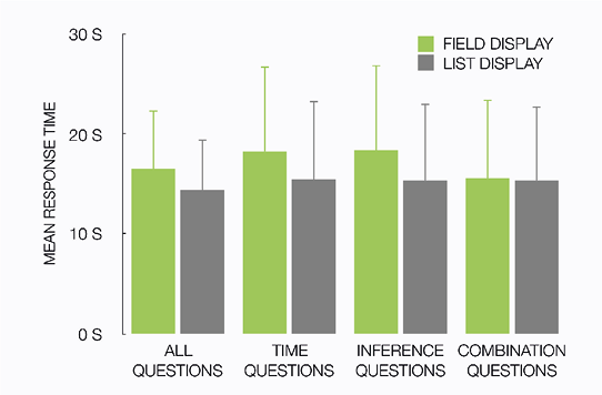
Notes Error bars are +1 standard deviation.
We also looked at the mean search time for questions that inquire temporal information, as we expected that the field display would have an advantage over the list display because it visualizes time. This analysis of a subset of the questions however revealed an opposite effect of display used on search times, F(1, 476) = 62.14, p < .001, ηp2 = .115): Search times were slower when the field display was used (M = 18.3 s) than when the list display was used (M = 15.0 s).
Analysis of search times for questions that required inferences or comparisons between elements again revealed a main effect of the display that was used, F(1, 506) = 31.19, p < .001, ηp2 = .058). This main effect was qualified by an interaction with the type of question (display × question type, F(1, 506) = 35.99, p < .001, ηp2 = .066). When answering a question required an inference to be made, search times were slower when the field display was used (M = 18.4 s) than when the list display was used (M = 15.3 s), F(1, 506) = 57.96, p < .001, ηp2 = .103). This difference between the two displays was not present when answering a question required information elements to be compared: The difference between search times when the field display was used (M = 15.6 s) and when the list display was used (M = 15.4 s) was not significant, F < 1.
Analysis of the two-alternative forced choices concerning appreciation, shown in Figure 6.4, revealed that the list display was found to be useful by more participants than the field display (χ2(1) = 79.14, p < .001). The same holds for clarity (χ2(1) = 79.14, p < .001) and completeness (χ2(1) = 5.14, p < .025).
Figure 6.4 Preferences for the displays, expressed as the percentage of users preferring each display.
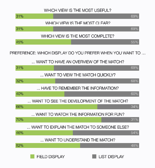
Notes Error bars are +1 standard deviation.
Analysis of the preferences, shown in Figure 6.4, revealed that more participants preferred the list display over the field display for three of the seven usage scenarios. The list display was preferred over the field display for “having an overview of the match” (χ2(1) = 73.64, p < .001). The list display was not only faster with regard to the search times, more participants preferred the list display of the field display for wanting to “view the game quickly” (χ2(1) = 66.28, p < .001). The list display was also preferred by most people for “remembering the information” (χ2(1) = 22.74, p < .001).
Concerning the other four scenarios, in line with our expectations users did show a preference for the field display when it came to “seeing the development of the game”, (χ2(1) = 55.28, p < .001). There was also a preference for the field display for “watching the information for fun” (χ2(1) = 80.37, p < .001). There was no significant difference between the proportion of participants that preferred the field display and those that preferred the list display when it came to “explaining the game to someone else” (χ2(1) = 2.88, p = .09) and “understanding the game” (χ2(1) = 1.19, p = .28).
The search time analyses revealed that the field display led to significantly slower responses than the list display. We expected that the field display would be slower than the list display overall, but we did not expect that this was also the case when participants had to answer questions that inquired temporal aspects of the games. No advantage of the field display’s visualization of time was found in the search times − on the contrary, the field display is slower than the list display.
We also compared search times for the two displays for questions that required an inference to be made (e.g., “which player scored the winning goal?”), and that required multiple information elements to be compared (e.g., “which team had the most shots on goal?”). We found that the field display is slower than the list display for answering questions that require inferences (Kessel & Tversky, 2011; Tversky, 2001; Tversky, 2011a). But concerning questions that required information elements to be compared, no significant difference in search time was found.
Looking at appreciation and preferences, our (tentative) expectations were supported by the data. The list display was found to be more useful, clear, and complete than the field display. The field display was only preferred over the list display when it came to watching the information for fun, and seeing the development of the match. This latter preference contrasted with the findings from the search time analysis: After using the displays participants indicated that they appreciated the visualization of temporal information in the field display, yet they did not seem to take advantage of it in terms of efficiency.
Table of contents
General discussion
In this study, we have compared two real-world informationally equivalent displays of soccer stats (Figures 6.1 and 6.2), to address the more general question of how data should be visually displayed. We have compared the displays in a qualitative analysis, and in a large-scale quantitative user evaluation, to examine the assumption that cognitively natural design-meaning mapping in an information display is beneficial for users.
The results of the qualitative analysis, summarized in Tables 6.1 and 6.2, show that the displays differ in terms of the number of design-meaning mappings they employ, and that having more of such mappings increases the risk of using the same visual variable for different meanings. Also, some mappings do not apply to all information elements. To test whether these differences between the displays have repercussions for the efficiency and appeal of the displays when they are actually used, we conducted a large-scale quantitative user evaluation of the displays to measure performance (search times) and preferences of the users.
The quantitative evaluation showed that the more richly designed (and, as a consequence, inconsistent) field-based display (Figure 6.1) led to slower search times than the list display (Figure 6.2) when users were asked to find information and answer questions about soccer games. This is largely in line with our expectations, as our analysis of the displays yielded the observation that the field display’s performance may be compromised as a result of having inconsistencies and ambiguity in design-meaning mappings. This also led to the field display being slower for answering questions that required inferences to be made. However, for questions concerning temporal aspects of the soccer games we expected the opposite. Because the field display visualizes time on a clock, which is an arguably very natural design-meaning mapping, we expected that the field display would be faster for such question. However, this turned out to be reversed, and even for these questions the field display was the slower of the two.
The experiment also pointed out that users mostly preferred the list display over the field display, except when they want to see the development of the game, or when they want to see the stats for fun. Because of the large number of participants in this evaluation (539), we not only have high statistical power, but we can also generalize over different cognitive styles, age groups, and levels of expertise.
Our findings challenge the view that natural mappings of design features to meaning in information displays always improve the effectiveness of a display by making it more efficient and more fun to use (e.g., Kosslyn, 2006; Hegarty, 2011; Tversky, 2011a). Natural mappings are useful, but we have seen that too many of these mappings may in fact be detrimental for performance and preference. For example, the field display is more ‘designed’ but is also less efficient to use and not always preferred over the simpler list display. So, stacking simple design principles into one design may counterfeit the efficiency entailed by the individual principles.
This also raises some interesting new research questions, which concern both the efficiency of information designs and preferences of users for such designs. Our findings on efficiency suggest that there may be some kind of a threshold in design choices: When some number of natural mappings used to define information elements is exceeded, a design can become less efficient (i.e., users find information less quickly). In the displays that we compared, we found that one information element may be defined by multiple visual variables, that there may be inconsistencies in how these multiple visual variables define the element, and that analogies in a design may be misleading. To disentangle these potential causes for a rich design to become less efficient, experiments can be carried out that take performance measures while systematically varying the number of visual variables, consistencies, and analogies in a design.
Can the differences in search times between the two displays also be ascribed to the possibility that the list display may be more conventional as a display of soccer stats than the field display is? Users of information displays apply knowledge of display conventions (i.e., “display schema’s”; Hegarty, 2011, p. 454) when interpreting an information display. So, if the list display adheres to these display schema’s where the field display does not, this may greatly affect search times to the benefit of the list display. We have looked into this by studying whether the search times that we report may fluctuate as a factor of a user’s familiarity with soccer and soccer stats. We did ask participants in the quantitative analysis whether they liked soccer and whether they were familiar with soccer stats. However, we could not find reliable interaction effects between liking soccer (stats) and the the display that was used on search times or preferences. Future research can address the question as to what extent knowledge of particular visualization styles plays a role in assessing the effectiveness of information displays.
We have found that a more richly designed information display is often not preferred over a simpler display by users, but our data does not allow us to see which aspects of the displays drive these judgments. Again, further experiments are warranted that disentangle the effects of different aspects of information designs (e.g., inconsistency, analogy) on user preferences. Additionally, participants in our study expressed preferences after having used both displays to find information about soccer games, such that they can be compared on the same merit. However, it may also be interesting to compare these judgments to preferences of people who have not (yet) used the designs, as intuitions about visual representations may not always be in line with actual efficiency (e.g., Smallman & Cook, 2011).
Mapping decisions on the color, size, form, and location of information to meaning in a natural or compatible way is a well-known adagium in the design literature (e.g., Agrawala et al., 2011; Vande Moere & Purchase, 2011). However, in our case study we have shown that a design that contains many of such natural mappings is not a better design by definition. Efficiency and users preferences were compromised by the richness of the design in terms of the number of such design-meaning mappings employed.
This can be regarded as an argument in favor of more minimalistic design: Using less visual variables in a design can make the design more efficient and more likable. But it may be even more important to keep an eye on the consistency of design-meaning mappings. When many different design features are used to define information elements on different levels of precision (e.g., grouping, ordering), the risk of being inconsistent in these mappings increases. A design that contains many mappings, but is inconsistent, may not necessarily led to users finding the design more efficient and more preferred.
Proposing a redesign for the information displays that we analyzed and evaluated lies outside the scope of the current research. However, our work does allow us to recommend some more general guidelines for information design, related to our findings concerning the number of design-meaning mappings employed, and potential inconsistencies in design-meaning mapping.
The first guideline we formulate is to avoid ‘stacking’ visual variables in an information display. Our analyses and evaluation suggest that when multiple visual variables are used to assign meaning to an information element, efficiency of the information display may be compromised. A rule-of-thumb may be to not use more than two visual variables (e.g, color, size, location, form) to define an information element.
This guideline is advised to be used in correspondence with a second recommendation: Avoid inconsistent design-meaning mappings. When a visual variable (e.g,. color, size, position) is used to assign meaning to an information element (e.g., on a nominal or ordinal level), choose these design-meaning mappings in concordance with other mappings in the same display.
Although applying these guidelines to the field-based display discussed in this chapter probably leads to a more efficient display (and better user evaluations), future experimental research is needed to address the scope of these guidelines, and to investigate their generalizability.
Table of contents
References
Agrawala, M., Li, W., & Berthouzoz, F. (2011). Design principles for visual communication. Communications of the ACM, 54(4), 607—69.
Bertin, J. (1981). Graphics and graphic-information-processing. New York: Walter de Gruyter.
British Broadcasting Corporation. (2010). Netherlands − Brazil. BBC Sport World Cup 2010. Retrieved March 6, 2011, from http://news.bbc.co.uk/sport2/hi/football/worldcup2010/8729486.stm
Carpendale, M. S. T. (2003). Considering visual variables as a basis for information visualisation. University of Calgary, Department of computer science, 2001—693—16.
Casasanto, D. & Boroditsky, L. (2008). Time in the mind: Using space to think about time. Cognition, 106(2), 579—593.
Clark, H. H. (1973). Space, time, semantics, and the child. In T. E. Moore (Ed.), Cognitive Development and the Acquisition of Language (pp. 27—63). New York: Academic Press.
Hegarty, M. (2011). The cognitive science of visual-spatial displays: Implications for design. Topics in Cognitive Science, 3(3), 446—474.
Kessell, A. M., & Tversky, B. (2008). Cognitive methods for visualizing space, time, and agents. In G. Stapleton, J. Howse, & J. Lee (Eds.), Theory and Application of Diagrams. Dordrecht, The Netherlands: Springer.
Kessell, A. M., & Tversky, B. (2011). Visualizing space, time, and agents: Production, performance, and preference. Cognitive Processing, 12(1), 43—52.
Kosslyn, S. M. (2006). Graph design for the eye and the mind. Oxford: Oxford University Press.
Lakoff, G., & Johnson, M. (1980). Metaphors we live by. Chicago, IL: University of Chicago Press.
Larkin, J. H., & Simon, H. A. (1987). Why a diagram is (sometimes) worth ten thousand words. Cognitive Science, 11(1), 65—99.
MacDonald-Ross, M. (1977). How numbers are shown: A review of research on the presentation of quantitive data in texts. AV Communication Review, 25(4), 359—409.
Shah, P., & Freedman, E. G. (2011). Bar and line graph comprehension: An interaction of top-down and bottom-up processes. Topics in Cognitive Science, 3(3), 560—578.
Smallman, H. S., & Cook, M. B. (2011). Naïve realism: Folk fallacies in the design and use of visual displays. Topics in Cognitive Science, 3(3), 579—608.
Tversky, B. (2001). Spatial schemas in depictions. In M. Gattis (Ed.), Spatial Schemas and Abstract Thought (pp. 79—111). Cambridge, MA: MIT Press.
Tversky, B. (2011a). Visualizing thought. Topics in Cognitive Science, 3(3), 499—535.
Tversky, B. (2011b). Spatial thought, social thought. In T. W. Schubert & A. Maass (Eds.), Spatial Dimensions of Social Thought (pp. 17—38). Berlin: De Gruyter Mouton.
Tversky, B., Kugelmass, S., & Winter, A. (1991). Cross-cultural and developmental trends in graphic productions. Cognitive Psychology, 23(4), 515—557.
Vande Moere, A., & Purchase, H. (2011). On the role of design in information visualization. Information Visualization, 10(4), 356—371.
Zacks, J., & Tversky, B. (1999). Bars and lines: A study of graphic communication. Memory & Cognition, 27(6), 1073—1079.
Zhang, J., & Norman, D. A. (1994). Representations in distributed cognitive tasks. Cognitive Science, 18(1), 87—122.
Table of contents
Chapter 7
General discussion
In this concluding chapter, first the most important findings of Chapters 2 through 6 of this dissertation are summarized. A brief overview of the experimental conditions and main findings of each chapter is given in Table 7.1. Second, reflections on general conclusions and overarching themes connecting the individual chapters are provided. Third, limitations of the work in this dissertation and a number of suggestions for future research are discussed. Finally, the studies in this dissertation lead to a number of suggestions on methodological issues in experimental research into the cognition of visual understanding, which are discussed at the end of this chapter, together with some considerations for practical applications of the current work.
Table of contents
Research questions and summaries per chapter
In this dissertation, five studies are reported that investigate effects of visual realism in representational pictures on cognitive processing. Deviations of visual realism, in the form of color atypicality, are the topic of study in Chapters 2 and 3. Chapters 4 and 5 deal with deviations of visual realism in the form of schematization. Using realistic elements in an information design is studied in Chapter 6. Below, these chapters are discussed in the light of the research questions formulated in the preface (Chapter 1).
Why are incongruent pictures (atypically colored objects) remembered better than congruent pictures (typically colored objects)?
In Chapter 2, atypically colored objects were used to address the question why people generally remember ‘strange’ or ‘different’ things better than common things. This effect is called the bizarreness effect, because the stimuli that are remembered better are distinctive from what is common or normal in the everyday world (e.g., Gounden & Nicolas, 2012; Hunt & Worthen, 2006; McDaniel & Einstein, 1986; Schmidt, 1991). While this effect has been established using a variety of stimulus materials and experimental procedures, the question why it occurs is subject to ample debate. One explanation concerns processing time: Distinctive items are remembered better because they receive longer or more elaborate processing during encoding than common items (e.g., Gounden & Nicolas, 2012; Kline & Groninger, 1991; McDaniel & Einstein, 1986). In the experiments described in Chapter 2, methodology from object recognition research (e.g., Therriault, Yaxley, Zwaan, 2009) was combined with procedures in memory research (e.g., McDaniel & Einstein, 1986) to investigate this processing time hypothesis. Participants named typically and atypically colored objects, and naming latencies were measured. After a two-week delay, they performed in memory tasks (old/new-recognition in one experiment, and free recall in the other).
The results of the recognition experiment suggested that processing time explains the bizarreness effect: An increase in processing time caused by color atypicality in the naming task predicted increased memorability for atypically colored objects in the delayed recognition task. However, in the free recall experiment such an effect was not found. These findings are interpreted as indicating that processing time during encoding explains part, but not all, of the bizarreness effect.
Are incongruent pictures (atypically colored objects) described differently than congruent pictures (typically colored objects)?
In Chapter 3 color atypicality was investigated in the context of language production. Specifically, Chapter 3 concerns the production of referring expressions: definite descriptions of objects in a visual context, produced by a speaker in such a way that an addressee can uniquely identify the referent object in that same visual context (such as “the red apple”). Previous work showed that speakers often produce color adjectives, even when these are not strictly necessary for unique identification (e.g., Koolen, Gatt, Goudbeek, & Krahmer, 2011; Pechmann, 1989). In Chapter 3, this is related to color typicality: Do speakers produce color adjectives more often when the referent object’s color is atypical? The prediction was that they would, as color typicality plays an important role in object recognition (an important part of reference production; e.g., Humphreys, Riddoch, & Quinlan, 1988; Tanaka, Weiskopf, & Williams, 2001), and because atypical colors attract the visual attention of both speakers and addressees (e.g., Becker, Pashler, & Lubin, 2007).
The results confirmed this prediction: There was a strong positive correlation between the degree of color atypicality of a target object and the proportion of speakers that mentioned color when referring to this object. Also, in line with studies in object recognition, the effect of color atypicality was stronger for objects with simple shapes than for objects with more complex shapes. This interaction between color atypicality and shape complexity was attributed to a relatively higher contribution of color information in object recognition for simple-shaped objects, because simple uncharacteristic shapes are less informative for recognition (e.g., Tanaka & Presnell, 1999). This makes manipulations of color atypicality for such objects more conspicuous, leading to an amplified effect on the content of referring expressions.
Are route descriptions that are based on realistic maps (aerial photographs) different from those based on schematic maps?
Chapter 4 addressed the question whether visual detail in route maps affects the way people verbally describe these routes, by comparing route descriptions of short and long routes, based on schematic maps or on aerial photographs (much like the “map” and “satellite” modes found in popular mapping applications such as Google, Apple, or Bing Maps). Aerial photographs contain more visual clutter (i.e., redundant visual detail; e.g., Coco & Keller, 2012; Rosenholtz, Li, & Nakano, 2007) than schematic maps, and the effects of this visual clutter were investigated in a language production experiment. Participants briefly studied a route map from a screen, and consecutively produced a spoken description of the route. Analyses of the produced descriptions particularly focused on how speakers refer to choice points. Choice points are locations on the route map where one has to change direction (i.e., by turning a corner), and speakers usually refer to these points by making use of landmarks (e.g., Allen, 2000; Daniel & Denis, 2004). In the experiment in Chapter 4, participants made use of either so-called route-external landmarks (e.g., “go left at the pharmacy”) or route-internal landmarks (e.g., “go left at the second street”).
This choice for external or internal landmarks was found to be affected by the degree of visual clutter in the route maps: Descriptions based on cluttered maps showed a higher preference for external landmarks compared to the schematic maps condition. This effect is attributed to the fact that external landmarks are more robust and less ambiguous than internal landmarks (i.e., there are many points on a map that can be pinpointed as “the second street”, while choice points designated by an external landmark may be more unique). However, producing external landmarks from memory comes at a cost: One has to memorize the specific names of these landmarks, like “the bakery” or “the pharmacy”. This is reflected in our finding that when routes are longer, and thus contain more choice points, speakers revert to using the slightly more ambiguous but more memory-efficient internal landmarks.
Some interesting collateral effects of visual clutter in route maps on spoken route descriptions were observed as well. Route descriptions based on cluttered maps contained more verbal clutter: Such descriptions contain more words, more propositions, and more non-essential assertions such as “keep walking”, compared to descriptions based on schematic maps.
Why do students learn better from schematic pictures (line drawings) than from detailed pictures (microscopic photographs)?
Visual realism as visual detail is also of interest for research in educational psychology and instructional design. Chapter 5 addressed the question whether and how visual detail in representational pictures affects how students comprehend expository materials consisting of text and pictures. Such materials present students with explanatory text illustrated by representational pictures that show what certain parts and subprocesses look like. Previous research suggests that using simple, schematic line drawings may yield better results on comprehension post-tests than using detailed photographs (e.g., Butcher, 2006; Joseph & Dwyer, 1984; Scheiter, Gerjets, Huk, Imhof, & Kammerer, 2009). However, the question why this is the case warrants further investigation.
In the experiment reported in Chapter 5, secondary school students were presented with a short text about mitosis (the six-phase biological process of cell reduplication), adjoined by either detailed photographs of each of the phases of mitosis, by schematic line drawings, or by a hybrid format in which the line drawings were superimposed on the photographs. The focus was on the process of making meaningful referential connections between text and pictures during study, as it was assumed that students search for visual referents in the pictures that correspond to concepts in the text (e.g., when a student reads about a certain movement of chromosomes during the anaphase of mitosis, she or he attempts to identify the chromosomes in the picture of the anaphase).
The results of this study supported the hypothesis that students’ performance is hampered by detailed photographs because these yield more difficulties for finding visual referents than schematic line drawings do. How well students were able to find these connections predicted performance on a comprehension test. Furthermore, the comparison between detailed, schematic, and hybrid pictures showed that students in the hybrid picture condition performed just as good as their peers in the schematic line drawings condition. The hybrid condition contained the visual emphasis (e.g., thick lines, clear contrasts) found in schematic line drawings, but also showed a similar amount of visual detail as the photographs. This suggests that the potential advantages of schematic pictures for finding visual referents and for comprehension are mainly attributable to the added visual emphasis in schematic pictures, and not to a mere reduction of visual detail.
Does the use of visually realistic elements affect how people interpret and use an information display?
In Chapter 6, a more applied perspective on visual realism was adopted to study effects of using realistic elements and natural metaphors in an information display on how efficiently people can use this display. Two real-world information displays showing soccer statistics were compared in a quasi-experimental setting. One display was mostly text and table based, and showed basically no visual resemblance to real-world soccer. The other display, however, looked like a football field, and icons and football-related symbols such as balls and yellow cards were distributed on the field in a manner that made use of real-world knowledge about soccer. For example, data on shots on goal was displayed in the goal areas, and statistics on corners were shown in the corners of the field. Additionally, the latter display made heavy use of cognitively natural metaphors such as showing large numbers (i.e., a high number of corners) as larger shapes on the field.
The two information designs that were compared differed in terms of visual realism. The field-based display copied a number of visual elements from actual soccer, by showing a field, balls, yellow cards etcetera on relevant places on the field. However, although the realistic elements in the field-based display are theoretically beneficial for finding and understanding information (e.g., Agrawala, Li, & Berthouzoz, 2011; Kosslyn, 2006; Larkin & Simon, 1987; Tversky, 2011; Vande Moere & Purchase, 2011; Zhang & Norman, 1994), the experiment in Chapter 6 showed that this display was actually less effective in several respects, such as finding data and drawing inferences. Also, the text-based display, which contained no realistic elements, was largely preferred by its users. These results support the idea that experimentally tested design principles may yield unexpected results when scaled up to real-world displays (Hegarty, 2011). In particular, combining multiple design-meaning mappings in one display may yield inconsistencies in how certain visual variables (color, size, form, and location) are to be interpreted, leading users to find information less quickly and less easily.
Table 7.1 Overview of the studies, conditions, and selected results in this dissertation.
|
|
Field of research |
Experimental conditions |
Results (selected) |
| Chapter 2
Naming and remembering typically and atypically colored objects |
|
Memory |
Typically colored objects (TCO)
Atypically colored objects (ACO) |
ACO are named named slower than TCO.
ACO are remembered better in delayed recognition than TCO.
No differences between ACO and TCO in free recall. |
| Chapter 3
Describing typically and atypically colored objects |
|
Language production:
Referring expressions |
Typically colored objects (TCO)
Atypically colored objects (ACO) |
Color adjectives are more often used in descriptions of ACO than in descriptions in TCO. |
| Chapter 4
Describing routes from schematic and realistic maps |
|
Language production:
Route desciptions |
Aerial photographs (AP)
Schematic maps (SM) |
More use of external landmarks
(e.g., the shop) when AP are described compared to SM.
Descriptions based on AP are longer than those based on SM. |
| Chapter 5
Learning with schematic, realistic, and hybrid pictures |
|
Learning and comprehension:
Instructional design |
Microscopic photographs (MP)
Schematic pictures (SP)
Hybrid pictures (HP) |
HP are rated as most useful.
Comprehension was lowest in the MP condition.
Making connections between text and pictures was least accurate in the MP condition. |
| Chapter 6
Understanding a visually rich information display |
|
Information design |
Visually rich display (VRD)
Visually simple display (VSD) |
Finding information was slower using VRD than using VSD.
In most usage scenarios, VSD is preferred over VRD. |
Table of contents
Reflections on overarching findings and themes
The experiments reported in this dissertation present effects of different deviations from visual realism, using stimuli diverging in complexity and usage context, and situated in multiple fields of study. Visual realism is found to be a factor in studies in recognition, memory, language production, learning and comprehension, and information design.
In the preface (Chapter 1), it was hypothesized that deviations from visual realism in representational pictures influence how people process these pictures. All studies in this dissertation, reported in Chapters 2 to 6, offer support for this hypothesis, by showing that deviations of visual realism in pictures, either in terms of color atypicality or as schematization, influence a number of human reactions towards these pictures.
Taken together, the experimental studies in this dissertation offer evidence for three explanations for differences in processing between pictures that are visually realistic, and pictures that violate visual realism. First, atypical pictures of objects are more distinctive, which results in visual salience for the viewer (Chapters 2 and 3). Second, schematic pictures are less visually cluttered and offer visual clarity (Chapters 4 and 5). Third, atypicality and schematization have repercussions for how cognitively natural pictures are to process.
There are interesting parallels between distinctiveness (cf. Chapter 2) and visual salience (cf. Chapter 3). Both chapters have looked into behavioral effects of presenting pictures of objects in atypical colors, compared to control conditions in which the same objects are depicted in their natural colors. Both chapters bring to light that atypical colors draw visual attention (also, see Becker et al., 2007). By acknowledging that atypically colored pictures can be both visually salient and distinctive in memory, the suggestion arises that salience and distinctiveness may be highly similar or even identical aspects of a picture.
Does distinctiveness always result in visual salience? Although distinctiveness is a notion stemming from memory research (e.g., Hunt & Worthen, 2006), and the concept of visual salience stems from research into visual processing and visual search (e.g., Itti & Koch, 2000), distinctiveness and visual salience appear to align under certain circumstances. This alignment is especially apparent when considering that a major dichotomy in distinctiveness effects in memory aligns well with a dichotomy in salience effects in visual processing. In memory research, on the one hand, primary and secondary distinctiveness effects are distinguished (Schmidt, 1991). Primary distinctiveness refers to an item being distinctive because it is different from other items in the same context (e.g., the word “dog” in a list of fruits). Secondary distinctiveness is related to an item being distinctive because it contrasts with stored knowledge and expectations in long-term memory (e.g., the sentence “the dog rode the bicycle down the street”; McDaniel & Einstein, 1986). In studies on visual salience, on the other hand, a distinction is made between visual salience of objects in contexts because these objects are incongruent with the gist of the context in which they are shown (Loftus & Mackworth, 1978; Underwood & Foulsham, 2006), and visual salience of objects that show incongruence within the object itself; for example because of an atypical color (as in Chapters 2 and 3; Becker et al., 2007). As such, a parallel between primary distinctiveness and context-dependent visual salience on the one hand, and between secondary distinctiveness and object-intrinsic oddities on the other can be observed.
The results of the experiments in Chapters 2 and 3 give support to the idea that objects with object-intrinsic oddities (in this case atypical colors) are secondary distinctive, and visually salient: They differ from mental representations, and draw visual attention resulting in different verbal descriptions. A possible follow-up question to this may then be whether a similar parallel can be uncovered between primary distinctiveness and context-dependent visual salience. This may open up new research ventures, in which concepts from memory research may be related to concepts in language production and visual processing (and vice versa).
Chapters 4 and 5 in this dissertation discuss visual realism in relation to visual clutter. Visual clutter is defined in terms of physical characteristics of images, comprised of a congestion of features, dense edges, and low entropy (Chapter 4; Coco & Keller, 2012; Donderi, 2006; Rosenholtz et al., 2007). These characteristics are found to slow down visual search and visual processing. Visual clutter is found to affect language production in Chapter 4 (and in other recent work, e.g., Clarke, Elsner, & Rohde, 2013; Coco & Keller, 2012; Koolen, Krahmer, & Swerts, 2015).
It may be tempting to draw the conclusion that schematization can simply be defined as a reduction in visual clutter. A schematic picture namely contains fewer physical features, fewer edges (and edges are less close together in general), and entropy is typically higher than what is the case for realistic or photographic pictures. Conversely, a picture that entails a high level of realistic detail (i.e., photographs) is often a visually cluttered picture. However, Chapter 5 in particular suggests that visual clutter is not the one defining factor that tells apart realistic from schematic graphics. Schematization, besides a reduction of visual clutter, also involves visual emphasis of edges, and other visual elements. So, compared to realistic pictures, schematic pictures do not only leave out visual detail, they also make use of thick, sharp, and contrasting lines to depict things. This is further explored in Chapter 5, but it may also be applicable to the stimuli in Chapter 4 (and to some extend to the information designs in Chapter 6). Schematic route maps do not only contain less visual detail than aerial photographs, they also use sharp lines and often contrasting colors to depict an environment. Furthermore, recent work on route descriptions suggests that effects of visual clutter on route descriptions can occur irrespective of the level of visual realism in route map stimuli (Baltaretu, Krahmer, & Maes, 2014).
These observations suggest that a distinction between schematic and realistic visualizations is not only related to a reduction in visual clutter, but also involves an increase in visual clarity by adding lines and contrasts. The experimental results reported in Chapter 5 moreover put forward that some benefits of schematization may only be related to this latter increase in clarity, and not to a reduction in visual clutter per se.
Another parallel between chapters is based on the idea of cognitively natural processing. As introduced in Chapter 6, a cognitively natural design is an information design that exploits the workings of human perception, supporting a natural (‘unforced’) interpretation and understanding of an (information) graphic, by fitting for example image schemas (Hegarty, 2011) or familiar metaphors. One may stretch the definition of cognitive naturalness, by extending it to picture interpretation in general: A cognitively natural picture is one that can be processed in a less effortful way than a picture that does not align with existing image schemas.
An appealing question is then whether visually realistic pictures are cognitively natural to process. Do visually realistic pictures require less cognitive effort to process than pictures that violate reality? This question is best addressed by considering the two ways in which visual realism is manipulated in Chapters 2 through 5 in this dissertation. Atypically colored pictures are presumably processed less fluently than typically colored ones, as recognizing, describing, and remembering atypically colored pictures of objects (as in Chapters 2 and 3) is affected by whether the processing of such pictures is less alike the processing of actual, natural objects. In that sense, it can be said that realistic pictures are indeed processed in a way that is more cognitively natural.
However, concerning effects of schematic pictures, it is less straightforward to determine whether schematic pictures are less cognitively natural than realistically detailed ones. While some may suggest that realistically detailed pictures are more alike reality and are therefore easier to process (e.g., Imhof et al., 2011), the reduced visual clutter and increased clarity in schematic pictures likely makes the cognitive processing of schematic pictures more fluent (Tversky, Morrison, & Bétrancourt, 2002). The results of the experiments in Chapters 4 through 6 support this latter suggestion that many schematic pictures may be more cognitively natural to process than pictures with a high level of realistic detail. This may be explained by considering that a cognitively natural picture is probably one that is most alike previous experiences (and the mental representation that is built on the basis of those), rather than a picture that is most alike ‘reality’. Schematic pictures may be indeed cognitively natural when considering aerial photographs (i.e., Chapter 4) and microscopic photographs of biological cells (i.e., Chapter 5): Many people probably know the street plan of a city without having ever seen it from up in the air, but they know it based on schematic maps. Also, most people have probably learned about biological cells and anatomy based on schematic pictures in schoolbooks, and not based on experiences with the topic in reality. Taken together, previous experiences with a topic may be based on (schematic) pictures themselves, and not on (tangible) experiences with the topic in the world outside of the picture.
Taken together, the above suggests that visual realism cannot be equated to cognitively natural design per se, but that cognitive naturalness relates to prior experiences and the build-up of prior knowledge. Undeniably, more research is needed to further explore the relationships between visual realism, typicality, schematization, and cognitive processing effort.
Irrespective of whether pictures that violate visual realism are cognitively natural or not, the studies in this dissertation do suggest that violations of visual realism can have a number of potentially beneficial effects. In Chapter 2, pictures of atypically colored objects were found to be remembered better than typically colored objects. Chapter 3 reports that spoken descriptions of atypically colored objects often contain color attributes, while descriptions of typically colored objects do not, which may be beneficial for listeners who want to identify which object is described. Schematic pictures may be more beneficial for certain purposes than realistic ones as well. This is put forward in Chapter 4, where it is found that route descriptions based on schematic maps are more efficient than descriptions that are based on photographic maps. Chapter 5 reports how secondary schools students may benefit from schematization in pictures when studying from textbooks. Finally, an evaluation of two information displays presented in Chapter 6 suggests that abstaining from using realistic elements in such displays leads to better performance when finding information.
Table of contents
Limitations and suggestions for future work
A number of limitations of the work in this dissertation will be discussed. First, only color atypicality and schematization (i.e., leaving out visual detail) are considered as manipulations of visual realism, ignoring other potential violations of realism. Second, individual differences and relevant personal characteristics are not of primary interest, while they would have been relevant for most of the studies. Third, despite the merits of employing cognitive psychology as the general approach towards exploring visual realism, other approaches can be considered as well.
Color atypicality and schematization are only two of many potential ways in which representational pictures can be incongruent with reality. Pictures can be non-realistic in other ways as well, for example by distorting objects’ size or texture. A useful perspective on a possible array of violations of visual realism may be one in terms of visual variables (Bertin, 1983), thereby considering violations of for example size, shape, orientation, and texture. In future work, it may be interesting and feasible to investigate whether atypicality on each one (or a combination) of these variables has an influence on cognitive processing. Also, a perspective in terms of visual variables suggests it may well be possible to schematize pictures in different ways, by systematically leaving out certain visual variables. Crossing visual variables (size, shape, etc.) with different types of violations (atypicality, schematization) yields an intricate array of directions for future research. Furthermore, manipulations of visual realism can entail both object-intrinsic violations (such as strange orientations or atypical colors, cf. Becker et al., 2007), and contextual oddities (Loftus & Mackworth, 1978). Moreover, there is a wide range of dependent measures that can be considered in future work, especially considering how the few studies in this dissertation have already employed several dependent measures such as naming latency, recognition, recall, description, comprehension, making connections, finding information, appreciation, and perceived utility. In sum, further explorations and tests into the influence of visual realism on processing can take many directions, considering different aspects of reality that can be violated in representational pictures, different ways in which pictures can be non-realistic, object-intrinsic versus contextual oddities, and a wide range of dependent measures.
Future work can also aim at uncovering the influence of personal characteristics and individual differences between perceivers of representational pictures that deviate from visual realism. As illustrated in Chapter 1, one can assume that prior knowledge plays an important role in the understanding of non-realistic pictures. In effect, a picture is non-realistic when it violates one’s expectations and assumptions about reality. Considering that such expectations and assumptions may be different for individuals, taking into account individual differences when studying the influence of visual realism would be relevant for both future work as for the work presented in this dissertation. Looking at Chapters 2 and 3 for example, some colors that are deemed atypical in Western societies (e.g., red bananas) may not be atypical for individuals living in areas where fruits in different colors are more common (e.g., red bananas are relatively popular in Central America). The work presented in Chapter 4, concerning navigation and route description, may also be relevant in the light of individual differences. Given that several (online) mapping and navigation software products provide users with a choice between photographic and schematic maps, it may be interesting to consider a user’s preference for either one of the two modes when studying how route maps are described. Also, one’s experience with describing routes from such maps can be a relevant factor. In Chapter 5, concerning learning with schematic and photographic pictures, prior knowledge on the subject of mitosis is assumed to be comparable across conditions, and a prior selection of participants is made to avoid such confounds (i.e., only students who did not have biology as a compulsory subject in their study curriculum took part). However, this does not rule out that studying interactions between prior knowledge, level of expertise, personal preferences, and the effect of schematic, detailed, and hybrid pictures would be an interesting and potentially fruitful direction for further investigation.
Other limitations of the work in this dissertation are related to the general approach in terms of cognitive psychology, and employing quantitative, deductive research methodologies to explore the influence of visual realism on the processing and understanding of pictures. It can be argued that taking an explorative and more inductive approach using qualitative methodology is fruitful as well. Pictures, graphics, and visualizations are the object of study in for example graphic design, semiotics, and philosophy of language. Such analyses may start with considering visual realism in relation to the iconic nature of representational pictures (one may for example define visual realism in terms of the degree of resemblance between signifier [picture] and signified [reality], thus effectively equating visual realism to the degree of iconicity of the representation). Such a semiotic view may also be more suitable in acknowledging the role of the sender and receiver in the process of visual communication: The semiotic triangle comprises of object (referent; reality), symbol (picture), and the reference (thought, of the communicator and of the receiver). In contrast, the dominant view in cognitive psychology as well as in this dissertation is mainly focused on two aspects: internal and external representations (De Vries, 2012). This dyadic (instead of triadic) view on pictures and their interpretation can be said to underrepresent the importance of sender and receiver of visual communication, and may therefore fall short of acknowledging the potential role of individual differences therein.
A further direction for future research is related to the scope of this dissertation in terms of the processing of pictures. The current work is limited to this processing, which is an important but arguably small part of visual communication. Future work may thus corroborate the current findings, and lead to specific questions on how variations in visual realism affects particular kinds of visual messages such as manuals, warnings, and marketing materials. For example, do changes in visual realism affect how instructions instruct, warnings warn, and how advertisements advertise and persuade? In fact, some of the work in this dissertation (Chapters 5 and 6, for example) takes a step in this direction by focusing on the utility value of visual realism in visual communication. However, more work can be done to increase the applicability and utility validity of the current work.
Table of contents
Methodological implications
The work in this dissertation constitutes an exploration of visual realism in representational pictures, commenced from a myriad of different angles and scientific fields, and using different methodologies. In some fields, considering a deviation from visual realism as a factor appears to be a relatively novel approach, for example in reference production (Chapter 3). In other fields, such as instructional design (Chapter 5), the level of visual of realism in pictures has been in focus for a number of decades, and our work can be seen more as building on existing findings and expanding the understanding of the potential effects of visual realism.
In this dissertation, it is attempted to utilize potentially interesting connections between different fields of research. In every chapter, research in a certain field has been intertwined with findings and theories from one or more other fields. Chapter 2 combined methods from object recognition with procedures from memory research. In Chapter 3, findings in object recognition and suggestions from visual attention research were combined with language production. Chapter 4 combined research in route description and navigation with studies in reference production and visual perception. Chapter 5 combined insights from visual perception and visual search with research on education and text comprehension. Chapter 6 connected insights from visual metaphor with perception and information design. By identifying and exploiting such connections between different fields of study, the work in this dissertation motivates to further acknowledge and build upon the potential opportunities that such an interdisciplinary approach yields.
The individual studies in this dissertation bring to bear a number of more chapter- and field-specific methodological implications. These implications are derived from the findings reported in this dissertation, as well as from the methodologies employed. Below, methodological implications are discussed for each chapter.
Chapter 2 introduced an experimental paradigm designed to investigate the processing time hypothesis for the secondary distinctiveness effect in memory. Previous studies generally investigated this hypothesis by grouping participants in different presentation time conditions, so that memory performance can be compared for people who saw stimuli for, say, 500 or 1,000 milliseconds (Gounden & Nicolas, 2012; Kline & Groninger, 1991; McDaniel & Einstein, 1986). Instead, taking up methodology from object recognition research processing time was measured, instead of manipulating presentation time. In an object naming task, participants recognized and named objects, and response times in this task were regarded as processing time in an incidental learning task (e.g., Nicolas & Marchal, 1998). Consecutively, participants performed in recognition tasks to gauge their memory for the objects that were named earlier (comparable to for example McDaniel & Einstein, 1986; and Michelon, Snyder, Buckner, McAvoy, & Zacks, 2003). This combination of methodologies allowed a prediction of memory performance based on processing time, effectively yielding a relatively direct test of the processing time hypothesis. Additionally, the type of distinctive objects used (i.e., atypically colored objects) was based on stimuli in object recognition studies (e.g., Naor-Raz, Tarr, & Kersten, 2003; Ostergaard & Davidoff, 1985; Therriault et al., 2009). In such studies, it has been repeatedly found that atypically colored objects are recognized less quickly than typically colored objects. This finding from the field of object recognition has been utilized to investigate the processing time hypothesis in memory research in Chapter 2.
Chapter 3 presented a study that combined stimuli comparable to those in Chapter 2 with findings in visual attention, to make predictions in the field of language production. This has yielded an experimental design that utilizes findings from object recognition and visual attention to study language production: Atypical colors affect object recognition (e.g., Tanaka et al., 2001; Chapter 2), they attract visual attention (Becker et al., 2007), and this affects verbal descriptions of these objects. The findings of Chapter 3 tap into two recent discussions in reference production research concerning the degree to which stimuli are naturalistic or visually realistic. In several recent publications, it is argued that when natural language production is behaviorally studied, the pictures and objects that participants describe should be relatively naturalistic (e.g., Clarke et al., 2013; Clarke, Coco, & Keller, 2013; Coco & Keller, 2012; Koolen, Houben, Huntjens, & Krahmer, 2014; Mitchell, 2013; Mitchell, Reiter, & Van Deemter, 2013a, 2013b). Color atypicality is one factor that impacts the degree to which stimuli are naturalistic, and as it has a considerable impact on reference production, this may be relevant for studies in which stimuli are mainly composed of atypically colored objects. As such, our results seem to argue against using artificial contexts in reference production studies because using atypical colors may undesirably boost color use in referring expressions.
Chapter 4 fits in a relatively recent tradition in language production research, in which a route instruction task is employed to elicit referring expressions and other linguistic behavior (e.g., Byron et al., 2009; Koller et al., 2010; Viethen, Dale, & Guhe, 2014). This does not only yield relatively natural behavior in an everyday communicative setting, but it also allows for a more direct valorization of results in for example automated mapping and navigation solutions. However, this comes at the cost of data complexity: Compared to the language production paradigm in Chapter 3, for example, a route description task does yield relatively long, complex, and diverse verbal protocols, which may make certain comparisons between conditions and stimuli less precise than what would be possible when comparing more simple descriptions consisting of one single noun phrase, for instance.
Chapter 5 focused on educational psychology and instructional design, and studied how differences in visual realism may affect comprehension. In particular, the focus was on the process of finding visual referents. A pretest employed eye tracking and analysis of fixations to support the assumption that students engage in this visual search behavior while reading an illustrated text (alike Mason, Pluchino, Tornatora, & Ariasi, 2013, for example). Where eye tracking is an established method to investigate such behavior, for the main experiment an arrow drawing paradigm was developed to measure effects of different picture types on finding visual referents. In this arrow drawing task, participants were instructed to visualize referential connections between text and pictures by drawing arrows. Asking participants to draw and pinpoint the exact locations of relevant visual information allows for a more precise analysis of their ability to do so than eye tracking would. Eye tracking data does reveal where people’s gaze is, but this does not necessarily imply that they have identified relevant information. Also, the time-scaled and complex nature of eye tracking data makes such an analysis considerably more labor intensive than using an arrow drawing task. However, the arrow drawing task measured offline behavior, and it remains unclear to what extent performance on the arrow drawing task mirrors actual visual search behavior during study. This would have not been an issue if it would have been possible to make high-resolution recordings of eye movements on all participants in their classrooms, in a preferably non-obtrusive manner. Unfortunately, this is not (yet) possible.
Where Chapters 2 to 5 contain highly controlled lab experiments, with carefully designed conditions and stimulus materials, Chapter 6 presents a quasi-experimental design in which two real-world information designs were employed as stimuli in qualitative and quantitative comparisons. This is interesting from a methodological perspective, because as Hegarty (2011) points out, effects of design variables in well-defined experimental tasks and environments may not easily scale up to real-world situations. Findings in information design that appear almost trivial in controlled designs, in fact appeared to be harder to understand in the quasi-experimental design of Chapter 6. Another noteworthy methodological asset of this chapter lies in the procedure for recruiting participants. Instead of asking undergraduate students to participate in the experiment (which is often the case in cognitive science research), students were instructed to recruit participants instead. This yielded not only a very large participant group — with each student recruiting a handful of volunteers, hundreds of participants initially took part in our study — but also a remarkable diversity in terms of for example social background and age in the participant group. This potentially allowed for a boost in the ecological validity of the study results. A potential downside of this method is that there is less control over the participants and that not all of the data can be used. It is therefore important to safeguard the quality of the dataset, for example by removing participants who did not finish the experiment, and by tracking the time course of participation and selecting only participants who finished the experiment within a reasonable time (which was done in Chapter 6).
Table of contents
Some considerations for practice
Although the work in this dissertation mainly expresses a theoretical and methodological approach, some considerations for practical applications of our findings can be thought of. In general, designers of representational pictures for different kinds of contexts may be advised to consider using non-realistic pictures, as these can have beneficial effects on for example comprehending and remembering these pictures. Although modern screens and advanced printing techniques make it possible to present high fidelity, realistic pictures, in many contexts using non realistic or schematic pictures can have substantial benefits.
The remainder of this section presents some more potential practical applications of the findings in each chapter.
Findings on visual incongruity and memory (cf. Chapter 2) may be translatable to applications in marketing and advertising. In fact, a number of examples of incongruent colors are seen in advertising nowadays, such as a purple (lila) cow that the Milka chocolate brand uses in their branding. It may be argued that such incongruity makes the cow, and consequently the brand, more memorable. Another interesting example of color typicality and branding was found by Mugge and Schoormans (2012), who report a significant correlation between how novel a product looks, and the perceived quality of the product. Novelty in the product’s appearance was manipulated as color typicality, changing the color of a typically white washing machine to grey or black, and by changing the color of a typically black photo camera to lighter shades of grey and white.
Chapter 3 describes how incongruity leads human speakers to mention this in their referring expressions. This is an especially interesting finding for attempts to simulate human behavior (e.g., Dale & Reiter, 1995; Frank & Goodman, 2012; Krahmer & Van Deemter, 2012), so applications of this finding can be found in Natural Language Generation, Artificial Intelligence, and Social Robotics. If one wants to design and build an artificial agent that can talk about the visible world that it perceives (through cameras), it should be sensitive to atypicality similar to the human speakers in our study, in order to be as humanlike as possible. For example, an artificial shopping assistant or robot may be more advanced and humanlike if it describes unripe fruits as “green”, but would neglect mentioning color when referring to ripe fruits in a grocery store.
Navigation systems and applications that produce verbal descriptions of routes on the basis of map data may be enhanced to more closely mirror human behavior, such as the behavior that reported in Chapter 4. Human speakers in that study exclusively referred to choice points by making use of landmarks, either route-internal (e.g., “Take the second street on the left”), or route-external (e.g., “Go left at the bookstore”). In contrast, most navigation systems (to our knowledge) produce descriptions that rely on distance estimates to refer to choice points (e.g., “Go left after 300 meters”). Context awareness can further enhance automated route descriptions (e.g., Tversky & Lee, 1999) by scanning the visual environment and providing route directions that tap into salient landmarks in the direct vicinity of the person who receives route descriptions. Such a system can then decide to mention these landmarks in route directions. Augmented reality solutions can further build on this, by for example adding visual signals that show where a choice point is, and what direction should be taken (i.e., by showing arrows in situ). They can even single out an important landmark (a peculiar tree, for example), by adding visual emphasis to it for example through showing a label next to an outline around the landmark.
Such visual signals, that emphasize what is important in the visual context, are suggested to be useful for learning and comprehension in Chapter 5 of this dissertation. The hybrid condition in that study added visual emphasis to printed photographs, and this helped students to identify what the important parts of these photographs were. It may be interesting to explore what this finding can mean for augmented reality, where visual emphasis can be added to reality in real time. It is conceivable, for example, that in the near future a surgeon can look to organic structures while goggles or lenses can add visual signals to these structures that single out important parts or anomalies. These visual signals can be added automatically on the basis of computer vision, but may also be ‘drawn’ by another surgeon in order to enhance medical communication.
The findings in Chapter 5 also suggest that although technological advances make it possible to create educational and instructional graphics with more fidelity and visual detail than ever before, designers may need to be careful that this visual realism doesn’t come at the cost of reduced clarity (e.g., Tversky et al., 2002). A purely photographic display may make it difficult for students and others to identify the relevant or otherwise important parts of what is shown.
Chapter 6 concludes with two explicit considerations or guidelines for visual design. The first guideline is to avoid ‘stacking’ visual variables in an information display. Our analyses and evaluation suggest that when multiple visual variables are used to assign meaning to an information element, efficiency of the information display may be compromised. A rule of thumb may be to not use more than two visual variables (e.g, color, size, location, form; Carpendale, 2003) to define an information element. This is advised to be done while considering a second recommendation, namely to avoid inconsistent design-meaning mappings. When a visual variable (e.g,. color, size, position) is used to assign meaning to an information element (e.g., on a nominal or ordinal level), these design-meaning mappings should be chosen in coordination with other mappings in the same display.
In conclusion, the studies in this dissertation show effects of violations of visual realism in pictures, in different forms ranging from atypically colored objects to schematic line drawings, on how these pictures are cognitively processed. By studying effects of visual realism from different angles and in different contexts, a number of novel findings in different fields of research have come to light, as explained above and in the preceding chapters. Additionally, a number of methodological implications were formulated, and some directions for practical applications of the current findings are presented as well.
Table of contents
References
Agrawala, M., Li, W., & Berthouzoz, F. (2011). Design principles for visual communication. Communications of the ACM, 54(4), 60—69.
Allen, G. L. (2000). Principles and practices for communicating route knowledge. Applied Cognitive Psychology, 14(4), 333—359.
Baltaretu, A., Krahmer, E., & Maes, A. (2014). Improving route directions: The role of intersection type and visual clutter for spatial reference. Applied Cognitive Psychology, 29(5), 646—660.
Becker, M. W., Pashler, H., & Lubin, J. (2007). Object-intrinsic oddities draw early saccades. Journal of Experimental Psychology: Human Perception and Performance, 33(1), 20—30.
Bertin, J. (1983). Semiology of graphics: Diagrams, networks, maps. Madison, WI: University of Wisconsin press.
Butcher, K. R. (2006). Learning from text with diagrams: Promoting mental model development and inference generation. Journal of Educational Psychology, 98(1), 182—197.
Byron, D., Koller, A., Striegnitz, K., Cassell, J., Dale, R., Moore, J., & Oberlander, J. (2009). Report on the First NLG Challenge on Generating Instructions in Virtual Environments (GIVE). In Proceedings of the 12th European Workshop on Natural Language Generation, Stroudsburg, PA, USA (pp. 165—173).
Carpendale, M. S. T. (2003). Considering visual variables as a basis for information visualisation. University of Calgary, Department of computer science, 2001—693—16.
Clarke, A. D. F., Coco, M. I., & Keller, F. (2013). The impact of attentional, linguistic and visual features during object naming. Frontiers in Psychology, 4: 927.
Clarke, A. D., Elsner, M., & Rohde, H. (2013). Where’s Wally: The influence of visual salience on referring expression generation. Frontiers in Psychology, 4: 329.
Coco, M. I. & Keller, F. (2012). Scan patterns predict sentence production in the cross-modal processing of visual scenes. Cognitive Science, 36(7), 1204—1223.
Dale, R. & Reiter, E. (1995). Computational interpretations of the Gricean maxims in the generation of referring expressions. Cognitive Science, 19(2), 233—263.
Daniel, M. & Denis, M. (2004). The production of route directions: Investigating conditions that favour conciseness in spatial discourse. Applied Cognitive Psychology, 18(1), 57—75.
De Vries, E. (2012). Learning with external representations. In N. Seel (Ed.), Encyclopedia of the sciences of learning (pp. 2016-2019). Berlin-Heidelberg, Germany: Springer.
Donderi, D. C. (2006). Visual complexity: A review. Psychological Bulletin, 132(1), 73—97.
Frank, M. C. and Goodman, N. D. (2012). Predicting pragmatic reasoning in language games. Science, 336(6084), 998—998.
Gounden, Y. & Nicolas, S. (2012). The impact of processing time on the bizarreness and orthographic distinctiveness effects. Scandinavian Journal of Psychology, 53(4), 287—294.
Hegarty, M. (2011). The cognitive science of visual-spatial displays: Implications for design. Topics in Cognitive Science, 3(3), 446—474.
Humphreys, G. W., Riddoch, M. J., & Quinlan, P. T. (1988). Cascade processes in picture identification. Cognitive Neuropsychology, 5(1), 67—104.
Hunt, R. R. & Worthen, J. B. (2006). Distinctiveness and memory. Oxford: Oxford University Press.
Imhof, B., Scheiter, K., & Gerjets, P. (2011). Learning about locomotion patterns from visualizations: Effects of presentation format and realism. Computers & Education, 57(3), 1961—1970.
Itti, L., & Koch, C. (2000). A saliency-based search mechanism for overt and covert shifts of visual attention. Vision research, 40(10), 1489—1506.
Joseph, J. H. & Dwyer, F. M. (1984). The effects of prior knowledge, presentation mode, and visual realism on student achievement. The Journal of Experimental Education, 52(2), 110—121.
Kline, S. & Groninger, L. D. (1991). The imagery bizarreness effect as a function of sentence complexity and presentation time. Bulletin of the Psychonomic Society, 29(1), 25—27.
Koller, A., Striegnitz, K., Gargett, A., Byron, D., Cassell, J., Dale, R., Moore, J., & Oberlander, J. (2010). Report on the Second NLG Challenge on Generating Instructions in Virtual Environments (GIVE-2). In Proceedings of the 6th International Natural Language Generation Conference, Stroudsburg, PA, USA (pp. 243—250).
Koolen, R., Gatt, A., Goudbeek, M., & Krahmer, E. (2011). Factors causing overspecification in definite descriptions. Journal of Pragmatics, 43(13), 3231—3250.
Koolen, R., Houben, E., Huntjens, J., & Krahmer, E. (2014). How perceived distractor distance influences reference production: Effects of perceptual grouping in 2D and 3D scenes. In Proceedings of the 36th annual meeting of the Cognitive Science Society (CogSci), Quebec City, Canada.
Koolen, R., E. Krahmer and M. Swerts (2015). How distractor objects trigger referential overspecification: Testing the effects of visual clutter and distractor distance. Cognitive Science, to appear.
Kosslyn, S. M. (2006). Graph design for the eye and mind. Oxford University Press.
Krahmer, E. & Van Deemter, K. (2012). Computational generation of referring expressions: A survey. Computational Linguistics, 38(1), 173—218.
Larkin, J. H. & Simon, H. A. (1987). Why a diagram is (sometimes) worth ten thousand words. Cognitive Science, 11(1), 65—100.
Loftus, G. R. & Mackworth, N. H. (1978). Cognitive determinants of fixation location during picture viewing. Journal of Experimental Psychology: Human Perception and Performance, 4(4), 565—572.
Mason, L., Pluchino, P., Tornatora, M. C., & Ariasi, N. (2013). An eye-tracking study of learning from science text with concrete and abstract illustrations. The Journal of Experimental Education, 81(3), 356—384.
McDaniel, M. A. & Einstein, G. O. (1986). Bizarre imagery as an effective memory aid: The importance of distinctiveness. Journal of Experimental Psychology: Learning, Memory, and Cognition, 12(1), 54—65.
Michelon, P., Snyder, A. Z., Buckner, R. L., McAvoy, M., & Zacks, J. M. (2003). Neural correlates of incongruous visual information: An event-related fMRI study. NeuroImage, 19(4), 1612—1626.
Mitchell, M. (2013). Generating reference to visible objects. Ph.D. dissertation, University of Aberdeen.
Mitchell, M., Reiter, E., & Van Deemter, K. (2013). Typicality and object reference. In Proceedings of the 35th annual meeting of the Cognitive Science Society (CogSci), Berlin, Germany.
Mitchell, M., Reiter, E., & Van Deemter, K. (2013). Attributes in visual object reference. In Proceedings of PRE-Cogsci 2013: Bridging the gap between cognitive and computational approaches to reference, Berlin, Germany.
Mugge, R. & Schoormans, J. P. L. (2012). Newer is better! The influence of a novel appearance on the perceived performance quality of products. Journal of Engineering Design, 23(6), 469—484.
Naor-Raz, G., Tarr, M. J., & Kersten, D. (2003). Is color an intrinsic property of object representation? Perception, 32(6), 667—680.
Nicolas, S. & Marchal, A. (1998). Implicit memory, explicit memory and the picture bizarreness effect. Acta Psychologica, 99(1), 43—58.
Ostergaard, A. L. & Davidoff, J. B. (1985). Some effects of color on naming and recognition of objects. Journal of Experimental Psychology: Learning, Memory, and Cognition, 11(3), 579—587.
Pechmann, T. (1989). Incremental speech production and referential overspecification. Linguistics, 27(1), 89—110.
Rosenholtz, R., Li, Y., & Nakano, L. (2007). Measuring visual clutter. Journal of Vision, 7(2), 17.
Scheiter, K., Gerjets, P., Huk, T., Imhof, B., & Kammerer, Y. (2009). The effects of realism in learning with dynamic visualizations. Learning and Instruction, 19(6), 481—494.
Schmidt, S. R. (1991). Can we have a distinctive theory of memory? Memory & Cognition, 19(6), 523—542.
Tanaka, J. & Presnell, L. (1999). Color diagnosticity in object recognition. Perception & Psychophysics, 2(6), 1140—1153.
Tanaka, J., Weiskopf, D., & Williams, P. (2001). The role of color in high-level vision. Trends in Cognitive Sciences, 5(5), 211—215.
Therriault, D., Yaxley, R., & Zwaan, R. (2009). The role of color diagnosticity in object recognition and representation. Cognitive Processing, 10(4), 335—342.
Tversky, B. (2011). Visualizing Thought. Topics in Cognitive Science, 3(3), 499—535.
Tversky, B., & Lee, P. (1999). Pictorial and verbal tools for conveying routes. In C. Freksa & D. M. Mark (Eds.), Spatial information theory: Cognitive and computational foundations of geographic information science (Vol. 1661, pp. 752—752). Berlin: Springer.
Tversky, B., Morrison, J. B., & Bétrancourt, M. (2002). Animation: Can it facilitate? International Journal of Human-Computer Studies, 57(4), 247—262.
Underwood, G. & Foulsham, T. (2006). Visual saliency and semantic incongruency influence eye movements when inspecting pictures. The Quarterly Journal of Experimental Psychology, 59(11), 1931—1949.
Vande Moere, A. & Purchase, H. (2011). On the role of design in information visualization. Information Visualization, 10(4), 356—371.
Viethen, J., Dale, R., & Guhe, M. (2014). Referring in dialogue: Alignment or construction? Language, Cognition and Neuroscience, 29(8), 950—974.
Zhang, J. & Norman, D. A. (1994). Representations in distributed cognitive tasks. Cognitive Science, 18(1), 87—122.
Table of contents
Acknowledgements
Much of the work in this dissertation would not have been possible without the valuable contributions of those who helped with discussing this work, and who commented on earlier versions of the chapters in this dissertation, albeit as critical peers or as reviewers for conferences, workshops and journals. I thank all audiences in informal discussions, colloquia, workshops, conferences, and other research meetings for their critical reflections on this work, and for exchanges of views.
For Chapter 2 specifically, I thank Ruud Mattheij for assisting with image analyses in MATLAB. For Chapter 3, contributions have been made by Nanne van Noord, by applying the computational physical salience estimations, and by Eveline van Groesen, with her assistance in experiment 1. For Chapter 4, I thank Madelène Munnik for her assistance in annotation, and Eric Postma for applying computational physical salience estimations. The experiments in Chapter 5 would not have been conducted without the participation of staff and students from the Cambreur College in Dongen, 2College Cobbenhagen in Tilburg, and the Möllerlyceum in Bergen op Zoom. Specifically, I am grateful to Corné van Doorn, Piet van de Heijning, Matthijs van Iersel, Monika Jakubowska, and Peter Kuijpers, for allowing me to run the experiments in the classrooms. I also thank Kitty Leuverink for setting up contact with the schools. Finally, the quantitative evaluation in Chapter 6 would have never reached this scale without the help of the students following the methodology course in 2010.
This dissertation would have never materialized without the help of my promotors Fons Maes, Marc Swerts, and Marije van Amelsvoort.
Figure 1.1a is courtesy of Foodphotosite, http://www.foodphotosite.com/. Figure 1.2a is captured from the movie Dumbo (Walt Disney Productions, 1941). Figure 1.2b is captured from Apple Maps in November 2015. Figure 1.2c, “Diagram of eye evolution” is made by by Matticus78 at English Wikipedia, Transferred from en.wikipedia to Commons, Licensed under CC BY-SA 3.0 via Wikimedia Commons. Figure 1.2d is courtesy of the Nederlandse Omroep Stichting (NOS), http://www.nos.nl/tour/ (accessed in July 2015), and represents stage 18 of the 2015 Tour de France. Figures 6.1 and 6.2 are adapted from the British Broadcasting Corporation (BBC), http://news.bbc.co.uk/sport2/hi/football/worldcup2010/8729486.stm (accessed in August 2010), and originally represented the round of 16 match between Uruguay and South Korea for the 2010 FIFA World Cup.
Table of contents
Appendix
Typicality scores for all objects in five colors as used in Experiment 1 are listed below.
|
Typicality score per color |
|
Blue |
Yellow |
Green |
Orange |
Red |
| Bell pepper |
2 |
91 |
88 |
76 |
97 |
| Apple |
5 |
58 |
60 |
92 |
93 |
| Banana |
19 |
91 |
37 |
25 |
6 |
| Carrot |
13 |
18 |
14 |
98 |
6 |
| Cheese |
3 |
98 |
5 |
51 |
9 |
| Corn |
9 |
97 |
19 |
38 |
5 |
| Grapes |
16 |
57 |
97 |
17 |
17 |
| Lemon |
7 |
95 |
5 |
71 |
5 |
| Lettuce |
3 |
67 |
92 |
4 |
3 |
| Orange |
13 |
47 |
19 |
91 |
10 |
| Pear |
5 |
40 |
68 |
33 |
18 |
| Pineapple |
12 |
75 |
10 |
54 |
18 |
| Pumpkin |
2 |
39 |
12 |
98 |
21 |
| Tomato |
3 |
21 |
38 |
65 |
97 |
In Experiment 1, initial target objects included a cauliflower and a pomegranate. After pretests the cauliflower was rejected because typicality scores were disproportionally low (typicality scores were lower than 32 for all colors). The pomegranate was rejected because many participants had difficulties naming the object (this was the case in all colors).
The proportion of descriptions that contained color for each target object in Experiment 1 is listed below.
| Object |
Typicality score |
Proportion of descriptions with a color attribute |
| Yellow |
Cheese |
98 |
.13 |
| Orange |
Pumpkin |
98 |
.23 |
| Orange |
Carrot |
98 |
.13 |
| Green |
Grapes |
97 |
.18 |
| Yellow |
Corn |
97 |
.08 |
| Red |
Bell pepper |
97 |
.35 |
| Red |
Tomato |
97 |
.17 |
| Yellow |
Lemon |
95 |
.13 |
| Red |
Apple |
93 |
.15 |
| Green |
Lettuce |
92 |
.15 |
| Yellow |
Banana |
91 |
.15 |
| Orange |
Orange |
91 |
.10 |
| Orange |
Bell pepper |
76 |
.55 |
| Yellow |
Pineapple |
75 |
.18 |
| Green |
Pear |
68 |
.10 |
| Yellow |
Apple |
58 |
.38 |
| Orange |
Pineapple |
54 |
.20 |
| Orange |
Cheese |
51 |
.33 |
| Yellow |
Orange |
47 |
.65 |
| Yellow |
Pear |
40 |
.18 |
| Yellow |
Pumpkin |
39 |
.65 |
| Orange |
Corn |
38 |
.30 |
| Green |
Tomato |
38 |
.68 |
| Orange |
Banana |
25 |
.40 |
| Yellow |
Carrot |
18 |
.65 |
| Red |
Grapes |
17 |
.41 |
| Blue |
Grapes |
16 |
.60 |
| Green |
Pumpkin |
12 |
.73 |
| Green |
Pineapple |
10 |
.48 |
| Red |
Orange |
10 |
.76 |
| Red |
Banana |
6 |
.85 |
| Red |
Carrot |
6 |
.51 |
| Blue |
Apple |
5 |
.88 |
| Green |
Lemon |
5 |
.72 |
| Red |
Lemon |
5 |
.84 |
| Green |
Cheese |
5 |
.75 |
| Red |
Corn |
5 |
.65 |
| Blue |
Pear |
5 |
.83 |
| Orange |
Lettuce |
4 |
.73 |
| Red |
Lettuce |
3 |
.74 |
| Blue |
Tomato |
3 |
.85 |
| Blue |
Bell pepper |
2 |
.70 |
The target objects in both shape diagnosticity conditions, and their colors and typicality scores in both color typicality conditions, as used in Experiment 2, are listed below.
|
|
Typically colored objects |
|
Atypically colored objects |
|
|
Color |
Typicality score |
|
Color |
Typicality score |
Low shape-diagnostic objects
(Simple shape) |
Basketball |
Orange |
95 |
|
Green |
6 |
| Lemon |
Yellow |
99 |
|
Red |
2 |
| Lettuce |
Green |
98 |
|
Yellow |
3 |
| Orange |
Orange |
100 |
|
Green |
2 |
| Strawberry |
Red |
98 |
|
Orange |
7 |
| Tennis ball |
Yellow |
88 |
|
Red |
8 |
| Tomato |
Red |
97 |
|
Yellow |
7 |
| Watermelon |
Green |
89 |
|
Orange |
2 |
High shape-diagnostic objects
(Complex shape) |
Broccoli |
Green |
97 |
|
Orange |
2 |
| Carrot |
Orange |
99 |
|
Red |
1 |
| Cheese |
Yellow |
98 |
|
Red |
1 |
| Chick |
Yellow |
95 |
|
Green |
2 |
| Crocodile |
Green |
88 |
|
Orange |
7 |
| Goldfish |
Orange |
95 |
|
Green |
11 |
| Lobster |
Red |
91 |
|
Yellow |
1 |
| Phone booth |
Red |
98 |
|
Yellow |
8 |
Table of contents
List of publications
Westerbeek, H. & Maes, A. (2013). Route-external and route-internal landmarks in route descriptions: Effects of route length and map design. Applied Cognitive Psychology, 27(3), 297—305.
Westerbeek, H., Van Amelsvoort, M., Maes, A., & Swerts, M. (2014). Effects of cognitive design principles on user’s performance and preference: A large scale evaluation of a soccer stats display. Information Design Journal, 21(2), 129—145.
Westerbeek, H., Koolen, R., and Maes, A. (2015). Stored object knowledge and the production of referring expressions: The case of color typicality. Frontiers in Psychology, 6: 935.
Westerbeek, H., Van Amelsvoort, M., Maes, A., & Swerts, M. (submitted). Benefits of schematic line drawings compared to detailed photographs in educational materials: Effects of visual emphasis on text-picture integration and comprehension.
Westerbeek, H., Van Amelsvoort, M., Maes, A., & Swerts, M. (in preparation). Naming and remembering atypically colored objects: Support for the processing time account for a bizarreness effect.
Theijssen, D., Van Halteren, H., Boonpiyapat, T., Lohfink, A., Ruiter, B., & Westerbeek, H. (2010). To ish or not to ish? In E. Westerhout, T. Markus, & P. Monachesi (Eds.), Computational Linguistics in the Netherlands 2010: Selected papers from the twentieth CLIN Meeting (pp. 139—154), Utrecht, The Netherlands.
Westerbeek, H. & Maes, A. (2011). Referential scope and visual clutter in navigation tasks. In Proceedings of Bridging the gap between computational, empirical, & theoretical approaches to reference (PRE-CogSci), Boston, MA.
Van Amelsvoort, M. & Westerbeek, H. (2012). Visualizing football statistics: Performance and preference. In Proceedings of Staging knowledge and experience: How to take advantage of representational technologies in education and training? (EARLI SiG 2), Grenoble, France.
Westerbeek, H., Koolen, R., & Maes, A. (2013). Color typicality and content planning in definite reference. In Proceedings of Bridging the gap between cognitive and computational approaches to reference (PRE-CogSci), Berlin, Germany.
Westerbeek, H., Van Amelsvoort, M., Maes, A., & Swerts, M. (2014). Naming and remembering atypically colored objects: Support for the processing time account for a secondary distinctiveness effect. In Proceedings of the 36th annual meeting of the Cognitive Science Society (CogSci), Quebec City, Canada.
Westerbeek, H., Koolen, R., & Maes, A. (2014). On the role of object knowledge in reference production: Effects of color typicality on content determination. In Proceedings of the 36th annual meeting of the Cognitive Science Society (CogSci), Quebec City, Canada.
Westerbeek, H. G. W., Van Amelsvoort, M., Maes, A., & Swerts, M. (2014). Contents and graphics in line: When is it beneficial to schematize pictures in expository prose? In Building bridges: Improving our understanding of learning from text and graphics by making the connection (EARLI SiG 2), Rotterdam, The Netherlands.
Westerbeek, H., Van Amelsvoort, M., Maes, A., & Swerts, M. (2014). Color typicality and memory: Support for the processing time account for a secondary distinctiveness effect. In Color in concepts: Representation and processing of color in language and cognition, Düsseldorf, Germany.
Westerbeek, H., Koolen, R., Maes, A., Mattheij, R. (2014). Atypicality and reference production: Directions forward. In Proceedings of the RefNet workshop on psychological and computational models of reference comprehension and production, Edinburgh, Scotland.
Westerbeek, H. & Maes, A. (2013). Twee soorten verwijzingen in routebeschrijvingen: Effecten van kaarttype op het gebruik van route-interne en route-externe landmarks. In R. Boogaart & H. Janssen (Eds.), Studies in Taalbeheersing 4 (pp. 351—361). Assen, The Netherlands: Van Gorcum.
Theijssen, D., Van Halteren, H., Boonpiyapat, T., Lohfink, A., Ruiter, B., & Westerbeek, H. (2010, February). To ish or not to ish? Poster presentation at the 20th meeting of Computational Linguistics in the Netherlands (CLIN), Utrecht, The Netherlands.
Westerbeek, H. (2011, February). Do we speak differently about photos than about schematised pictures? Poster presentation at the 21st Anéla/VIOT Juniorendag, Utrecht, The Netherlands.
Westerbeek, H. (2011, December). Refereren in een navigatietaak: Effecten van visuele clutter en routelengte op refereren naar beslispunten in een route. Oral presentation at the 12th VIOT conference. Leiden, The Netherlands.
Westerbeek, H. (2012, August). Visualizing football statistics: Performance and preference. Oral presentation at the 2012 meeting of the EARLI Special Interest Group on Comprehension of Text and Graphics (EARLI SiG 2), Grenoble, France.
Westerbeek, H. (2013, July). Color typicality and overspecification in definite reference. Poster presentation at the workshop Production of referring expressions: Bridging the gap between cognitive and computational approaches to reference (PRE-CogSci), Berlin, Germany.
Westerbeek, H. (2014, June). Color typicality and memory: Support for the processing time account for a secondary distinctiveness effect. Oral presentation at the workshop Color in concepts: Representation and processing of color in language and cognition, Düsseldorf, Germany.
Westerbeek, H. (2014, July). Naming and remembering atypically colored objects: Support for the processing time account for a secondary distinctiveness effect. Poster presentation at the 36th annual meeting of the Cognitive Science Society (CogSci), Quebec City, Canada.
Westerbeek, H. (2014, July). On the role of object knowledge in reference production: Effects of color typicality on content determination. Oral presentation at the 36th annual meeting of the Cognitive Science Society (CogSci), Quebec City, Canada.
Westerbeek, H. (2014, August). Contents and graphics in line: When is it beneficial to schematize pictures in expository prose? Oral presentation at the 2014 meeting of the EARLI Special Interest Group on Comprehension of Text and Graphics (EARLI SiG 2), Rotterdam, The Netherlands.
Westerbeek, H. (2014, August). Atypicality and reference production: Directions forward. Poster presentation at the RefNet workshop on psychological and computational models of reference comprehension and production, Edinburgh, Scotland.
Table of contents
TiCC Ph.D. series
- Pashiera Barkhuysen. Audiovisual prosody in interaction. Promotores: M.G.J. Swerts, E.J. Krahmer. Tilburg, 3 October 2008.
- Ben Torben-Nielsen. Dendritic morphology: Function shapes structure. Promotores: H.J. van den Herik, E.O. Postma. Copromotor: K.P. Tuyls. Tilburg, 3 December 2008.
- Hans Stol. A framework for evidence-based policy making using IT. Promotor: H.J. van den Herik. Tilburg, 21 January 2009.
- Jeroen Geertzen. Dialogue act recognition and prediction. Promotor: H. Bunt. Copromotor: J.M.B. Terken. Tilburg, 11 February 2009.
- Sander Canisius. Structured prediction for natural language processing. Promotores: A.P.J. van den Bosch, W. Daelemans. Tilburg, 13 February 2009.
- Fritz Reul. New architectures in computer chess. Promotor: H.J. van den Herik. Copromotor: J.W.H.M. Uiterwijk. Tilburg, 17 June 2009.
- Laurens van der Maaten. Feature extraction from visual data. Promotores: E.O. Postma, H.J. van den Herik. Copromotor: A.G. Lange. Tilburg, 23 June 2009 (cum laude).
- Stephan Raaijmakers. Multinomial language learning. Promotores: W. Daelemans, A.P.J. van den Bosch. Tilburg, 1 December 2009.
- Igor Berezhnoy. Digital analysis of paintings. Promotores: E.O. Postma, H.J. van den Herik. Tilburg, 7 December 2009.
- Toine Bogers. Recommender systems for social bookmarking. Promotor: A.P.J. van den Bosch. Tilburg, 8 December 2009.
- Sander Bakkes. Rapid adaptation of video game AI. Promotor: H.J. van den Herik. Copromotor: P. Spronck. Tilburg, 3 March 2010.
- Maria Mos. Complex lexical items. Promotor: A.P.J. van den Bosch. Copromotores: A. Vermeer, A. Backus. Tilburg, 12 May 2010 (in collaboration with the Department of Language and Culture Studies).
- Marieke van Erp. Accessing natural history: Discoveries in data cleaning, structuring, and retrieval. Promotor: A.P.J. van den Bosch. Copromotor: P.K. Lendvai. Tilburg, 30 June 2010.
- Edwin Commandeur. Implicit causality and implicit consequentiality in language comprehension. Promotores: L.G.M. Noordman, W. Vonk. Copromotor: R. Cozijn. Tilburg, 30 June 2010.
- Bart Bogaert. Cloud content contention. Promotores: H.J. van den Herik, E.O. Postma. Tilburg, 30 March 2011.
- Xiaoyu Mao. Airport under Control. Promotores: H.J. van den Herik, E.O. Postma. Copromotores: N. Roos, A. Salden. Tilburg, 25 May 2011.
- Olga Petukhova. Multidimensional dialogue modelling. Promotor: H. Bunt. Tilburg, 1 September 2011.
- Lisette Mol. Language in the Hhnds. Promotores: E.J. Krahmer, A.A. Maes, M.G.J. Swerts. Tilburg, 7 November 2011.
- Herman Stehouwer. Statistical language models for alternative sequence selection. Promotores: A.P.J. van den Bosch, H.J. van den Herik. Copromotor: M.M. van Zaanen. Tilburg, 7 December 2011.
- Terry Kakeeto-Aelen. Relationship marketing for SMEs in Uganda. Promotores: J. Chr. van Dalen, H.J. van den Herik. Copromotor: B.A. Van de Walle. Tilburg, 1 February 2012.
- Suleman Shahid. Fun & face: Exploring non-verbal expressions of emotion during playful interactions. Promotores: E.J. Krahmer, M.G.J. Swerts. Tilburg, 25 May 2012.
- Thijs Vis. Intelligence, politie en veiligheidsdienst: Verenigbare grootheden? Promotores: T.A. de Roos, H.J. van den Herik, A.C.M. Spapens. Tilburg, 6 June 2012 (in collaboration with the Tilburg Law School).
- Nancy Pascall. Engendering technology empowering women. Promotores: H.J. van den Herik, M. Diocaretz. Tilburg, 19 November 2012.
- Agus Gunawan. Information access for SMEs in Indonesia. Promotor: H.J. van den Herik. Copromotores: M. Wahdan, B.A. Van de Walle. Tilburg, 19 December 2012.
- Giel van Lankveld. Quantifying individual player differences. Promotores: H.J. van den Herik, A.R. Arntz. Copromotor: P. Spronck. Tilburg, 27 February 2013.
- Sander Wubben. Text-to-text generation using monolingual machine translation. Promotores: E.J. Krahmer, A.P.J. van den Bosch, H. Bunt. Tilburg, 5 June 2013.
- Jeroen Janssens. Outlier selection and one-class classification. Promotores: E.O. Postma, H.J. van den Herik. Tilburg, 11 June 2013.
- Martijn Balsters. Expression and perception of emotions: The case of depression, sadness and fear. Promotores: E.J. Krahmer, M.G.J. Swerts, A.J.J.M. Vingerhoets. Tilburg, 25 June 2013.
- Lisanne van Weelden. Metaphor in good shape. Promotor: A.A. Maes. Copromotor: J. Schilperoord. Tilburg, 28 June 2013.
- Ruud Koolen. Need I say more? On overspecification in definite reference. Promotores: E.J. Krahmer, M.G.J. Swerts. Tilburg, 20 September 2013.
- J. Douglas Mastin. Exploring infant engagement, language socialization and vocabulary. Development: A Study of Rural and Urban Communities in Mozambique. Promotor: A.A. Maes. Copromotor: P.A. Vogt. Tilburg, 11 October 2013.
- Philip C. Jackson. Jr. Toward human-level artificial intelligence: Representation and computation of meaning in natural language. Promotores: H.C. Bunt, W.P.M. Daelemans. Tilburg, 22 April 2014.
- Jorrig Vogels. Referential choices in language production: The role of accessibility. Promotores: A.A. Maes, E.J. Krahmer. Tilburg, 23 April 2014.
- Peter de Kock. Anticipating criminal behaviour. Promotores: H.J. van den Herik, J.C. Scholtes. Copromotor: P. Spronck. Tilburg, 10 September 2014.
- Constantijn Kaland. Prosodic marking of semantic contrasts: Do speakers adapt to addressees? Promotores: M.G.J. Swerts, E.J. Krahmer. Tilburg, 1 October 2014.
- Jasmina Marić. Web communities, immigration and social capital. Promotor: H.J. van den Herik. Copromotores: R. Cozijn, M. Spotti. Tilburg, 18 November 2014.
- Pauline Meesters. Intelligent blauw. Promotores: H.J. van den Herik, T.A. de Roos. Tilburg, 1 December 2014.
- Mandy Visser. Better use your head: How people learn to signal emotions in social contexts. Promotores: M.G.J. Swerts, E.J. Krahmer. Tilburg, 10 June 2015.
- Sterling Hutchinson. How symbolic and embodied representations work in concert. Promotores: M.M. Louwerse, E.O. Postma. Tilburg, 30 June 2015.
- Marieke Hoetjes. Talking hands. Reference in speech, gesture and sign. Promotores: E.J. Krahmer, M.G.J. Swerts. Tilburg, 7 October 2015
- Elisabeth Lubinga. Stop HIV/AIDS. Start talking? The effects of rhetorical figures in health messages on conversations among South African adolescents. Promotores: A.A. Maes, C.J.M. Jansen. Tilburg, 16 October 2015.
- Janet Bagorogoza. Knowledge management and high performance: The Uganda financial institutions models for HPO. Promotores: H.J. van den Herik, B. van der Walle. Tilburg, 24 November 2015.
- Hans Westerbeek. Visual realism: Exploring effects on memory, language production, comprehension, and preference. Promotores: A.A. Maes, M.G.J. Swerts. Copromotor: M.A.A. van Amelsvoort. Tilburg, 10 February 2016.